catalogues

Time Capsules: A Guide to the Architecture of Minnesota


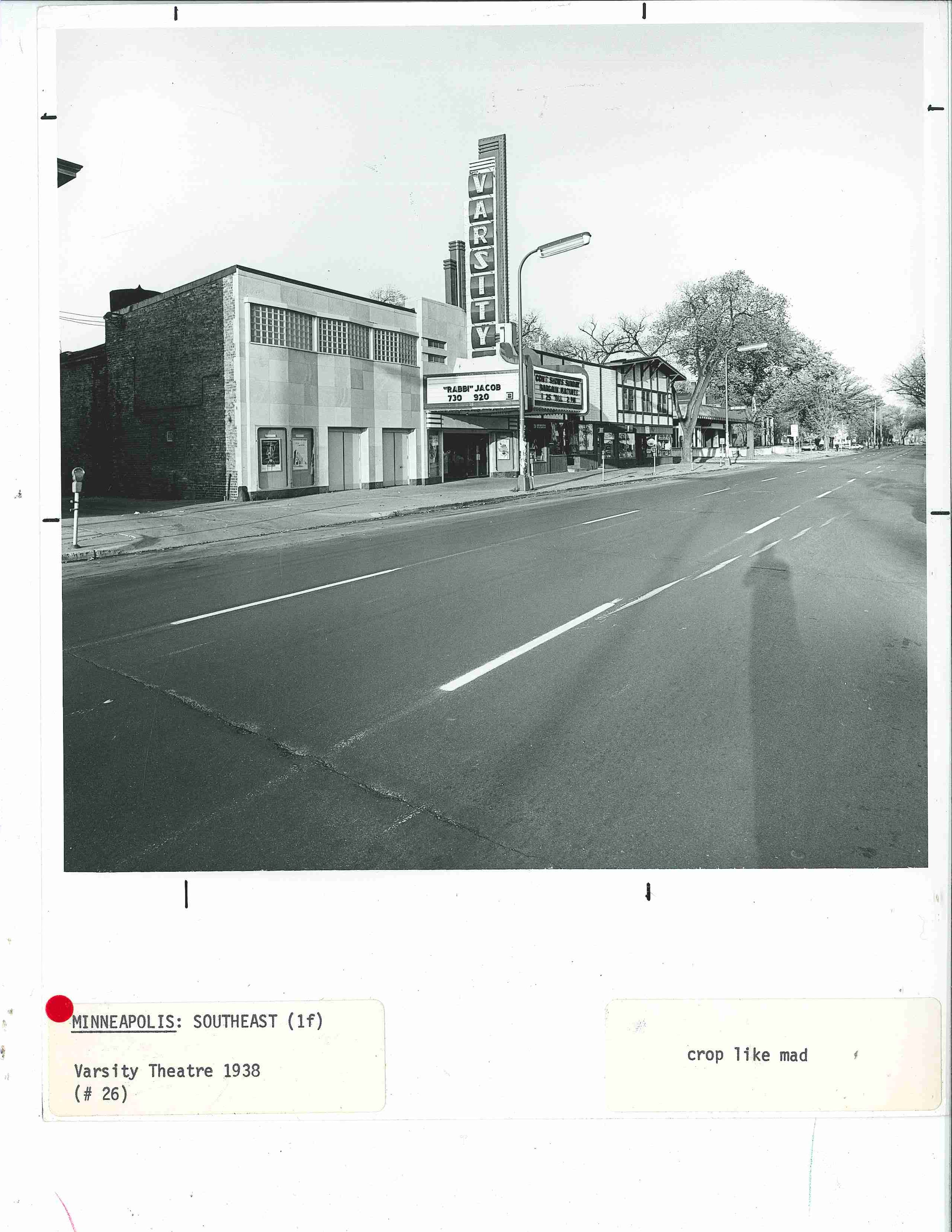
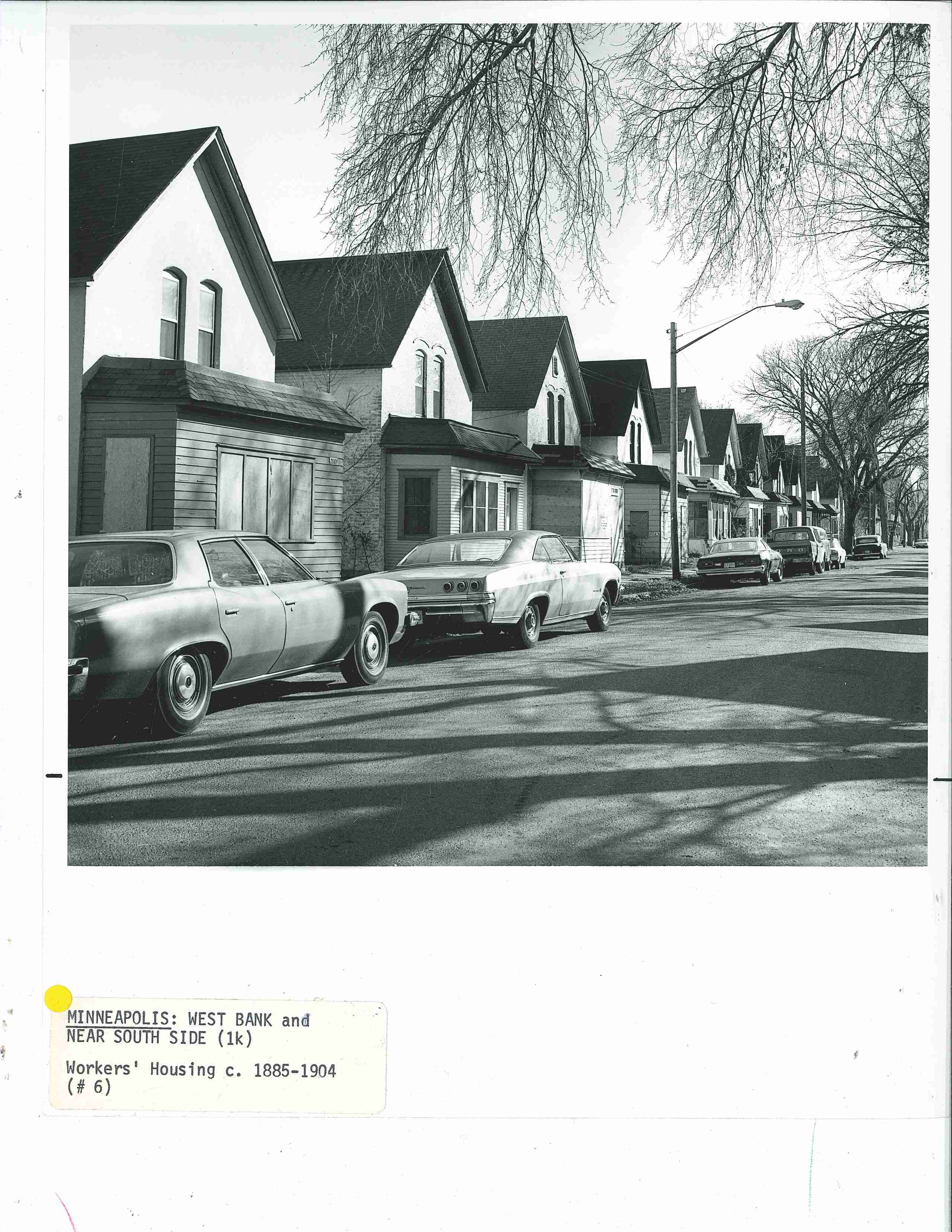
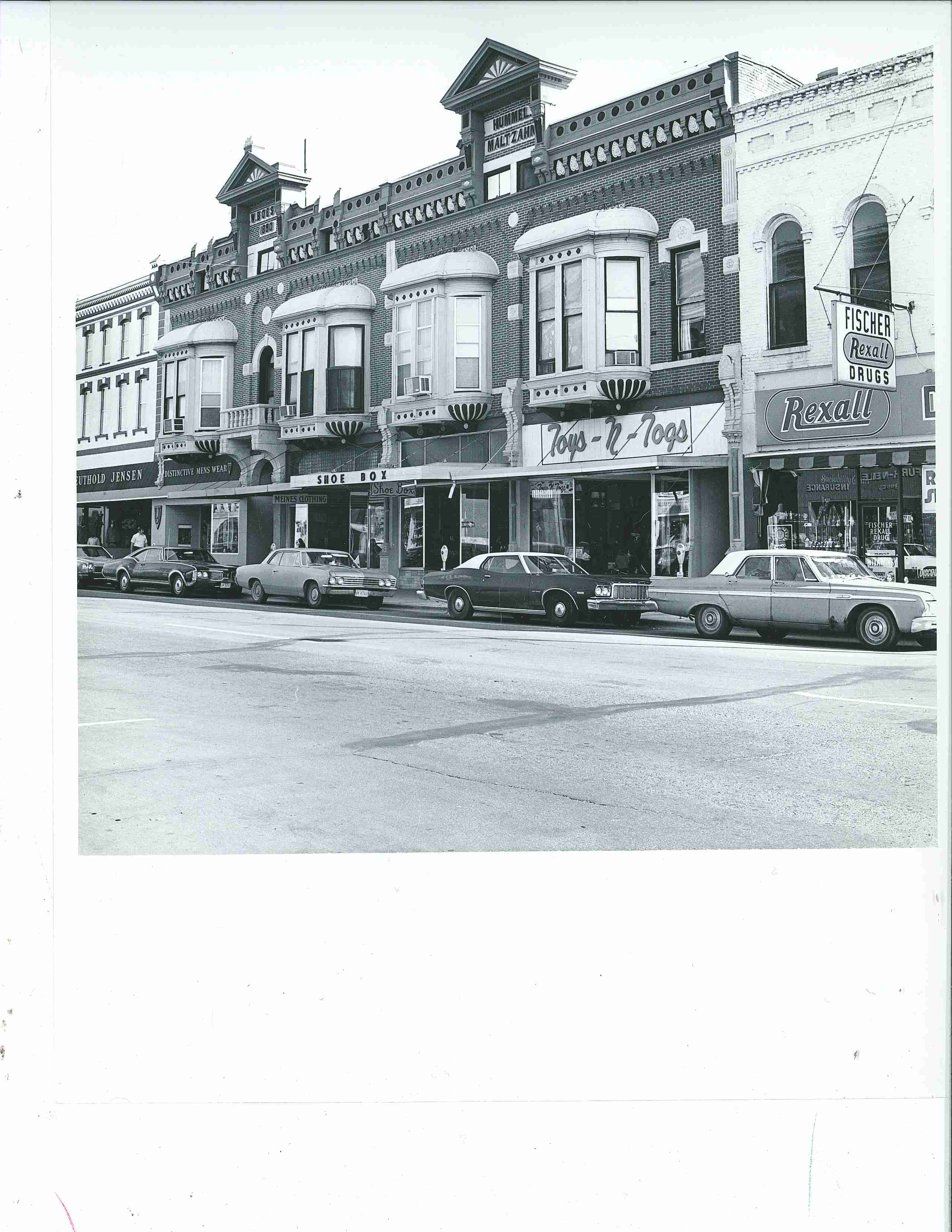
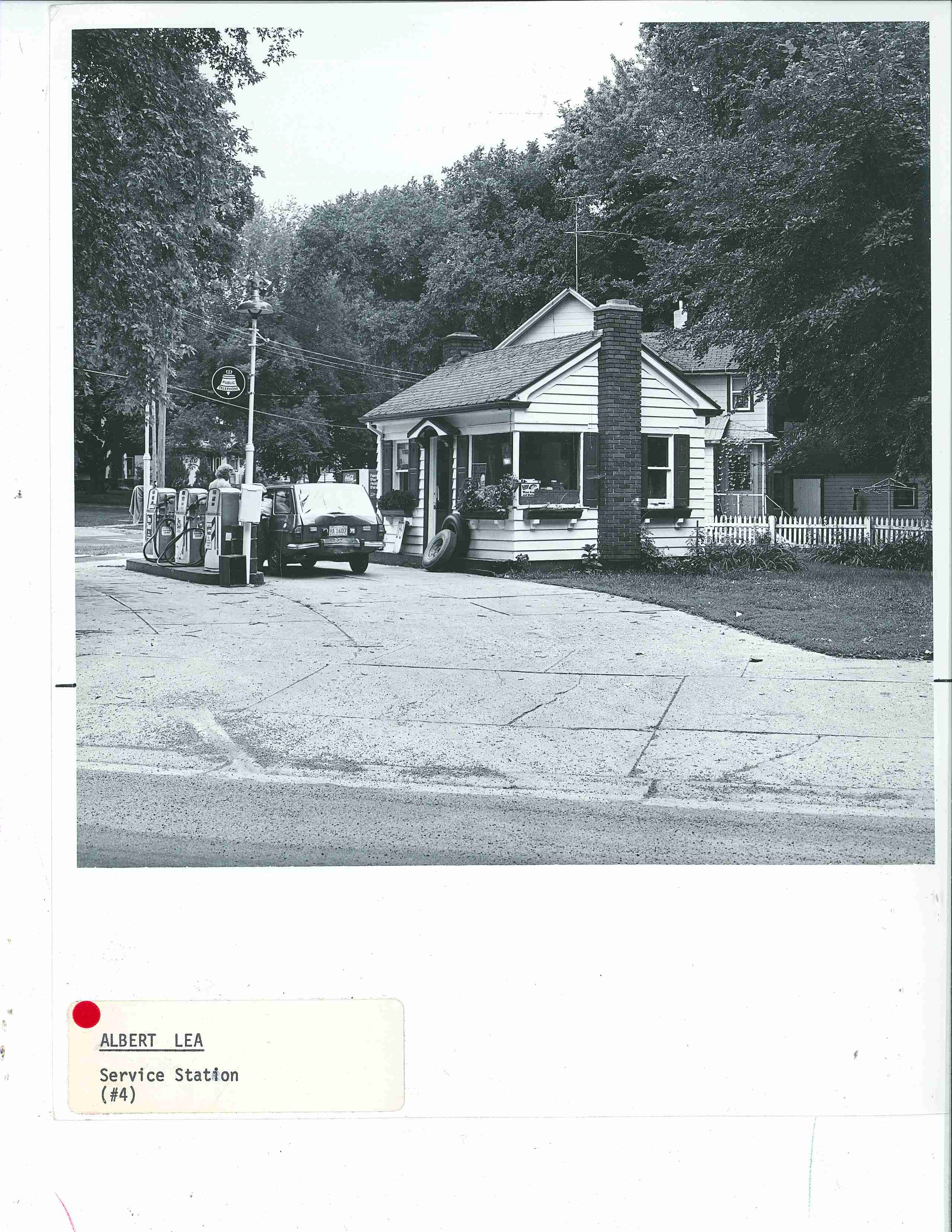
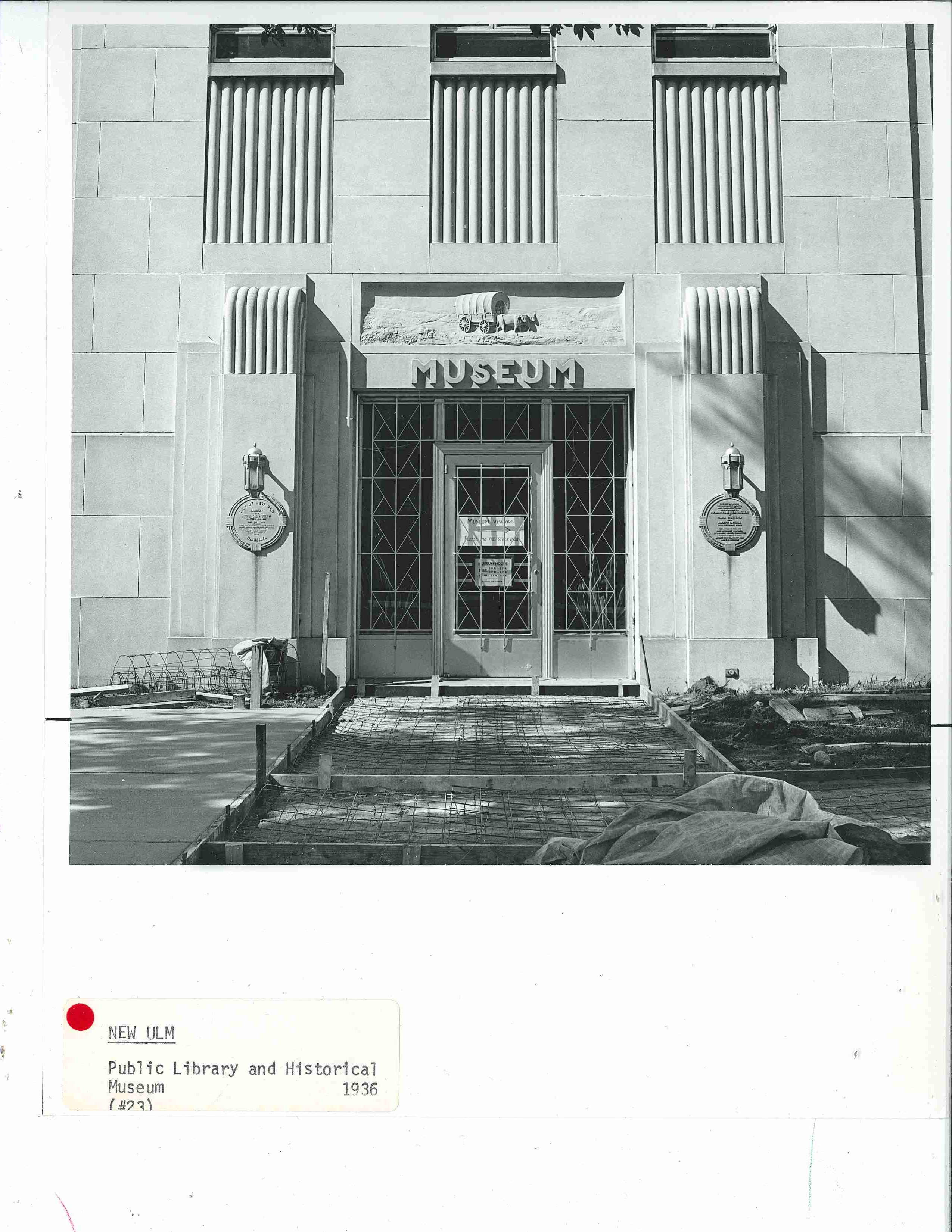
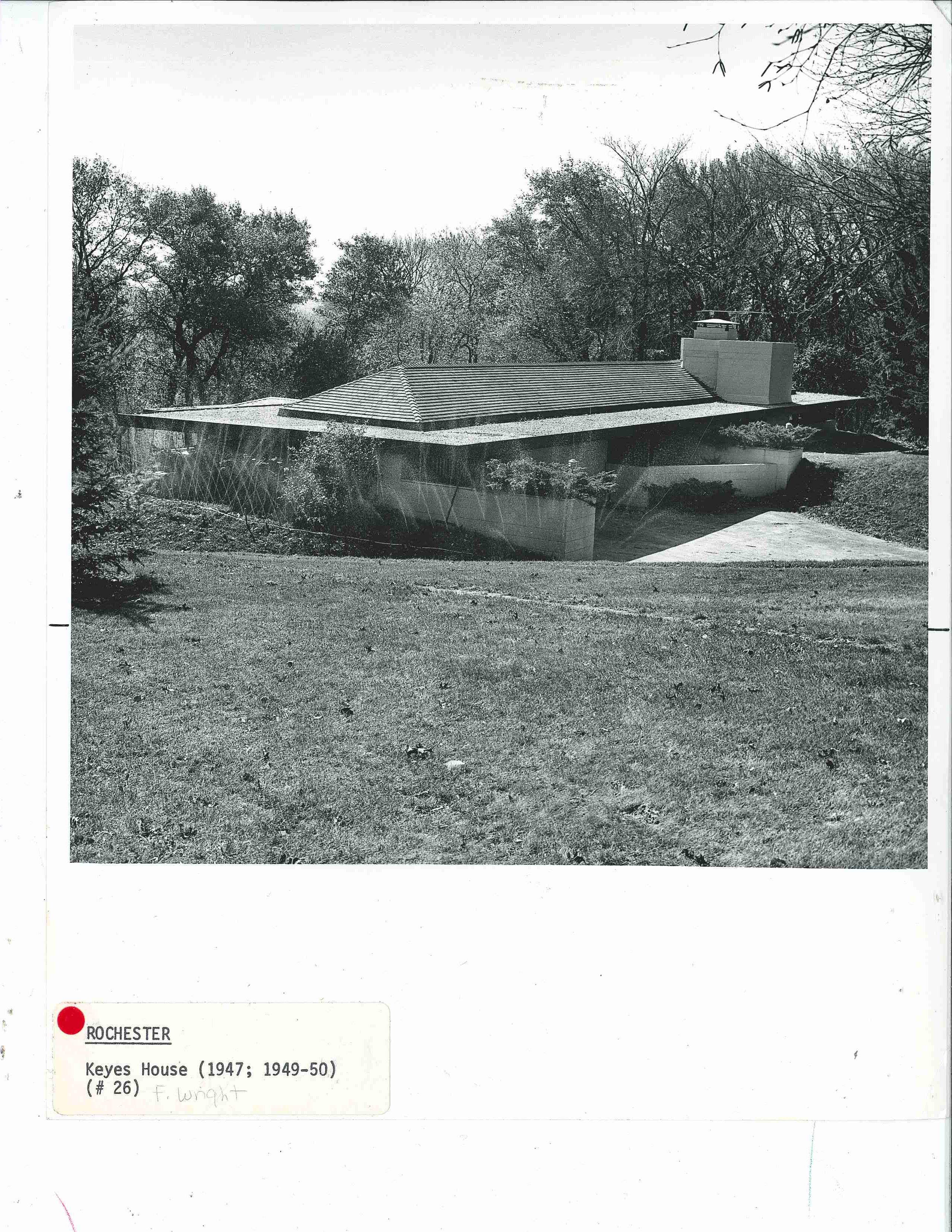
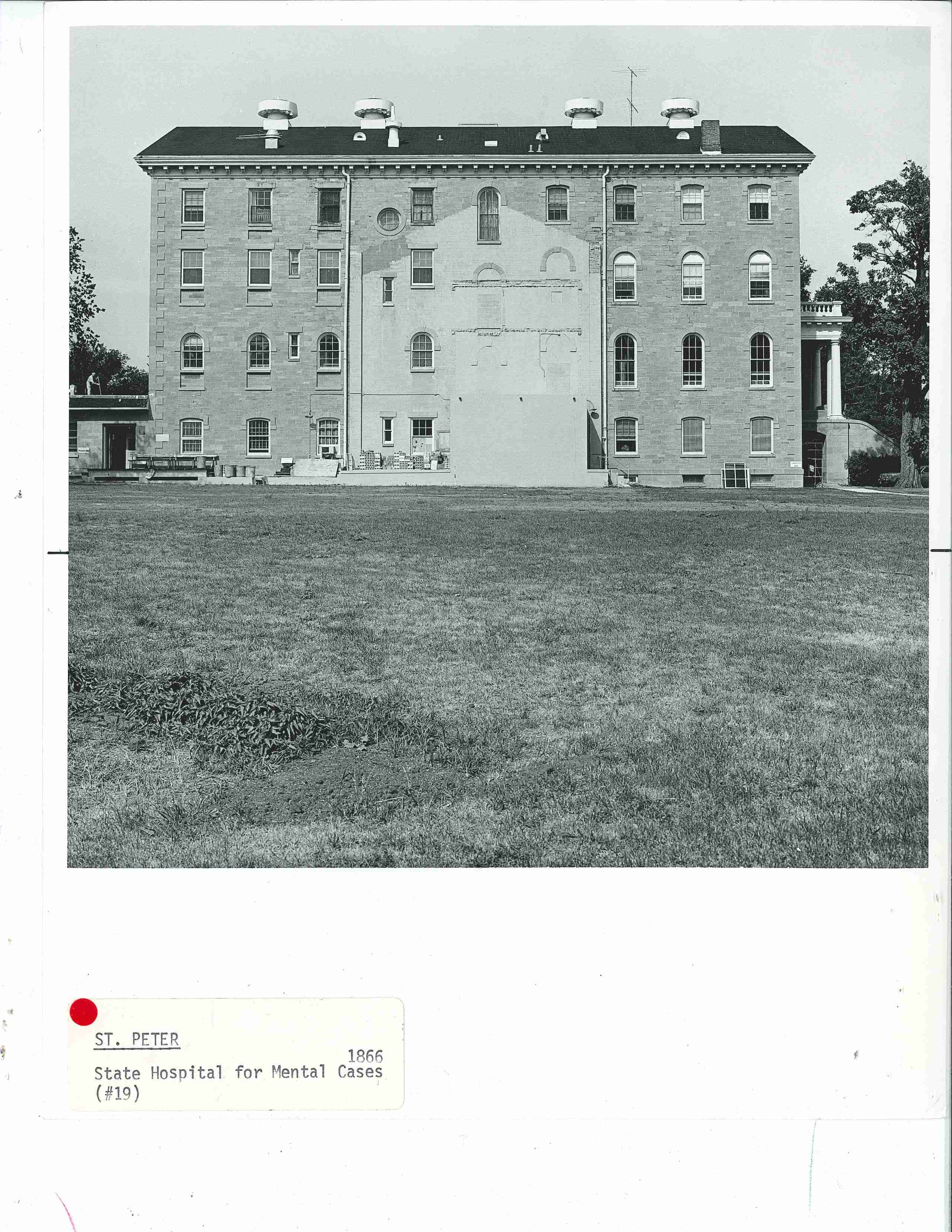
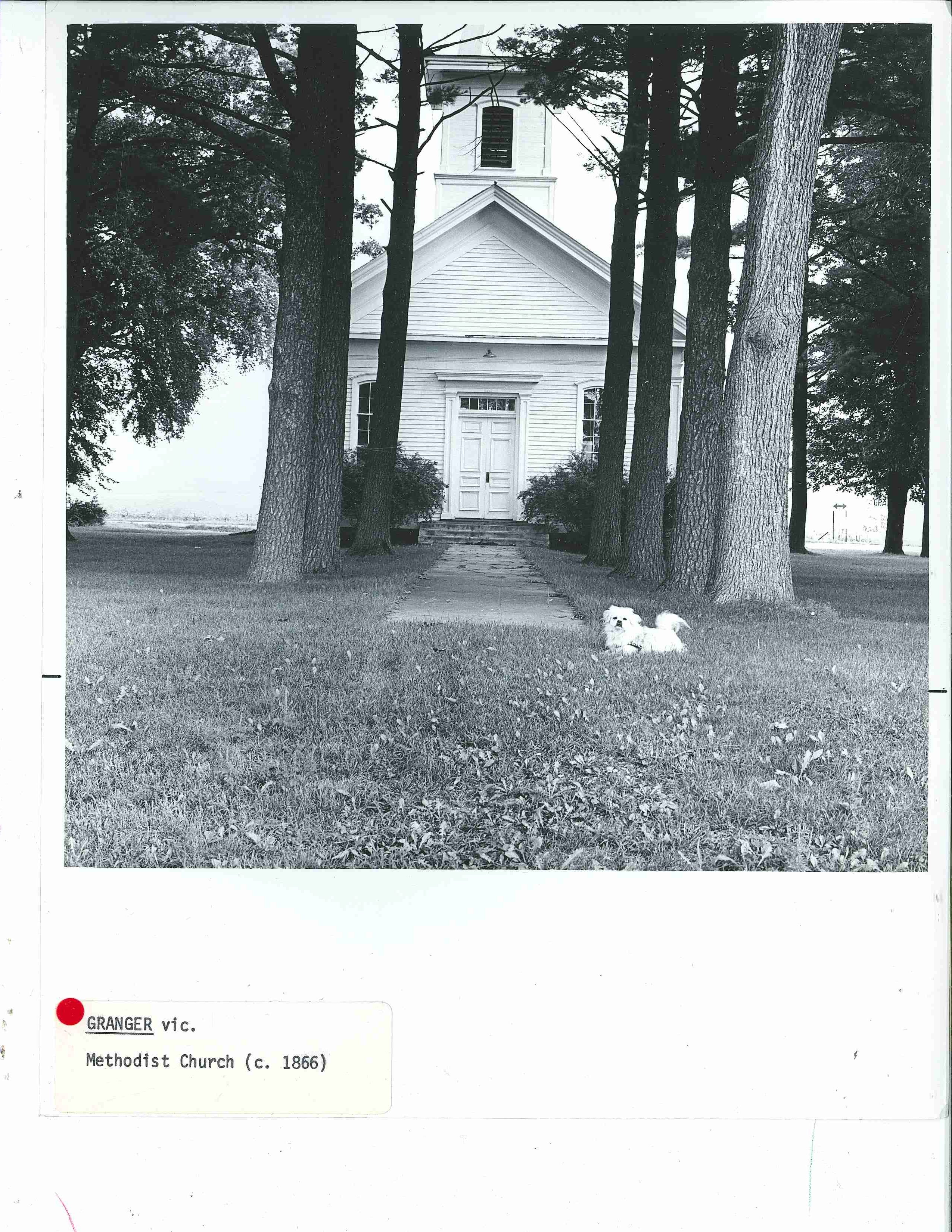
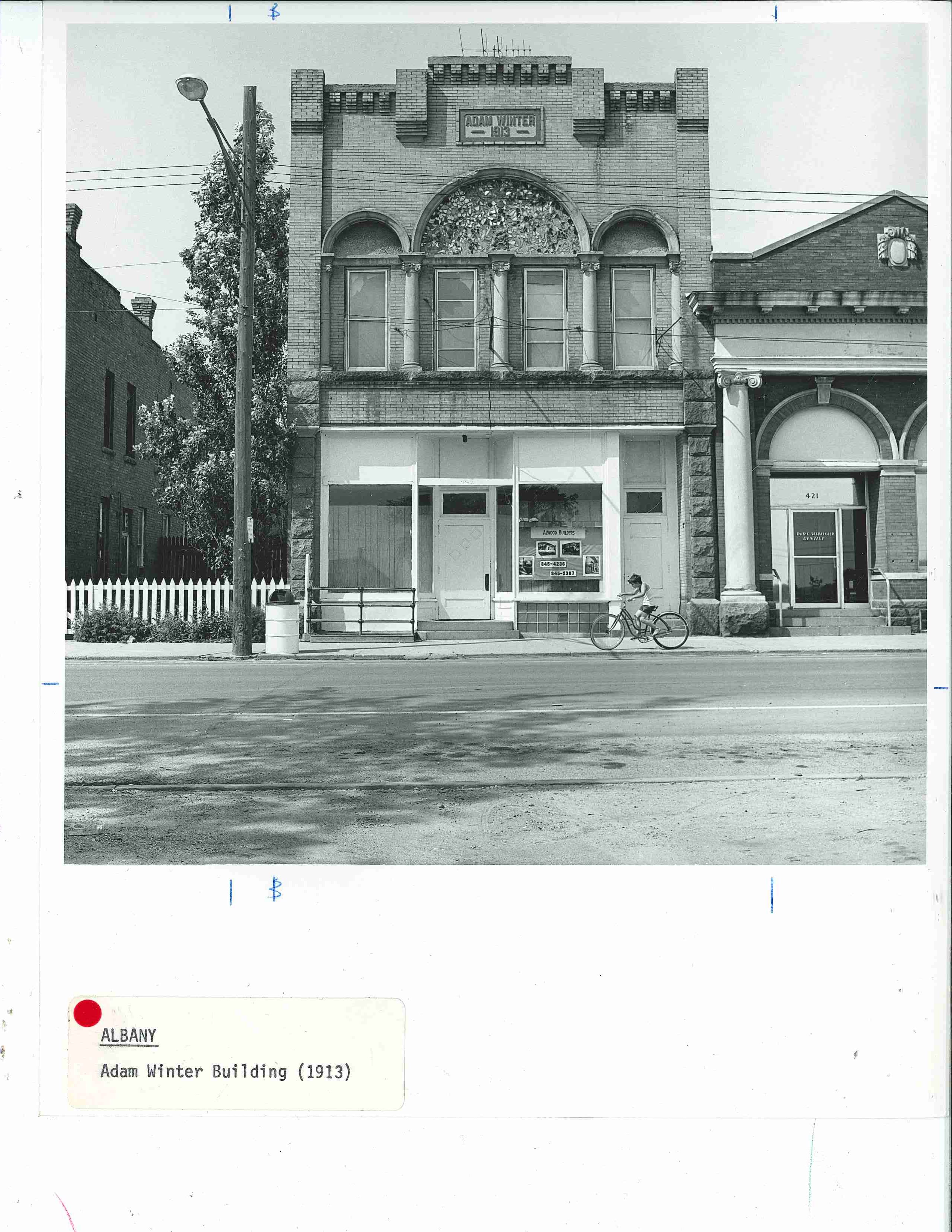
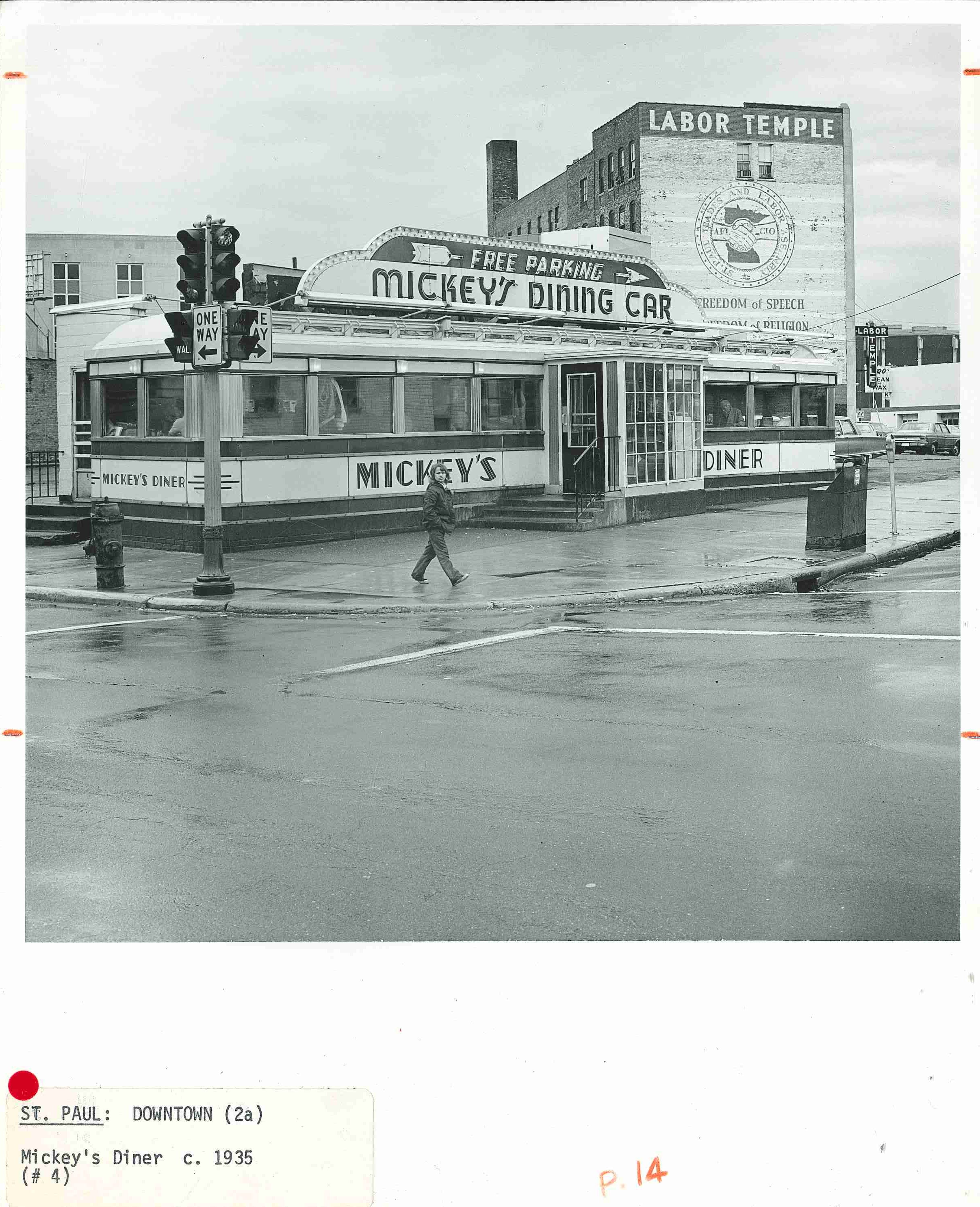
Photography has a curious way of encapsulating and immortalizing what might otherwise be a fleeting moment. Contemporary architectural photography is often devoid of people, sometimes placeless and gives a sense that the structures exist outside of time. While processing hundreds of photos for  A Guide to the Architecture of Minnesota, these uncropped, raw, pre-published versions of the architectural photography struck me as time capsules, outside the norms of architectural photography. Even knowing the intended use, there still seem to be more questions than answers in these photos. Some capture people or places during everyday moments like sprinklers watering a lawn or filling up a battered hatchback at a quaint gas station. Some are dated by non-architectural objects like automobiles and signs, and some imply movement while others are hauntingly still. Moments of happenstance frozen in time.

Fifth in a series, this photo-post was inspired by A Guide to the Architecture of Minnesota, published in 1977 as a supplement to University Gallery’s Bicentennial exhibition The Art and Architecture of Minnesota.


Heather Carroll is the processing archivist for the Weisman Art Museum‘s collection at the University of Minnesota Archives. This project was made possible by funds provided by the State of Minnesota from the Arts and Cultural Heritage Fund through the Minnesota Historical Society.


Hard Lines: A Guide to the Architecture of Minnesota


Straight lines, crisp angles, geometric forms, and openly planar surfaces in buildings become an embodiment of human’s power over the elements and ability to manipulate materials and environments. A Guide to the Architecture of Minnesota defines most of the buildings included in this post as Moderne (Art Deco) Style, International Style, New Brutalist or New Formalist. Contemporary architectural photography–where buildings appear timeless, monumental and almost separate from their actual locations and with a general absence of people–seems to accentuate and highlight these particular styles.

Fourth in a series of photo-posts inspired by A Guide to the Architecture of Minnesota, published in 1977 as a supplement to University Gallery’s Bicentennial exhibition The Art and Architecture of Minnesota, this post samples some of the awesomely geometric, monumental and sometimes hauntingly sparse buildings so popular at the time this book was published.

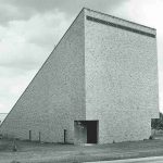
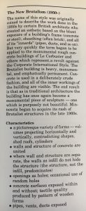
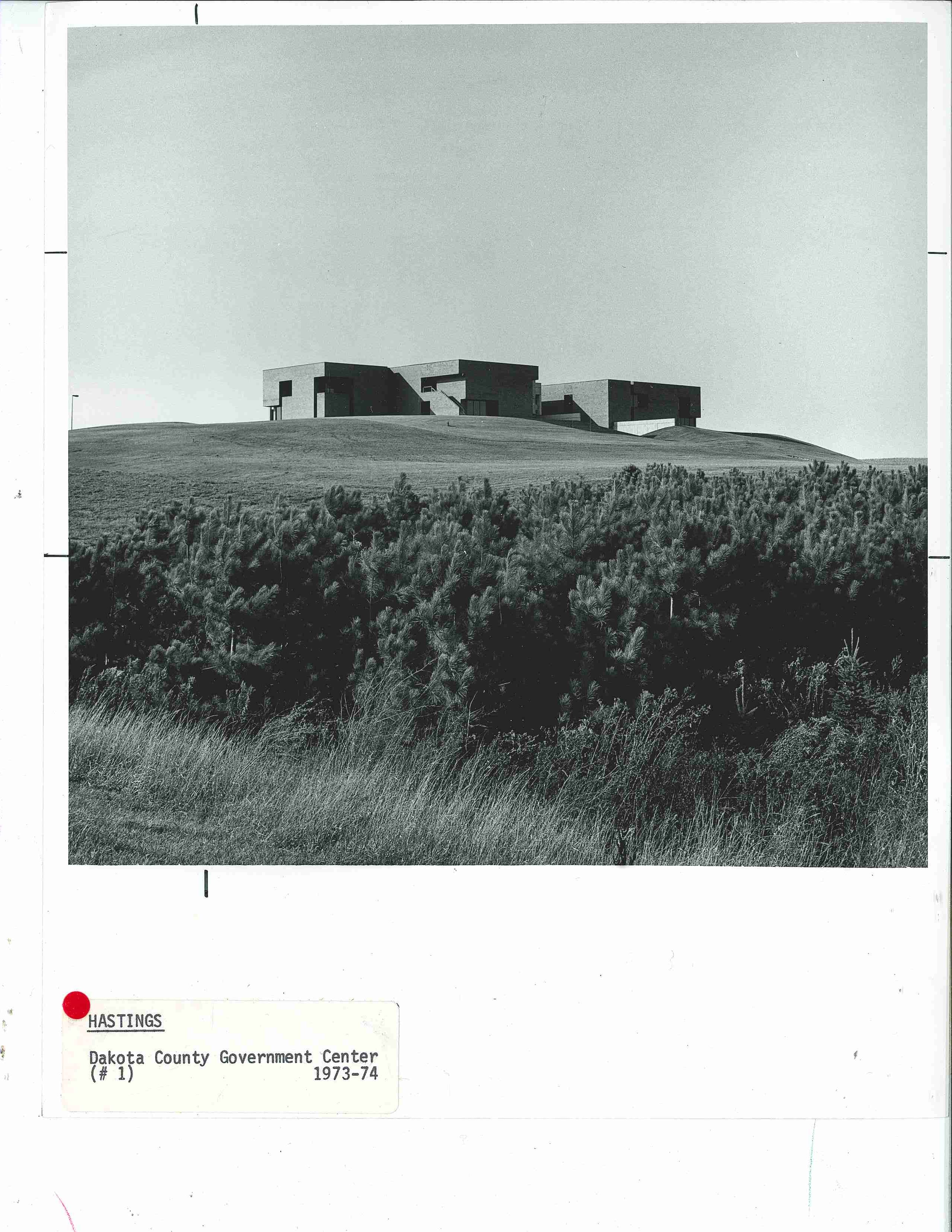
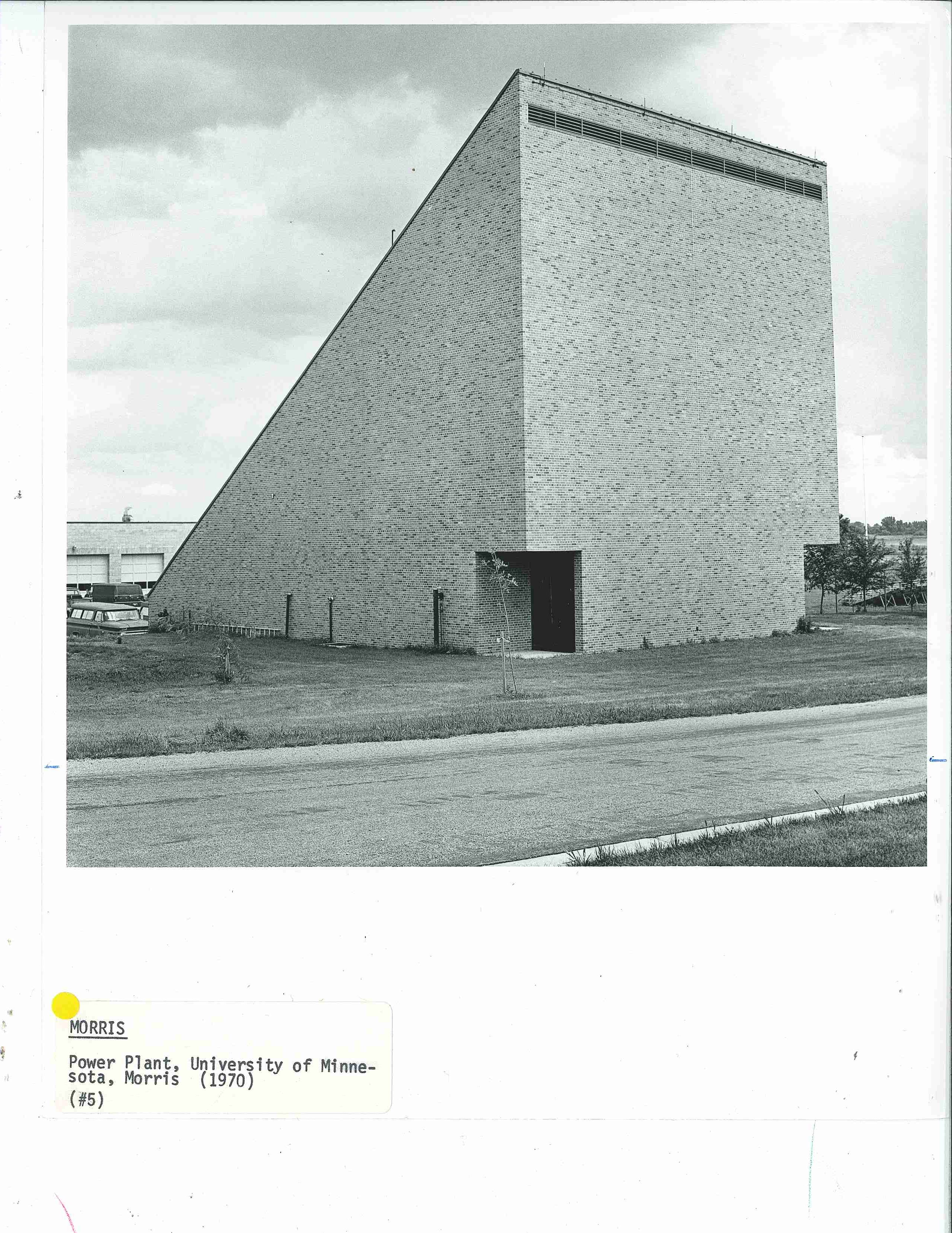
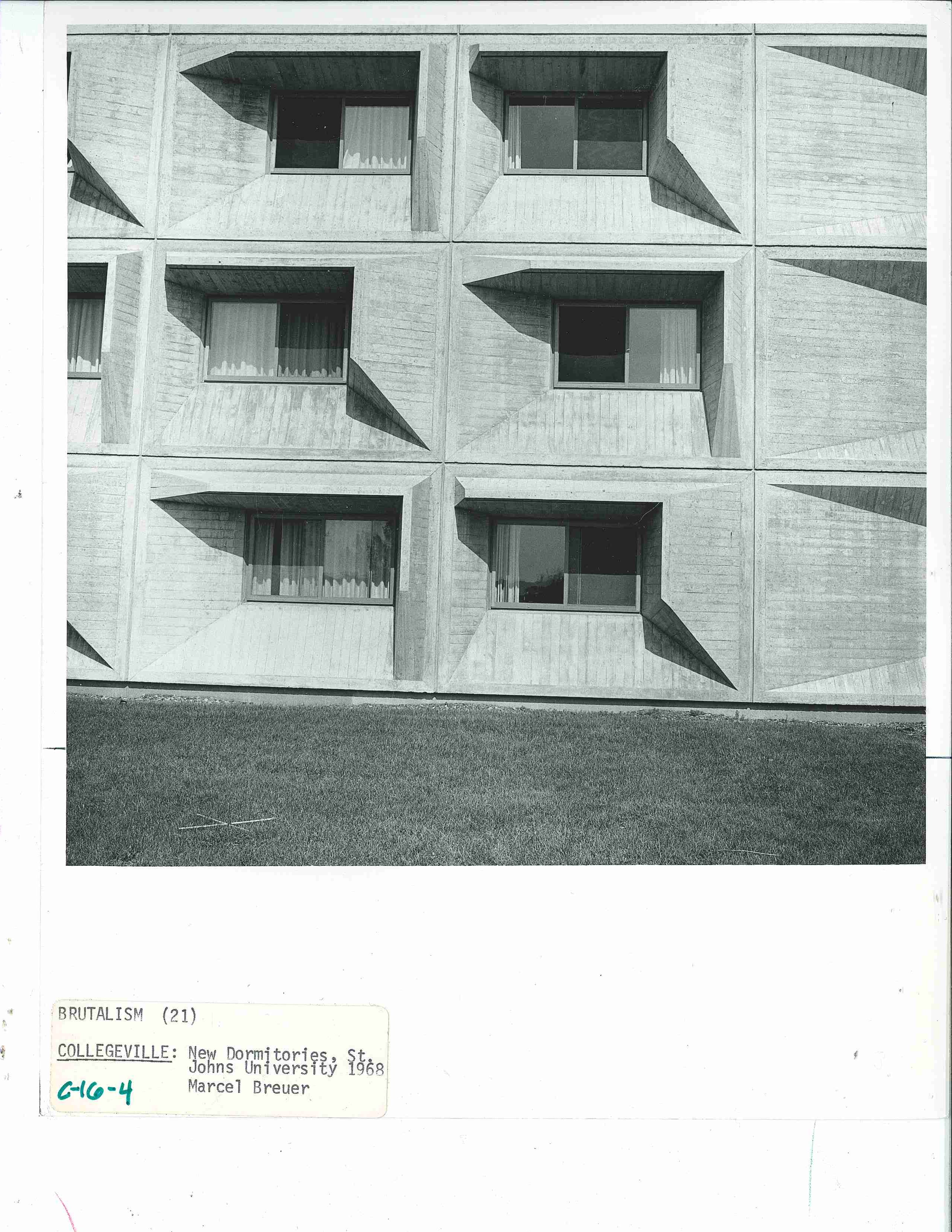
The first few photos of the post exemplify the Guide’s glossary definition and characteristics of New Brutalism: “heavy, monumental and emphatically permanent…[with] a picturesque variety of forms–volumes projecting horizontally and vertically, contradicting shapes, shed roofs, cylinders.” Click the image to the left for the full description from the Guide.


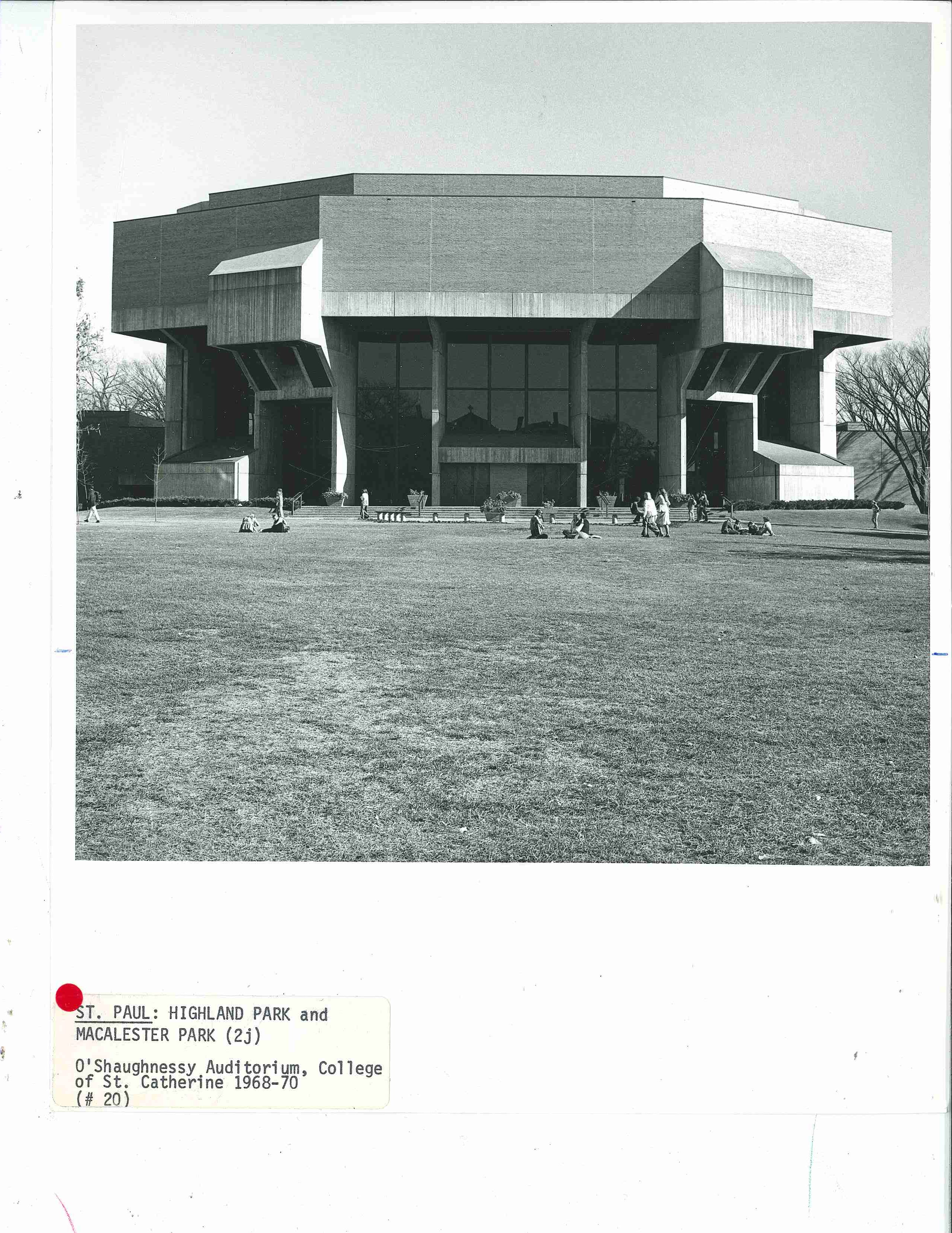
St. Catherine University’s O’Shaughnessy Auditorium in St. Paul, MN (below)

Dakota County Government Center in Hastings MN circa 1977. (below)Power Plant at the University of Minnesota in Morris, MN circa 19877 (below)

The “new” dormitories at St. John’s University in Collegeville, MN circa 1977 (below)

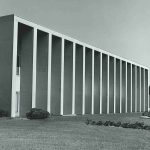
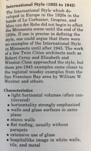
The following photos of the post might better exemplify the Guide’s glossary definition and characteristics of International Style: “light horizontal volumes (often cantilevered), horizontality strongly emphasized, walls and glass surfaces in the same plane…extensive use of glass…” Click the image to the left for the full description from the Guide.


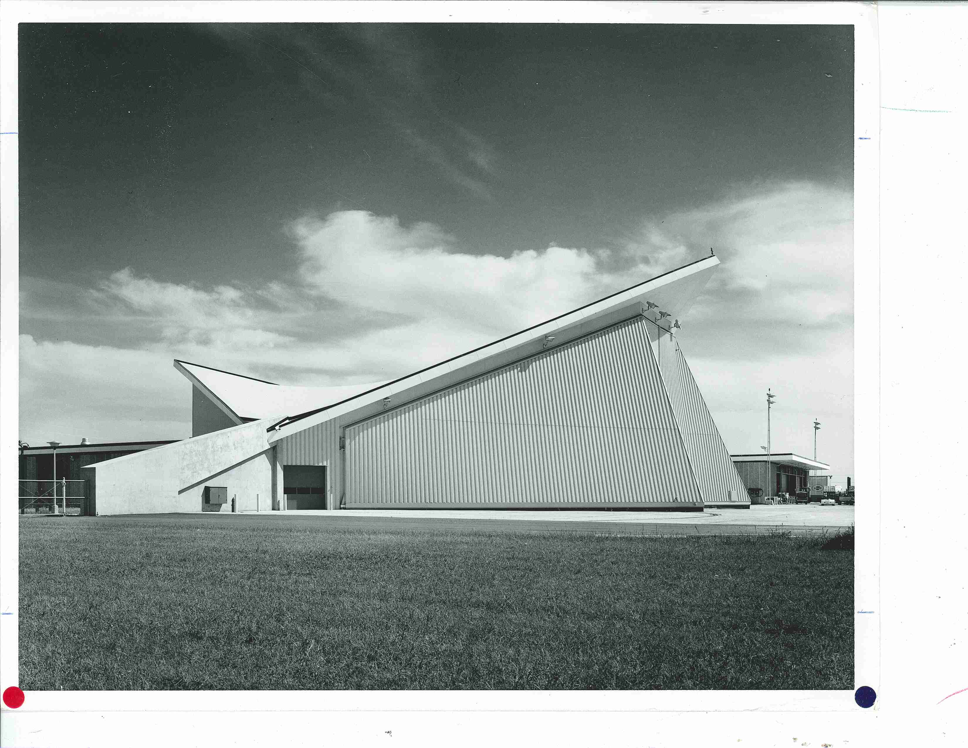
The United Airlines Hangar (below) was near the intersections of 34th Ave S and 494 in Bloomington MN. Described in the Guide as “a giant and workable hyperbolic paraboloid. Saarinen’s TWA building at Kennedy Airport transformed from concrete into angular steel.”

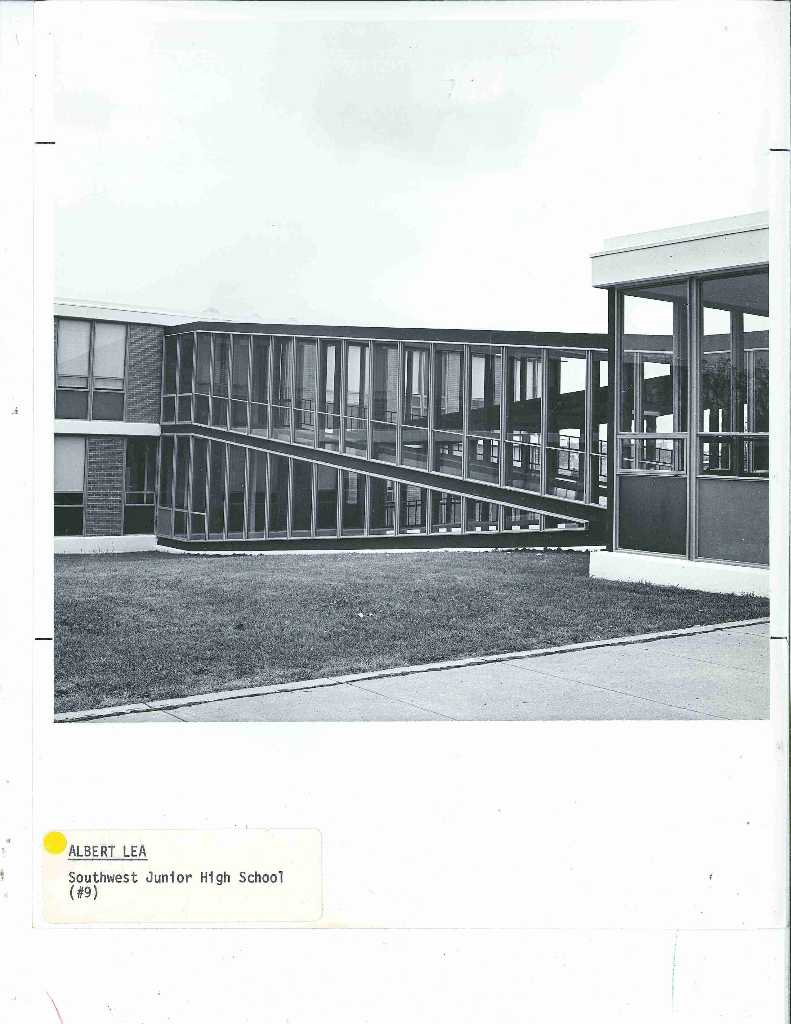
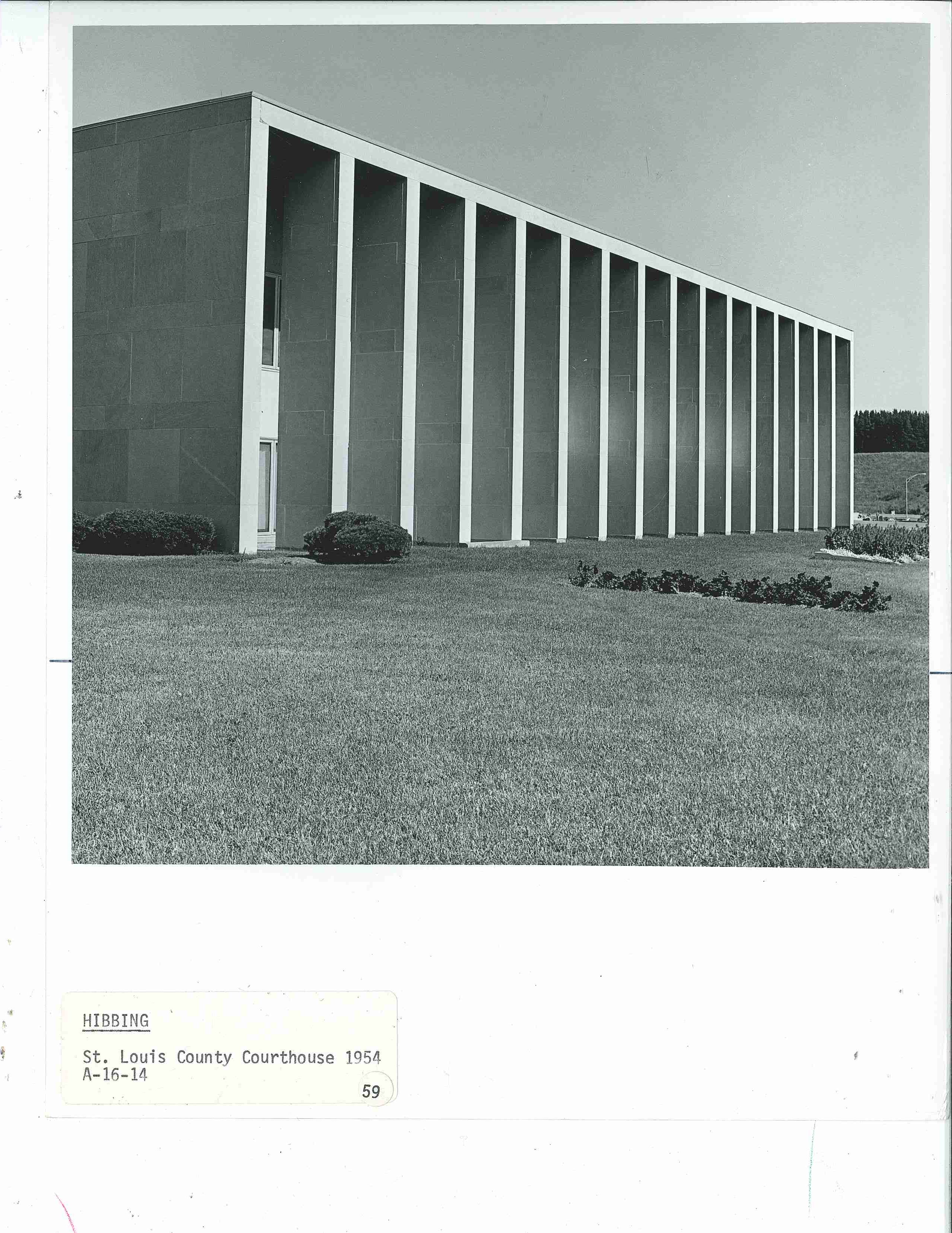
Southwest Junior High School in Albert Lea, MN circa 1977 (below)St Louis County Courthouse in Hibbing, MN circa 1977 (below)

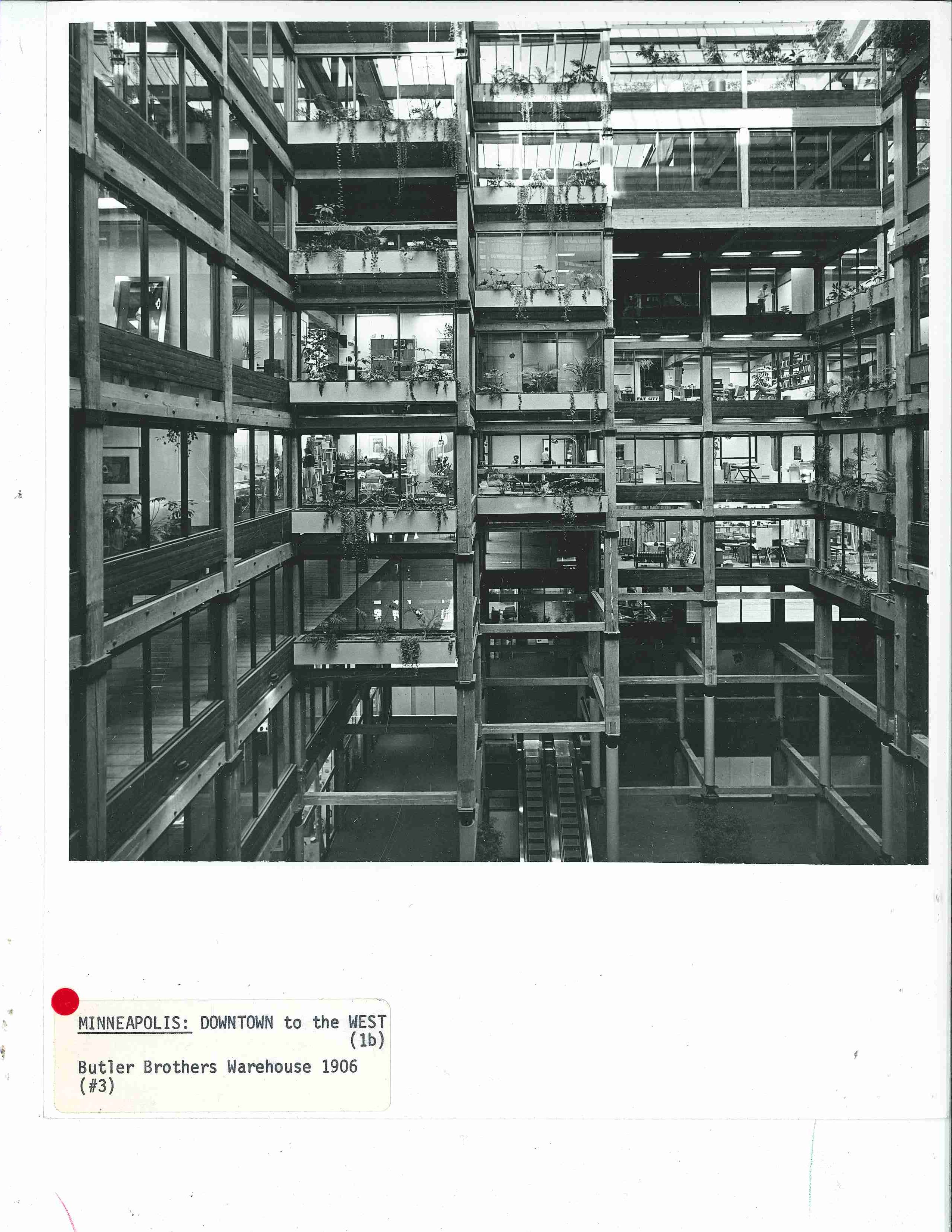
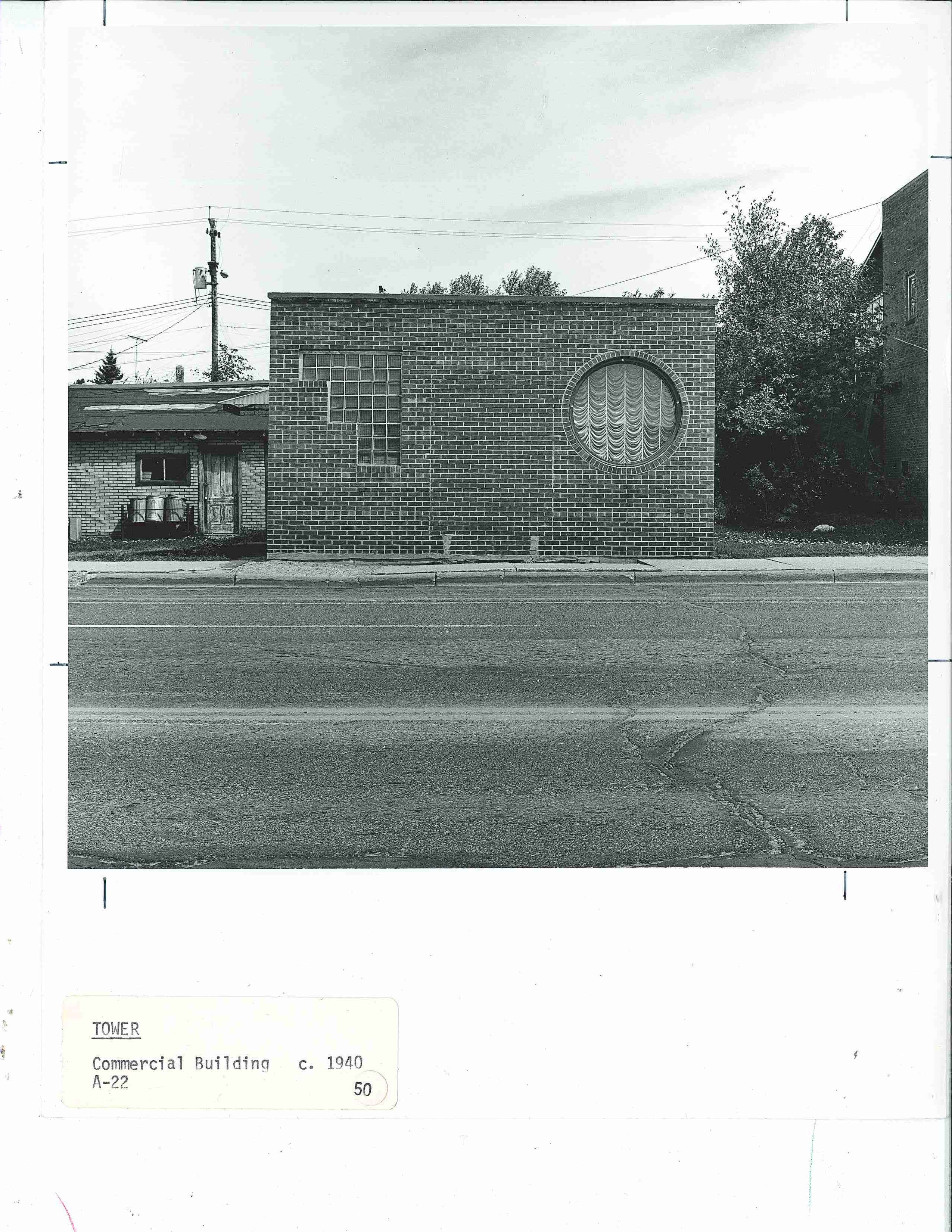
Butler Brothers Warehouse Building in Minneapolis, MN circa 1977 (below) was remodeled inside with walls of glass and the original heavy wood beams.The image (below) of a humble commercial building turned residence in Tower, MN didn’t make it into the book but instead is described as Streamline Moderne style which the Guide’s glossary describes as “an outgrowth of the machine aesthetic” and characterized here by the “non-symmetric compositions, glass brick for walls and windows, [and] round windows”. 

Heather Carroll is the processing archivist for the Weisman Art Museum‘s collection at the University of Minnesota Archives. This project was made possible by funds provided by the State of Minnesota from the Arts and Cultural Heritage Fund through the Minnesota Historical Society.


Sculptures: A Guide to the Architecture of Minnesota


Minnesota has no shortage of roadside attractions, including sculptures of monumental scale. Third in a series of photo-posts inspired by A Guide to the Architecture of Minnesota, published in 1977 as a supplement to University Gallery’s Bicentennial exhibition The Art and Architecture of Minnesota, this post is dedicated to just a few of the architectural sculptures across the state.

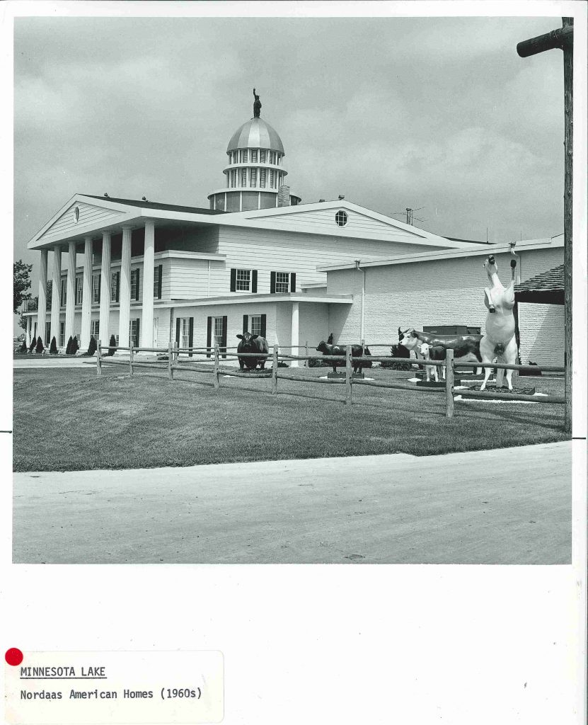
A detail (below) from the previous post–just one of the quirky sculpture areas of the Nordaas American Homes former landscape/architecture folly in Minnesota Lake.

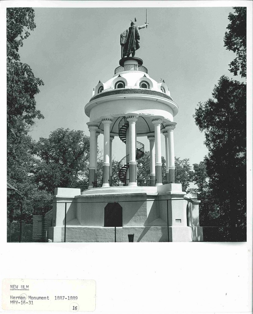
Hermann Heights Monument aka Hermann the German (below) of New Ulm, MN.

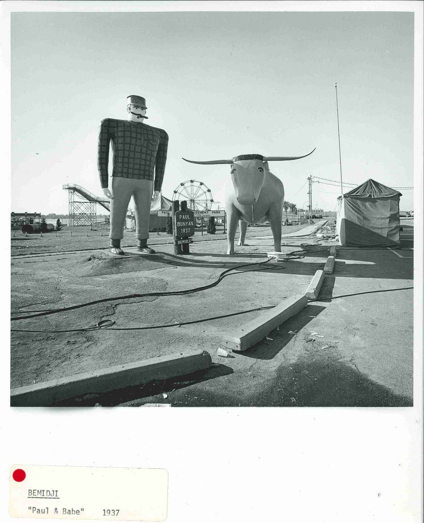
Paul Bunyan and Babe the Blue Ox, statues standing 18′ and 10′ tall respectively, made their public debut at the 1937 winter carnival in Bemidji, MN. Paul and Babe have continued to captivate imaginations ever since.

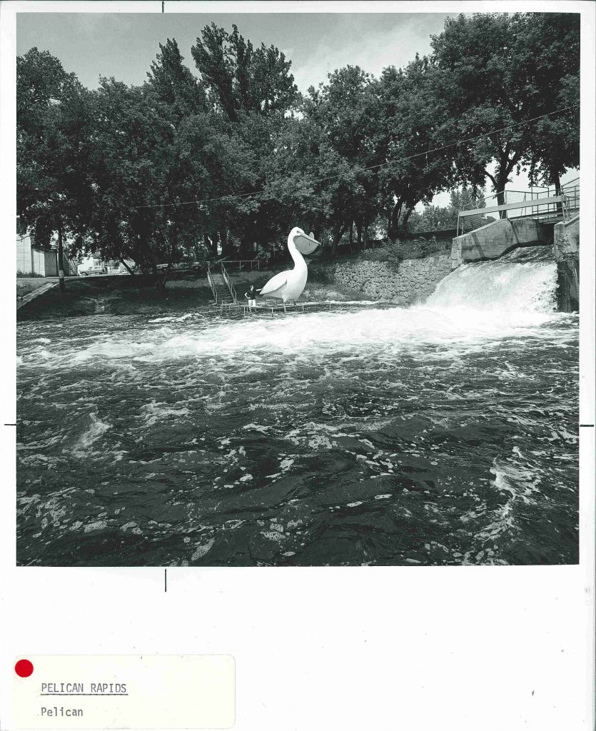
Inspired by the enduring success of  Paul & Babe in Bemidji, Pelican Pete (below) “is a 5:1 scale model [in concrete] of a mounted stuffed pelican which is located in the Old City Hall” of Pelican Rapids.

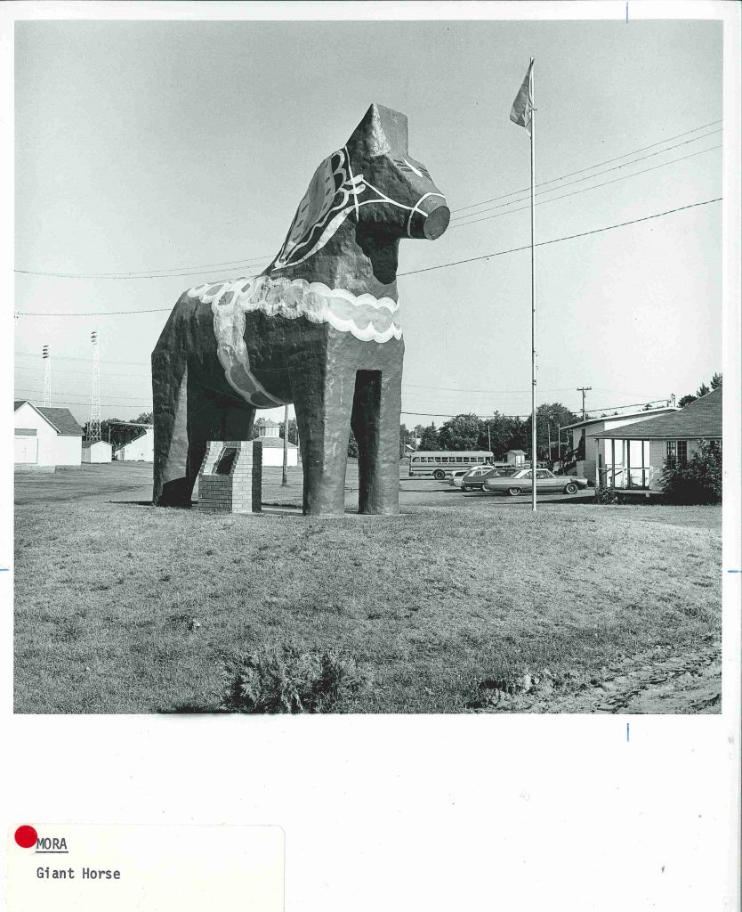
The giant Dalecarlian Horse or Dala Horse in Mora, MN honors the towns Swedish roots.

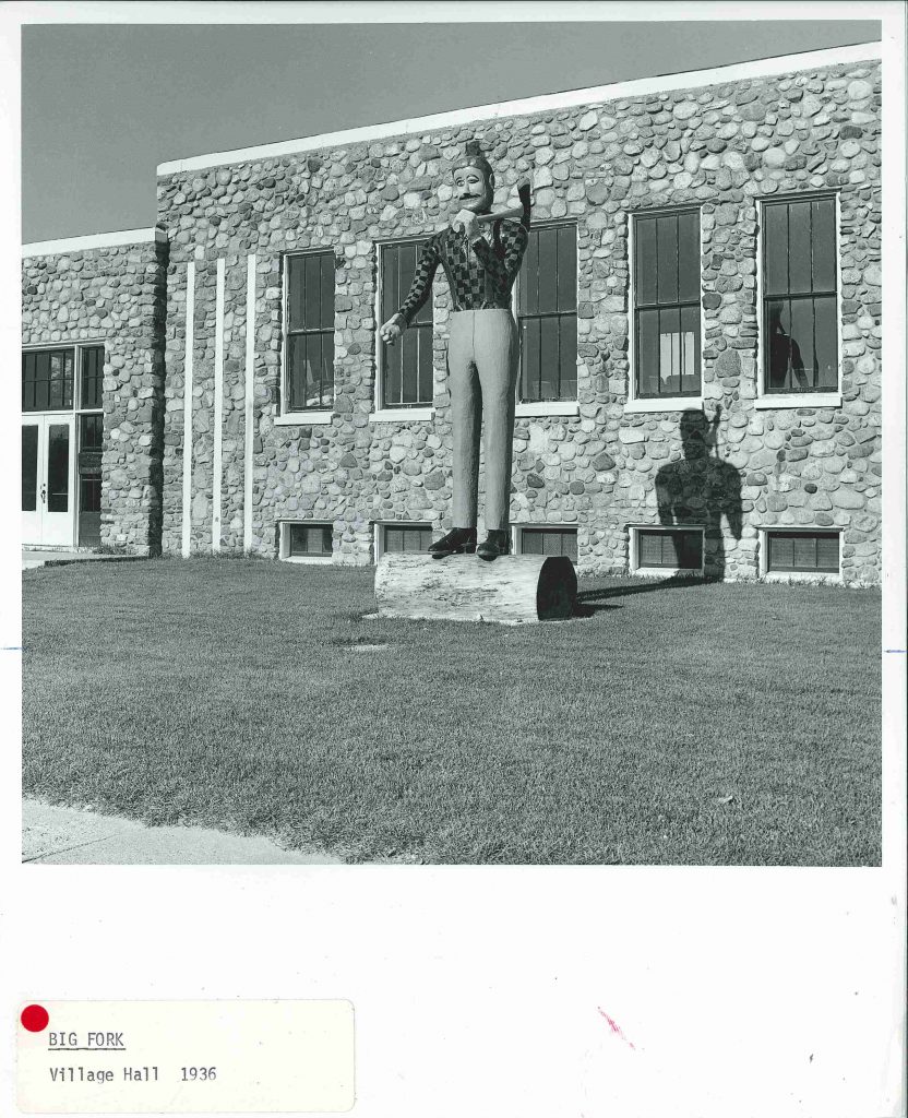
While this winking lumberjack no longer stands outside Bigfork’s WPA-built Village Hall, a new lumberjack does.

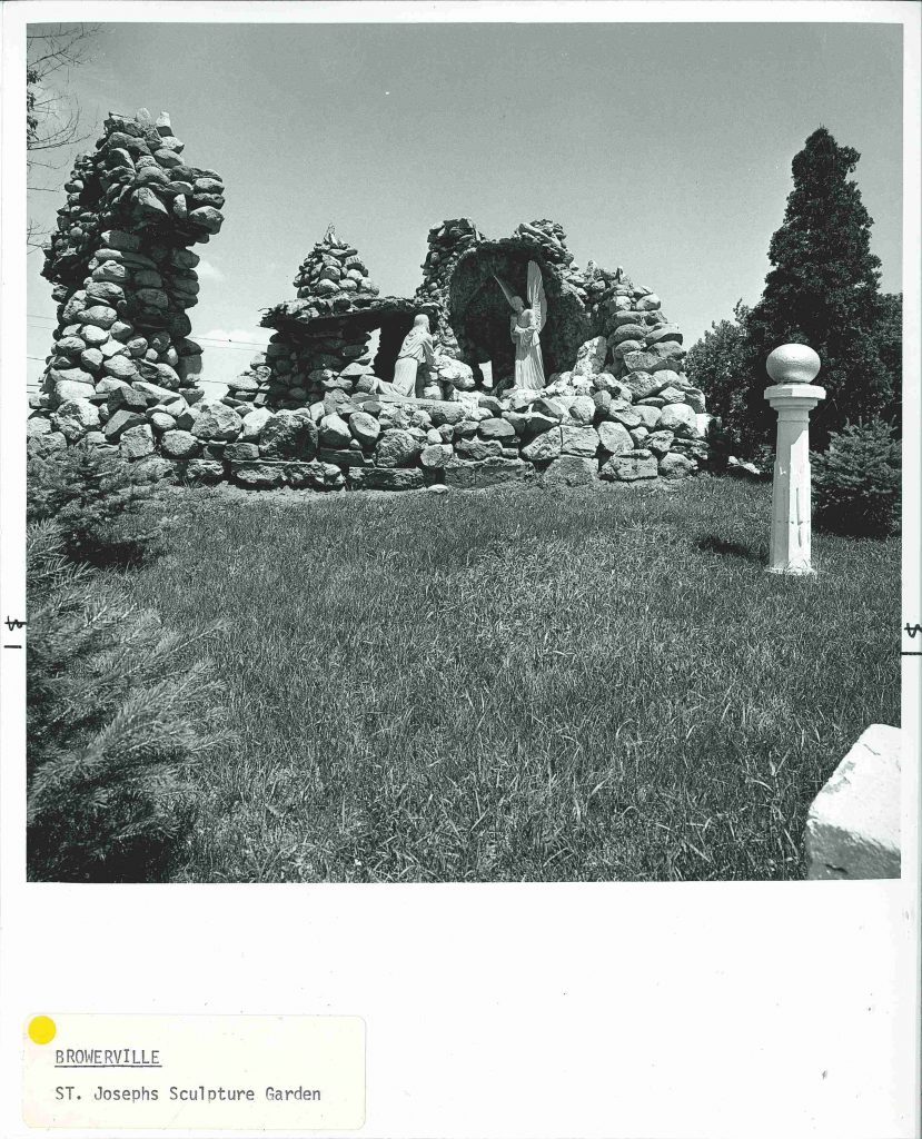
St Joseph’s Church sculpture garden in Browerville MN (below). “To the right and left of the church are what appear to be an eighteenth century English folly and grotto, only in this case the intent is religious– a depiction of Christ in the garden of Gethsemane. The boulder composition on the right with its sculptured figure, and the cascade on the left were created in the early twentieth century by Joseph Kieselewski.” ~A Guide to the Architecture of Minnesota, 1977.

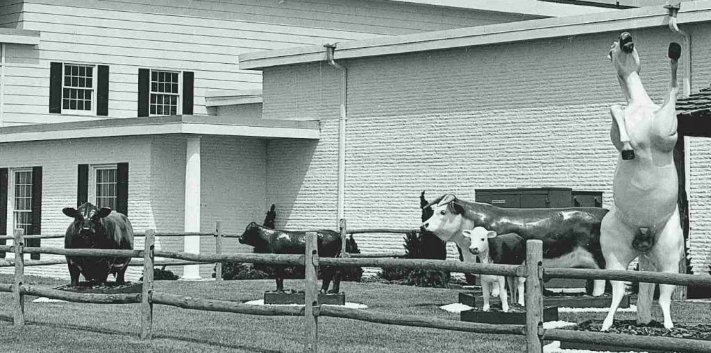
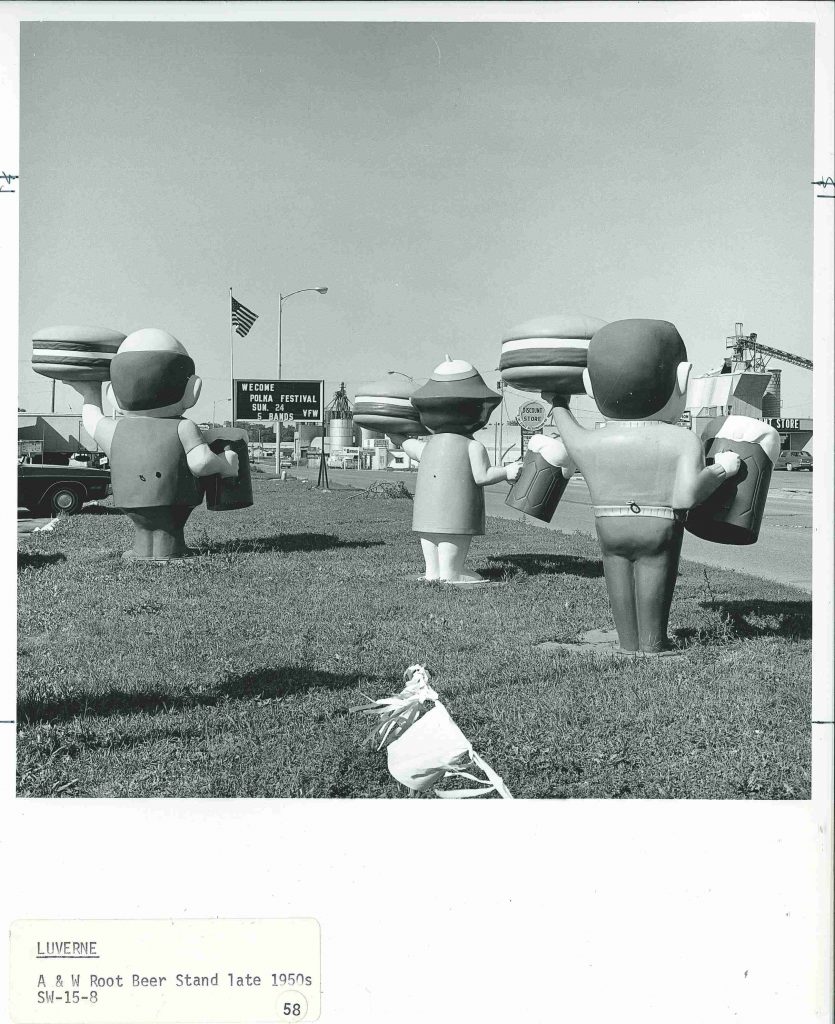
The A&W Root Beer stand in Luverne, MN. This image didn’t make it into the final publication but a description did:
“Three creatures from the wilds of Disneyland, each holding a hamburger and a mug of root beer.”
Creatures from the wilds of Disneyland?? I can only imagine–but will probably never know–the sculpted expressions from the other side.


Heather Carroll is the processing archivist for the Weisman Art Museum‘s collection at the University of Minnesota Archives. This project was made possible by funds provided by the State of Minnesota from the Arts and Cultural Heritage Fund through the Minnesota Historical Society.


Quirkiness: A Guide to the Architecture of Minnesota

Idiosyncratic and quirky architecture seemed to abound at one time in the not-so-distant past. The purpose of these buildings remains in most cases a mystery–perhaps in some cases necessity was the mother of invention or in other cases people someone took matters into their own hands to make the building of their dreams a reality.

The book A Guide to the Architecture of Minnesota, which was created “to supplement and augment the Bicentennial exhibition, The Art and Architecture of Minnesota‚ organized and presented by the University Gallery in conjunction with the Minnesota Society of Architects”, includes many unique structures. Here is a just a selection of the unique, quirky and idiosyncratic buildings across the state:

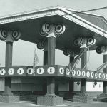
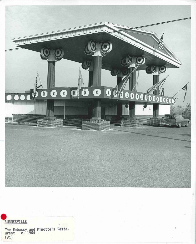
This unique structure (below, circa 1977) known as the Corner House Restaurant no longer exists but stood near what is now a car dealership off Cliff Road and 35W South in Burnesville, MN. I can only hope that this tympanum suspended by exaggerated columns was used as an outdoor dining area or observation deck looking out at the nearby Minnesota River valley.
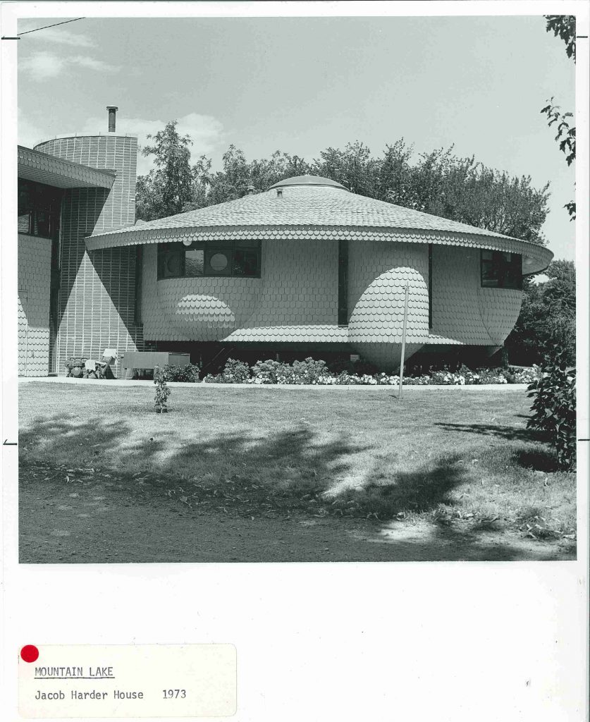
Bruce Goff, inspired by Antoni Gaudi, Frank Lloyd Wright and more, developed an architecture style was all his own. The small southwest Minnesota town of Mountain Lake was home to two of Goff’s creations: the Jacob Harder House and the Glen Harder House. A Guide to the Architecture of Minnesota describes the Jacob Harder House (below) as “somewhat like a pregnant spaceship, sheathed in fish-scale shingles which really look more like chicken feathers.”
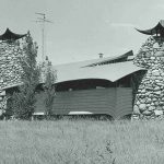
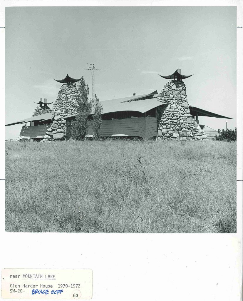
Goff’s “Glen Harder House” (below) was described in Guide: “Three gigantic tree-trunk chimneys of river boulders project upward, each topped by an upturned piece of metal, and between them floats the house in birdlike (turkey?) fashion. The roof is covered with bright orange indoor/outdoor carpet.” Barn swallow perhaps, but turkey seems a bit harsh. Sadly, this house was burnt to the ground in a fire in the 1990’s.
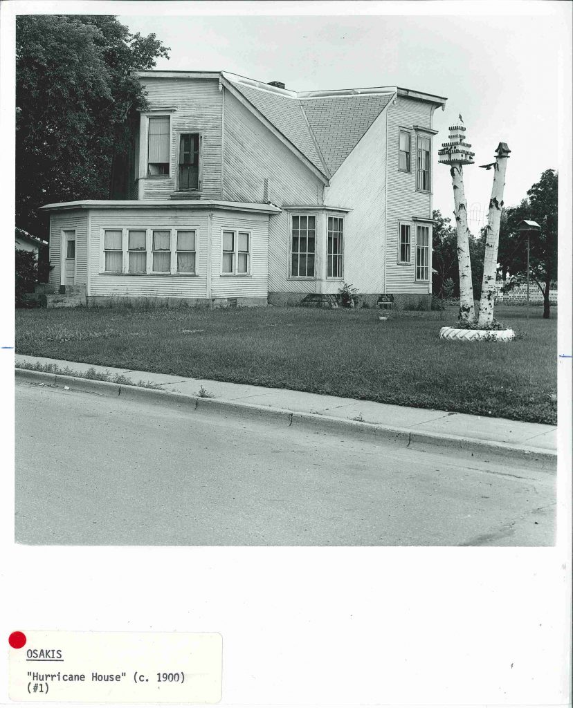
Built by J.B. Johnson the Hurricane House (below) in Osakis, MN “was the home of a man who adjusted very little to any convention and admired bees.” While the home did withstand a tornado, it is apparently a misnomer that it was designed to do so and rather the shape was inspired by industrious bees (according to Historic Homes of Minnesota by Roger G Kennedy).
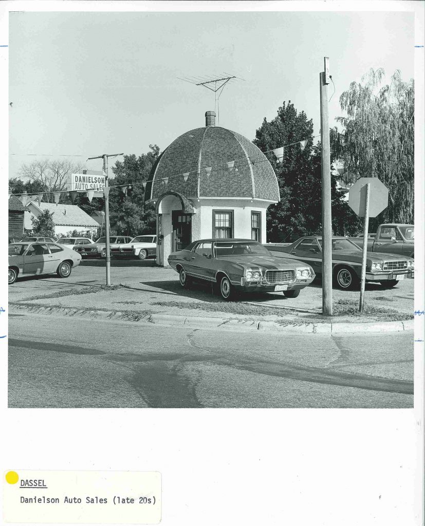
West of the Twin Cities in Dassel MN, what was once Danielson Auto Sales is today known as The Mushroom Building (below) was restored by the Dassel Area Historical Society and now serves ice cream and hosts town events.
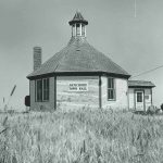
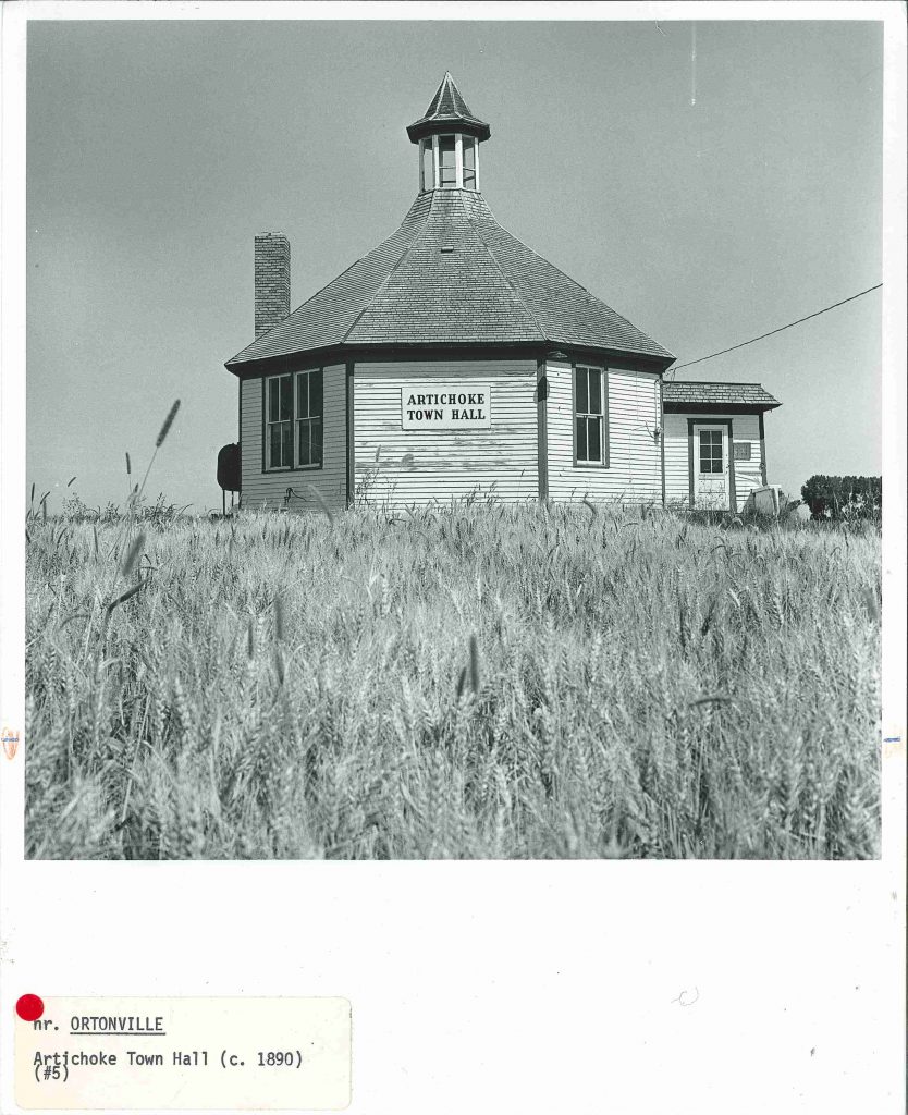
Artichoke Town Hall, was described in Guide circa 1977 as a shape that strongly suggested an artichoke with trim painted (appropriately) in artichoke green. However, the later application to the National Register of Historic Places suggests it is named for the nearby lake rather than its shape. Prior to becoming a town hall, this was the District 13 School House and is the only known octagonal school house in the state.
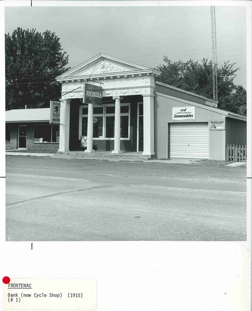
The Greek revival bank in Frontenac, MN–aka Frontenac Cycle Sales–has a cast iron facade identical to the historic bank in Marine-on-St-Croix, according to Guide.

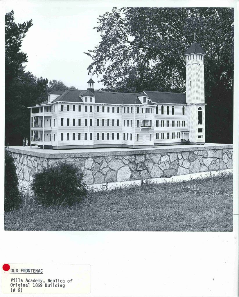
This miniature replica of the Villa Maria Academy in Old Frontenac, memorializes the girls’ school that burned to the ground in 1969 after being struck by lightening. Read more about it in the Old Frontenac history here.
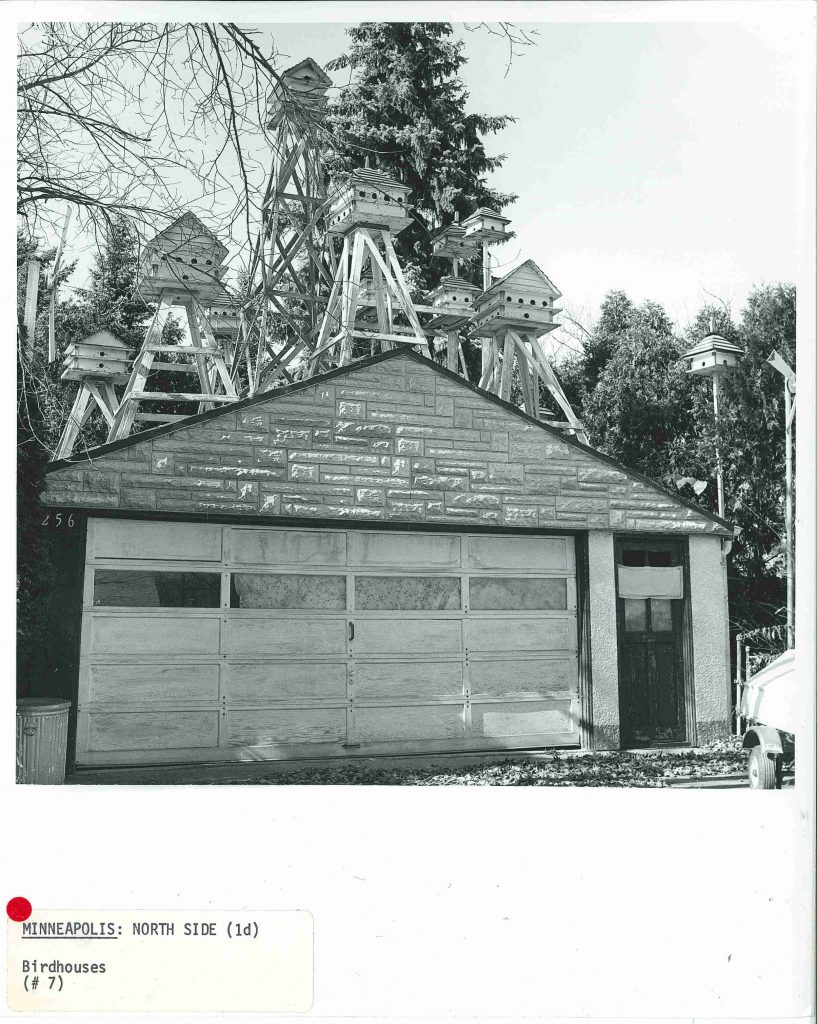
This North Minneapolis garage (below, circa 1977) is still in use but no longer for the birds–today this garage is home only to automobiles and lawn mowers.
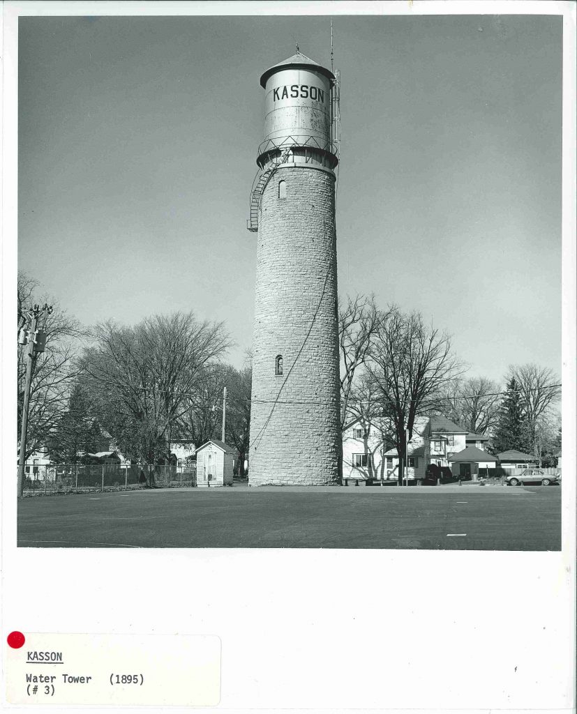
“[Kasson’s] major landmark. A circular stone base with a metal spiral staircase wrapped around it and the tank on tom–utility and romance, all in one.”
~from A Guide to the Architecture of Minnesota, 1977.
From A Guide: ” Here is an architectural/landscape folly which should be preserved. The main building is a dream version of Mount Vernon, surmounted by a triple tiered drum, a dome and a small replica of the Statue of Liberty. In the adjoining area are fenced statues of cows and horses. The nearby pond has a bridge, a fountain and a battleship…”
If you can believe it, the description of the folly* goes on. Although the site no longer exists, the business Nordaas American Homes is the biggest business in Minnesota Lake. The last building in this post is included as much for its interesting interpretation of Greek Revival architecture as for it’s sculptural adornments, which preview the next post in this series.

*Folly      noun
Architecture. a whimsical or extravagant structure built to serve as conversation piece, lend interest to a view,
commemorate a person or event, etc.: found especially in England in the 18th century.
 

Heather Carroll is the processing archivist for the Weisman Art Museum‘s collection at the University of Minnesota Archives. This project was made possible by funds provided by the State of Minnesota from the Arts and Cultural Heritage Fund through the Minnesota Historical Society.
Twentieth Century Painters: The Sidney Janis Collection

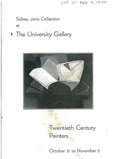
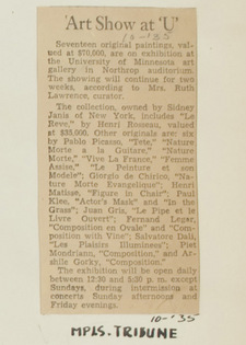
From the outset of the University Gallery program for the 1935-1936 academic year (the second year of its existence), the gallery’s focus on contemporary art was evidenced by the first exhibit that opened that season. The Minneapolis Tribune reported that the exhibit – literally titled – Twentieth Century Painters, consisted of seventeen original paintings valued at $70,000 from the personal collection of Sidney Janis of New York City. Artists represented in the October exhibit included Henri Rosseau, Pablo Picasso, Paul Klee, Piet Mondrian, and Arshile Gorky.
Cats_001_SidneyJanis_1935.jpgGallery curator Ruth Lawrence created a catalogue to provide explanatory material for the exhibit. Assistant to the President Malcolm Willey sent a copy of the catalogue to President Lotus Coffman, along with an accompanying note that promoted the profile of the exhibit in the infant gallery…
Malcolm Willey to President Coffman, October 25, 1935:

“I am attaching a catalog covering the exhibition now at the University Art Gallery. The catalog was written by Mrs. Lawrence. I do hope that during the showing of the Janis collection you and Mrs. Coffman will be able to visit the gallery. It is an exceedingly remarkable group of pictures and demonstrates better than I have ever seen it demonstrated, just how unbalanced art can sometimes become. It is, however, a very significant show and you will observe from the catalog that the paintings have hitherto been seen at relatively few places, but these important ones.”

A list of the artworks displayed in the exhibit was also published in the Minneapolis Tribune (click on the newspaper clipping from the gallery press books at left to view the article).

Decades after the exhibit, art collector Sidney Janis donated many of the works from his private collection to the Museum of Modern Art in New York City. From MOMA’s online collection database, we can view images of a few of the paintings that were once featured in the University Gallery’s October 1935 exhibit:

SidneyJanis1.jpg

Le Reve” (The Dream) – Henri Rosseau

Nature Morte a la Guitare” (Glass, Guitar, and Bottle)” – Pablo Picasso

Actor’s Mask,” “In the Grass,” – Paul Klee


WPA: Visual Aids to Teachers of Art

In her report titled, “University of Minnesota Gallery of Art,” with “Mrs. Lawrence 25-year report” written in pencil across the top, long time gallery director Ruth Lawrence provided a 24 page background on all of the activities of the Gallery over the course of 25 years. A large portion of the report — nearly seven pages — outlined the Works Progress Administration (WPA) work projects assigned to the Gallery. Ruth reflected, “By February 6, 1938, significant changes were taking place, but greater ones were ahead. On that date the Emergency Relief Works Progress Administration assigned a project of 20 workmen to the Gallery.”

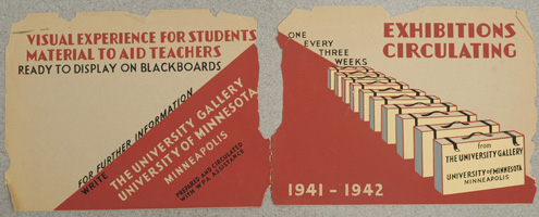
From 1938-1942 WPA workers were assigned to annual work projects in the University Gallery. The main duties of their work consisted of developing an art reference service to support instruction at the University. Workers also created circulating exhibitions comprised of visual aids for teachers. These visual aids were matted, framed, and compiled by the WPA employees and distributed by the Junior League Clubs of Minneapolis, St. Paul, and Duluth. Exhibitors from elementary and secondary schools, teachers colleges, and other small arts organizations throughout the state could rent the visual aid exhibits for a fee that covered postage.

WPA.jpg

WPA2.jpg

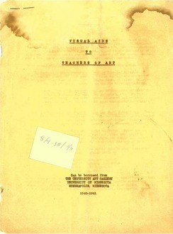
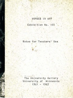
Found within WAM’s collection of exhibition catalogues was a stapled report titled, “Visual Aids to Teachers of Art” that included descriptions of the exhibits and how they could be rented. A booklet titled, “Horses in Art, Exhibition No. 101” was also found. This booklet, which contains instructions and a sample curriculum, accompanied the exhibit materials. Exhibits were comprised of 10 reproductions of old and contemporary artwork that were mounted to boards, designed to be set in the grooves of a chalk well and rest against classroom blackboards.

Cats_017_VisualAids_1940.jpg Cats_022_HorsesArt_1941-2.jpg

After the outbreak of WWII, all WPA work at the University was re-assigned to the war effort, and the art reference service was scaled back to provide resources to University instructors and students only. Ruth reflected, “All traveling exhibitions were stopped. During the war years unfortunately, these were destroyed by a mysterious fire in the storage or fan room, beginning in the organ loft.”

Thanks to the accessibility of the Minnesota Daily’s PDF Archives, more information about the mysterious fire is gleaned when a search of the PDF Archives provided a copy of the November 5, 1942 edition of the newspaper, which contains the following headline, “Fire Destroys Northrop Art Works.” The article begins,

A fire of undetermined origin burning for more than half an hour in the organ blower room, 303 Northrop auditorium, yesterday destroyed almost all of the art displays, and equipment stored in the room.

About $250 worth of picture frame moldings, ten elementary school art exhibits and numerous picture display board were burned.

Thanks to the WPA project reports, the existence and preservation of posters and catalogues, as well as additional resources such as the PDF Archives, we are able to learn more about the unique services and programs that the Gallery once provided.


University Gallery Silk Screen Process

Long considered as a commercial method of print production, the silkscreen process received a new appreciation in the mid-1930s, when artist Anthony Velonis, tasked by New York City Mayor Fiorello LaGuardia with a project to promote the city government, embraced the silkscreen method to produce posters that publicized administrative projects in the city. Velonis’s publicity work precipitated the Works Progress Administration (WPA) poster division, and also lead to the establishment of the silkscreen process as a fine art form, termed the “serigraph.” (Read more about Velonis and view posters produced by the WPA Poster Division from the collection of the Library of Congress.)

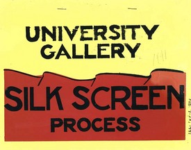
Cats_019_SilkScreen_1941.jpgIn February of 1941, the University Gallery held an exhibition of the silkscreen process and works created by it. An exhibition catalog (at left) was produced by the Gallery using the print method, and includes an overview of the art form, and a step-by-step description of the process. The concluding sentence of this 17 page catalog simply states, “And now we wish you success and much pleasure in working with the silk screen process.

In a clipping from the Star Journal, titled, “Silk Screen prints at ‘U’; Watercolors Shown,” John Sherman indicated in his review of the exhibit that,

One of the solutions of the tough and two-sided problem of getting original art to the art consumer at prices he can afford to pay and at prices which keep the artist solvent, is the silk screen process… The exhibit, rounded out by specimens from eastern artists, will surprise you by the sparkle and variety of its color, and the richness of effects which can be obtained. The medium is highly flexible – few or many colors may be used, and they can be applied “as is” or in combination by means of overprinting and overlapping.

SilkScreen1.jpgIn another clipping from the Minnesota Daily titled, “Silk Screen Work Shown By Gallery,” (at left) Violet Smith reported that in addition to displaying silkscreen work by artists, the actual frame and squeegee, tools utilized in the production of silkscreen prints, were displayed in the Gallery. The artist Syd Fossum (his work “Gas House District” was part of the exhibit) gave an impromptu demonstration of the process to visitors.

University faculty, students, and Gallery employees utilized the silkscreen process to produce exhibition posters and catalogs that promoted the frequently changing exhibitions held in the Gallery. (The work of University student Homer Mitchell is outlined in a previous post.) This work was representative of the curriculum of the Department of Art, part of the College of Science, Literature, and the Arts. A 1951 Course Bulletin (available in the Digital Conservancy’s collection of Course Catalogs, Bulletins and Course Guides) reports the following design courses available to students:


Art 73f-74w-75s. Presentation Techniques. A study of the communication of visual ideas in the fields of exhibition techniques, illustration, and advertising. Source materials available in the nature and tradition and creative use of media are explored as part of the problem of organization.

Art 73f. Experiments in the Use of Wash Techniques, Ink, Gouache, Watercolor, and Other Media. Elementary problems in presentation using the limitations of the media as a starting point…

Art 74w. Discussions and Readings in Area of Visual Communication. Workshop problems in photomechanical and related print processes, air brush, and mixed graphic techniques…

Art75s. Practice in the Use of Symbols in Specific Presentation Problems and a Reconsideration of General Design Principles…


78 Years…

Another year has come and gone in institutional existence for WAM as today marks the 78th anniversary of the “Little Gallery” which opened on April 5, 1934.

How do you celebrate 78 years? Perhaps with a look back to previous commemorations…

Upon the occasion of the 50th anniversary of the museum in 1984, several special exhibitions were held to celebrate the museum’s history and acknowledge the development of the permanent collection.

Special exhibition catalogues were designed as a throw-back to reflect the aesthetic of the catalogues produced during the 1930s.

1984 Exhibition Catalogues:

Cats_229_50Years-AmericanPaintings_1984.jpg Cats_230_50Years-Drawings_1984.jpg Cats_231_50Years-Decorative_1984.jpg Cats_232_50Years_RecentAcquisitions.jpg

1930s Exhibition Catalogues
:

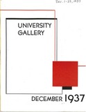
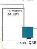
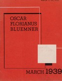
Cats_008_UGDecember_1937.jpg Cats_010_UGApril_1938.jpg Cats_013_OscarBluemner_1939.jpg

For a description of the opening day of the Gallery in 1934, see a previous post, that celebrated the museum’s seventy-seventh year.