University Gallery

With a Twist

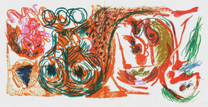
I hadn’t heard of the Belgian painter Pierre Alechinsky before I came upon his file (the University Gallery exhibited his work in 1965), but some of the colorful pieces in the catalog caught my eye.

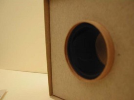
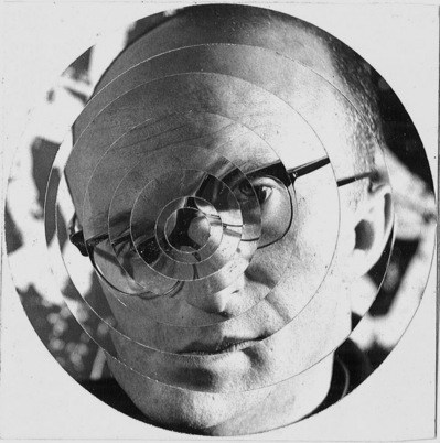
Another item that caught my attention in the file was a small hand-cut manipulated photo of a face, which I think is Alechinsky himself. There is no indication as to who made it or for what purpose, but it’s quite an interesting little piece.

alechinsky-face.jpg

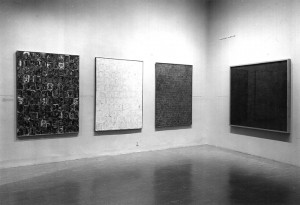
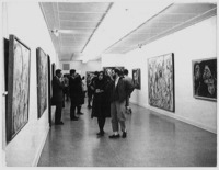
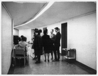
Photos from the Alechinsky opening, 1965:
alechinsky-opening1.jpg alechinsky-opening2.jpg

Image from the catalog:
alechinsky-catalog.jpg


Jasper Johns

In 1959, the University Gallery was looking to bring in some hot young artists from the New York art scene. They wrote to (the now famous) Jasper Johns and his gallerist, Leo Castelli, and managed to put up a show of Johns’ work in 1960 — and this was only two years after Johns had his first solo show in New York. The letter to Johns states:

The University Gallery, on a very modest budget, hopes to be able to initiate a new program which will aim at bringing to the campus a series of small exhibitions of work by New York artists of interest.

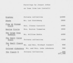
Letter to Jasper Johns and a list of the pieces loaned:
letter-to-johns.jpg johns-loan-list.jpg


Materials & Tools of Art

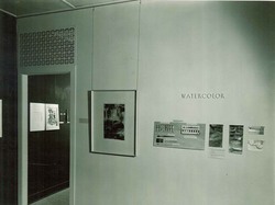
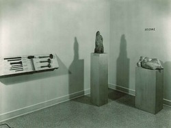
Amongst the files that were kept on exhibitions held at the University Gallery, an occasional treat is provided to the processor by the inclusion of photographs of the installation and final appearance of the exhibit. Often intermixed with correspondence and checklists of artwork, these photographs offer us prime examples of exhibit design from the era in which the exhibition was held.

“Materials and Tools of Art,” prepared by Gallery staff, was held from September 29 to October 29, 1947.

A September 16, 1947 news release from the U of M News Service (Digital Conservancy) offers this statement:


“The exhibition will show the materials and tools from which an artist works and will explain how his choice of materials and tools plus his inventiveness and creativeness go into the making of a work of art.”


Fresco
Watercolor, Stone
MTTA_Watercolor.jpg MTTA_Stone.jpg


Spring Flowers

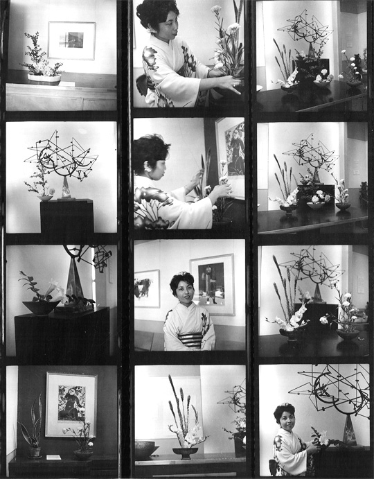
In 1959, the University Gallery hosted a Japanese flower-arranging demonstration in conjunction with the exhibition “Japanese Prints”, and I discovered this contact sheet documenting the event in the files. I love contact sheets, since they show every shot the photographer took on that roll, prior to editing.

japanese-flowers.jpg


Mysterious Media

Though a majority of processing has consisted of rhythmic re-foldering, several boxes have also contained mysterious miscellany found amongst the folder sets…

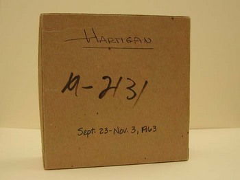
After removing each of the two folders containing materials for the Grace Hartigan Exhibition, (held at the University Gallery from Sept. 23 – Nov. 4, 1963), an item, which had been shoved underneath the folders, was revealed at the bottom of the box: a smaller cardboard box!

HartiganBox1.JPG

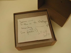
Labeled with “Hartigan” and the dates of the exhibition, the box was obviously intended to be included with this folder set. The contents of the box create further intrigue…

HartiganBox2.JPG
DSCN3513.JPG

A small note that states, “Joanne – this is the Hartigan tape recording – please ‘file; (ex: folder), 63-64, Sept. 23 – Nov. 3,” covered the small reel of tape that rested inside. After consulting with the advising archivist, the box was made note of and set aside for further investigation.

What is this mysterious media?


Swedish Modern

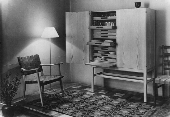
swedish-crafts-room.jpg

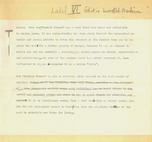
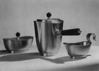
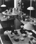
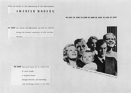
Most of the exhibition files from the late 1930s and early 1940s do not have photographs in them, but when they do, these images give a window into the times. This Swedish Arts and Crafts exhibition from 1944 actually still feels quite modern (I’m looking at you, IKEA). Some of the wall label drafts for the show are also quite interesting — Label IV reads:

Before the war, “Swedish Modern” was a word which had a clear cut definition in design terms. It was style-forming and came about through the determined esthetic (sic) and social efforts to raise the standard of the Swedish home and to improve the taste for a better quality of design… But “Swedish Modern” is not an original style created in the last couple of decades. It is an inheritance coming from a rich tradition of beauty loving people who are courageous enough to break away from the swaddling clothes of the past to entertain new forms for living.

swedish-crafts-tins.jpg swedish-crafts-bowls.jpg swedish-crafts-poster.jpg


Candid

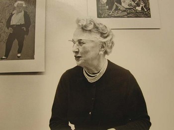
From Box 3, in a folder titled simply, “Staff Photographs, Resumes,” circa 1941 – 1959, a candid photograph of the University Gallery’s first permanent director, Ruth Lawrence:

Lawrence1.JPG


Creating space, expanding place

Processing the WAM collection allows for direct exposure to the documentation of institutional history. Contained within the third box of the WAM collection is a folder titled, “Biennial Report to President, 1947-1948.” The contents consist simply of four delicately aged pages, on which is contained a draft composed by then University Gallery director Ruth Lawrence. The draft opens with Lawrence acknowledging that the Gallery has “completed 15 years of service to the University. At such a milestone we would like to pause long enough to revise and make appraisal of our position and record what has been accomplished.

Lawrence continues to describe the accomplishments of the Gallery, notes the success of the W.P.A. program in conducting gallery programming, and lists the number of various art forms and works in the permanent collection, as well as the individuals and organizations that had donated them.

On the final page of the draft, Lawrence asserts a serious appraisal of position in regards to the state of Gallery facilities:

The Gallery is located on the 4th floors of Northrop in an inaccessible place. Many interested visitors cannot or will not climb the four flights of stairs. There is no elevator for such people nor any way of getting our exhibitions up to the Gallery except by carrying everything by hand. This entails making many trips daily. Certainly it is not only a waste of time but of valuable energy for all of us. There is no adequate storage space and our materials are spread into 12 rooms on the various levels of this huge building. With this allotment of funds this year, however, there will be improvements through consolidating most of our activity on the 3rd and 4th floors. For relatively a short period only can this growth for strength in the arts go on without our being stunted for lack of physical space. It hampers all our activity even now. Thus in any plans which are being made for more building by the University we fervently urge that we be included.”

As major construction will soon be accomplished on the current WAM expansion, I can’t help but wonder how Lawrence would appraise the position of art at the University today… Her dedication to creating space and expanding a place for art at the U of M has certainly echoed throughout University history and is demonstrated by it’s continued “growth for strength in the arts.”

Note: The University Archives holds a separate and unique collection titled, University Gallery Records, which was accessioned in 1957 and 1961. View the finding aid for historical notes, as well as a description of the records that document the Gallery.
Vintage Posters


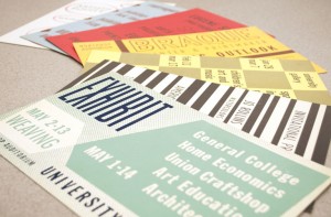
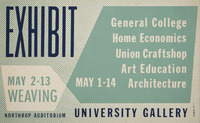
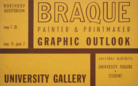
While going through the University Gallery files from the early 1950s, we found many small posters (7″x11″) for the exhibitions, no doubt to post around campus. These posters are one-color prints (sometimes on a colorful paper stock) with no images, but with some simple graphic flourishes–they are very charming in their simplicity. I can definitely see echos of this kind of straightforward design in today’s graphic design trends. We thought we’d share a few of these gems!

poster-yellowboxes.jpg poster-printshow.jpg poster-redarrows.jpg poster-weaving.jpg poster-braque.jpg poster-incas.jpg poster-pinkswirl.jpg