University Gallery

Seven Folds from Tires to Roof

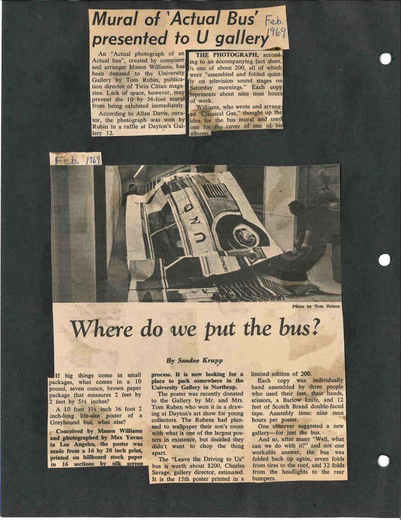
“If big things come in small packages, what comes in a 10 pound, seven ounce, brown paper package that measures 2 feet by 2 feet by 5 1/2 inches?

A 10 foot 3 1/2 inch[-tall] 36 foot 2 inch-long life-size poster of a Greyhound bus, what else?”


That was the beginning of an article by Sandee Krupp for an unnamed publication, a clipping of which was found in a University Gallery Press Book from 1969. The photo in this article shows the artwork being unfolded in a hallway in Northrup Auditorium, the former home of the art collection and the University Gallery. The unfolding and refolding of a life-sized screen-printed photomural of a Greyhound bus sounds like happening in itself!

Page from the 1969 Press Book in the Weisman Art Museum archival collection at the University of Minnesota.

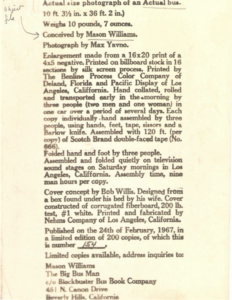
This enormous print was conceived by Mason Williams. Williams is known more for his music and the theme song he wrote for the (sometimes controversial) Smothers Brothers Comedy Hour than for his other artistic expressions. One of the Weisman Art Museum’s registrars shared this enlightening document from the object file of Actual Size Photograph of an Actual Size Bus.

120 feet of Scotch brand double-faced tape? Is that archival?!

Document from WAM’s object file for “Actual Size Photograph of an Actual Bus”, circa 1967.

Krupp’s article ends:

One observer suggested a new gallery–just for the bus.
And so, after many “Well, what can we do with it?” and not one workable answer, the bus was folded back up again, seven folds from tires to roof and 32 folds from headlights to the rear bumpers.

“Seven folds from tires to roof and 32 folds from headlights to the rear bumpers”, it lay safely tucked away in 1969 and waiting for decades to come. It took not just a new gallery but a whole new building for there to be enough space to display this work of art.  Seen here, too large to be framed, photographed while on display in the exhibition Reviewing the Real (6/8/2013 to 9/8/2013).

Mason Williams, with photography by Max Yavno, Actual Size Photograph of an Actual Bus, 1967, screenprint on paper, 123-1/2 x 434 in., Collection of the Weisman Art Museum, University of Minnesota, Gift of Mr. and Mrs. Tom Ruben, 1969.30.

And “seven folds from tires to roof and 32 folds from headlights to the rear bumpers”, it lays today, safely tucked away and waiting for the next time.

Heather Carroll is the processing archivist for the Weisman Art Museum‘s collection at the University of Minnesota Archives. This project was made possible by funds provided by the State of Minnesota from the Arts and Cultural Heritage Fund through the Minnesota Historical Society.


Library Amnesty Success


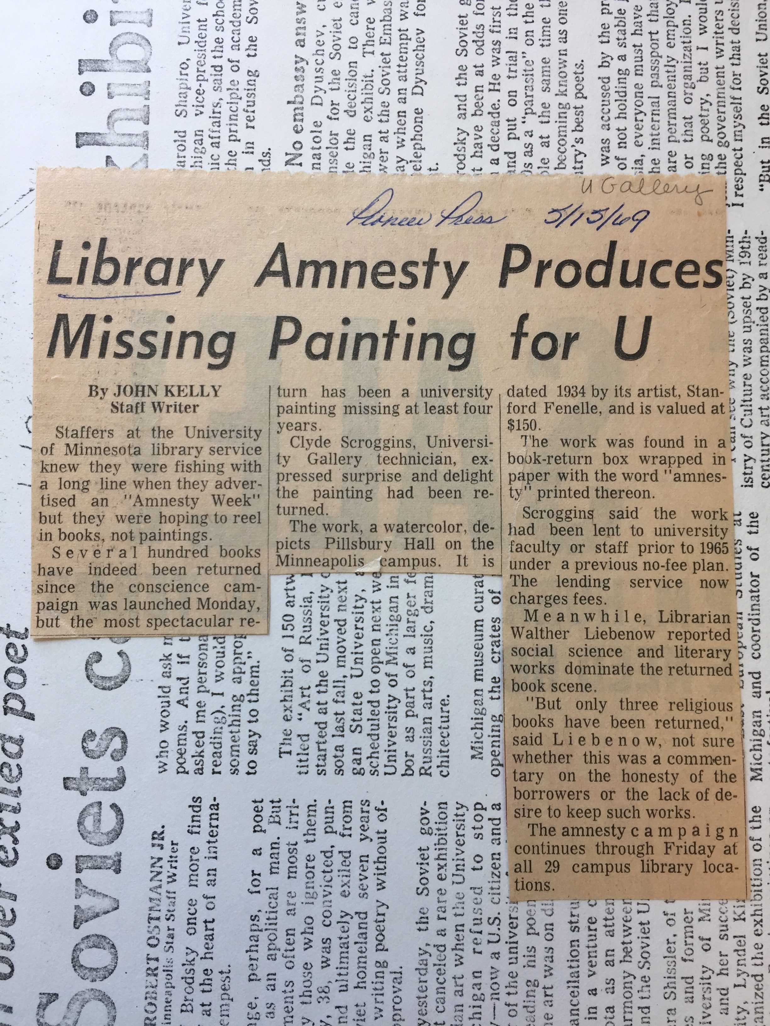
As with any loan from a library, a bank or otherwise, unexpected things can happen. The University of Minnesota’s permanent art collection has long had an art rental program and at one point in time there were no rental fees to University employees. It happened one day in 1969 that a loan gone awry found its way to Wilson library and back home to the art collection.

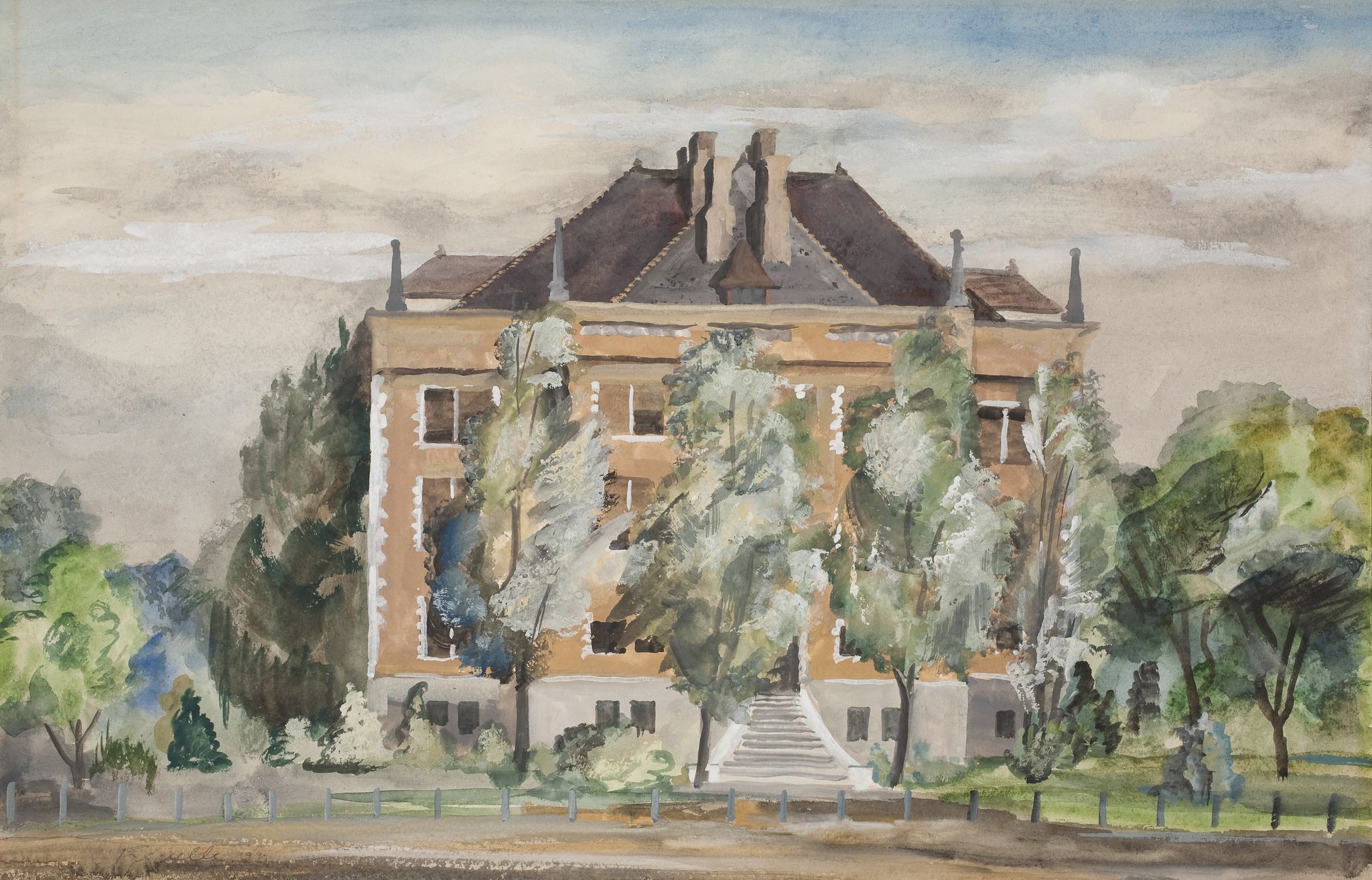
While I wasn’t able to find an image of the returned water color of Pillsbury Hall by Stanford Fenelle, I found another Fenelle work in WAM’s collection depicting Folwell Hall.

Check out this highlight from the Digital Content Libraries: a Then/Now Image Overlay including artworks of locations on campus by Josephine Lutz Rollins, Cameron Booth and Stanford Fenelle. The project was facilitated by UMN’s DASH team.


Heather Carroll is the processing archivist for the Weisman Art Museum‘s collection at the University of Minnesota Archives. This project was made possible by funds provided by the State of Minnesota from the Arts and Cultural Heritage Fund through the Minnesota Historical Society.


Time Capsules: A Guide to the Architecture of Minnesota


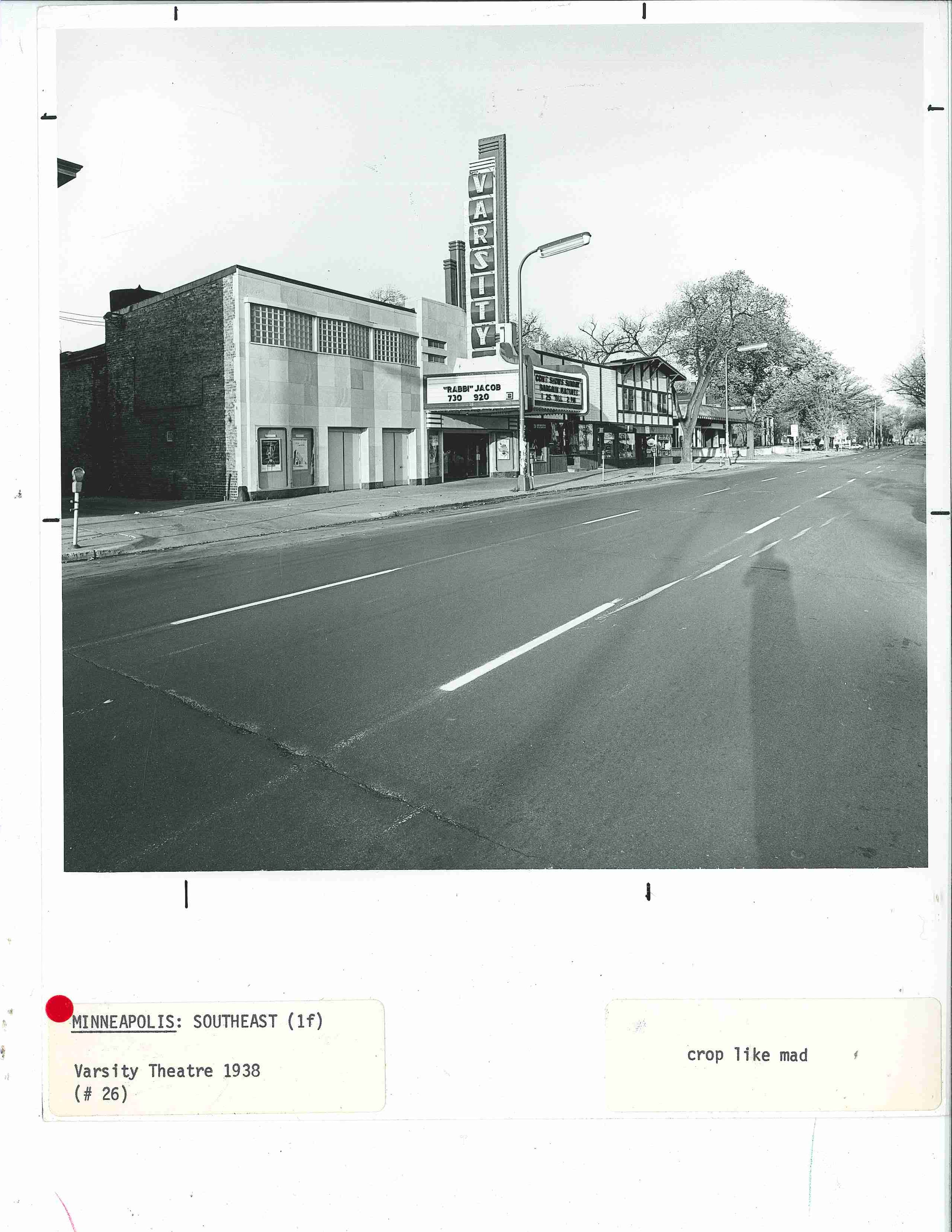
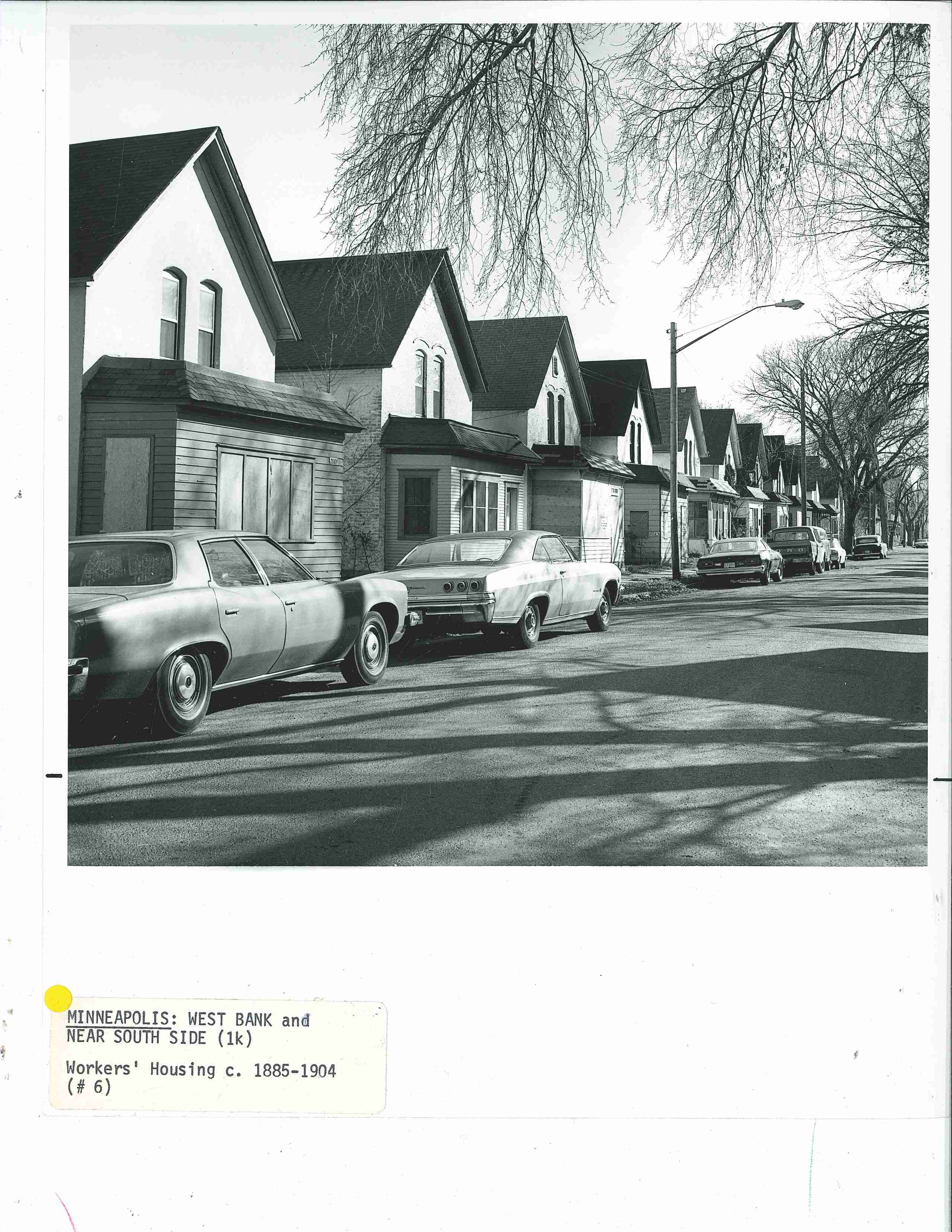
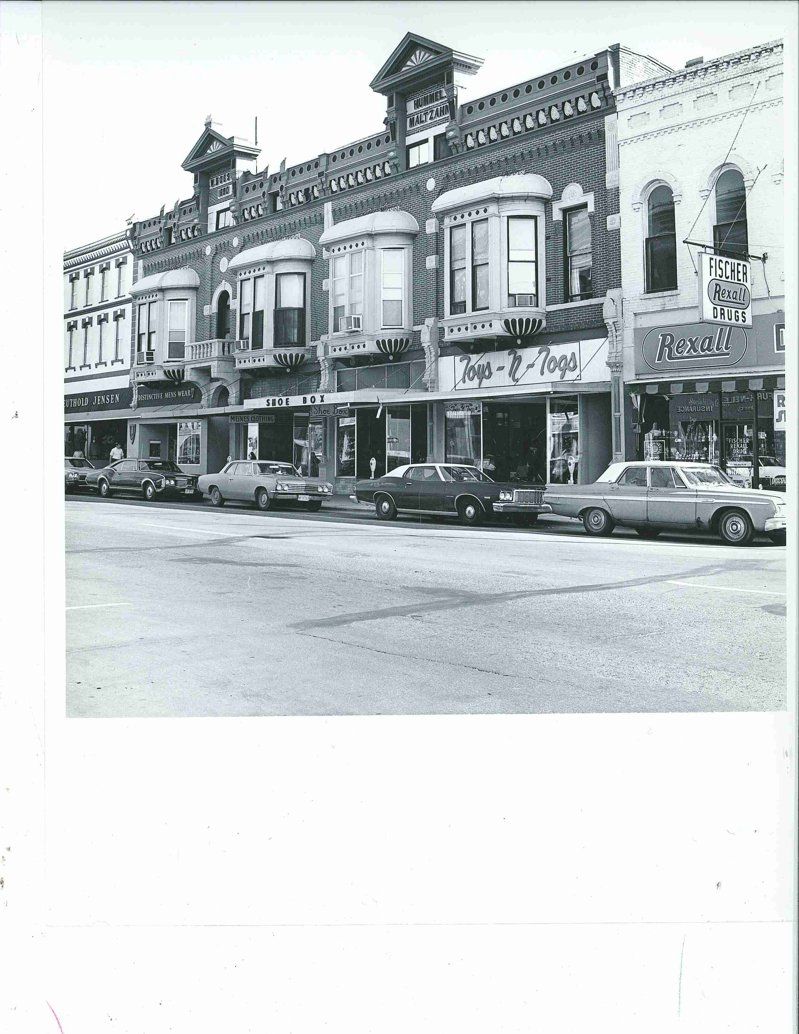
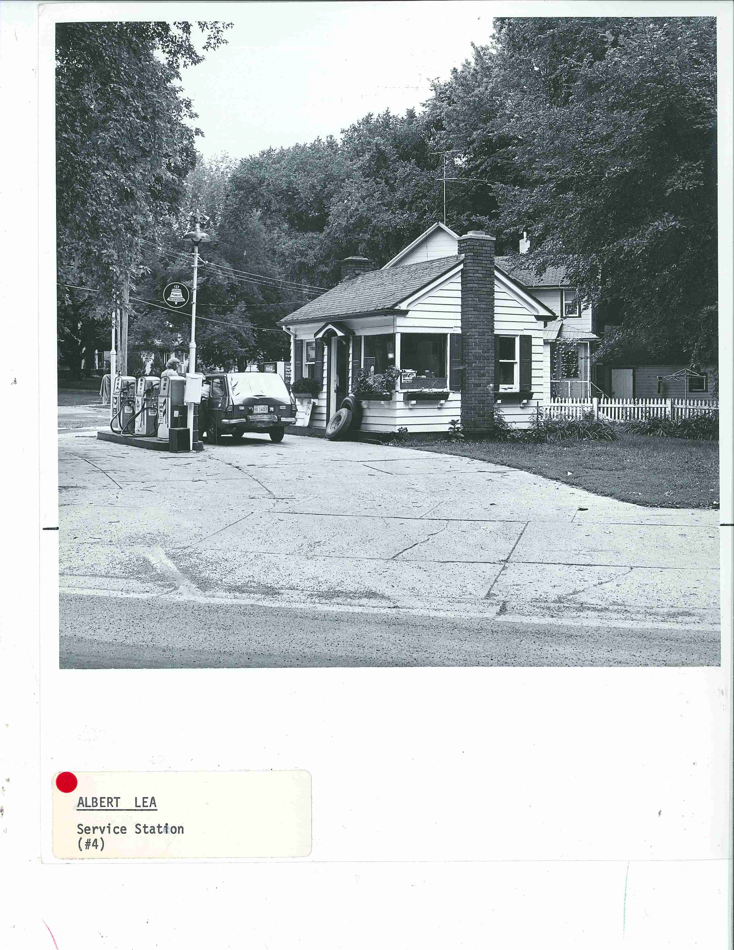
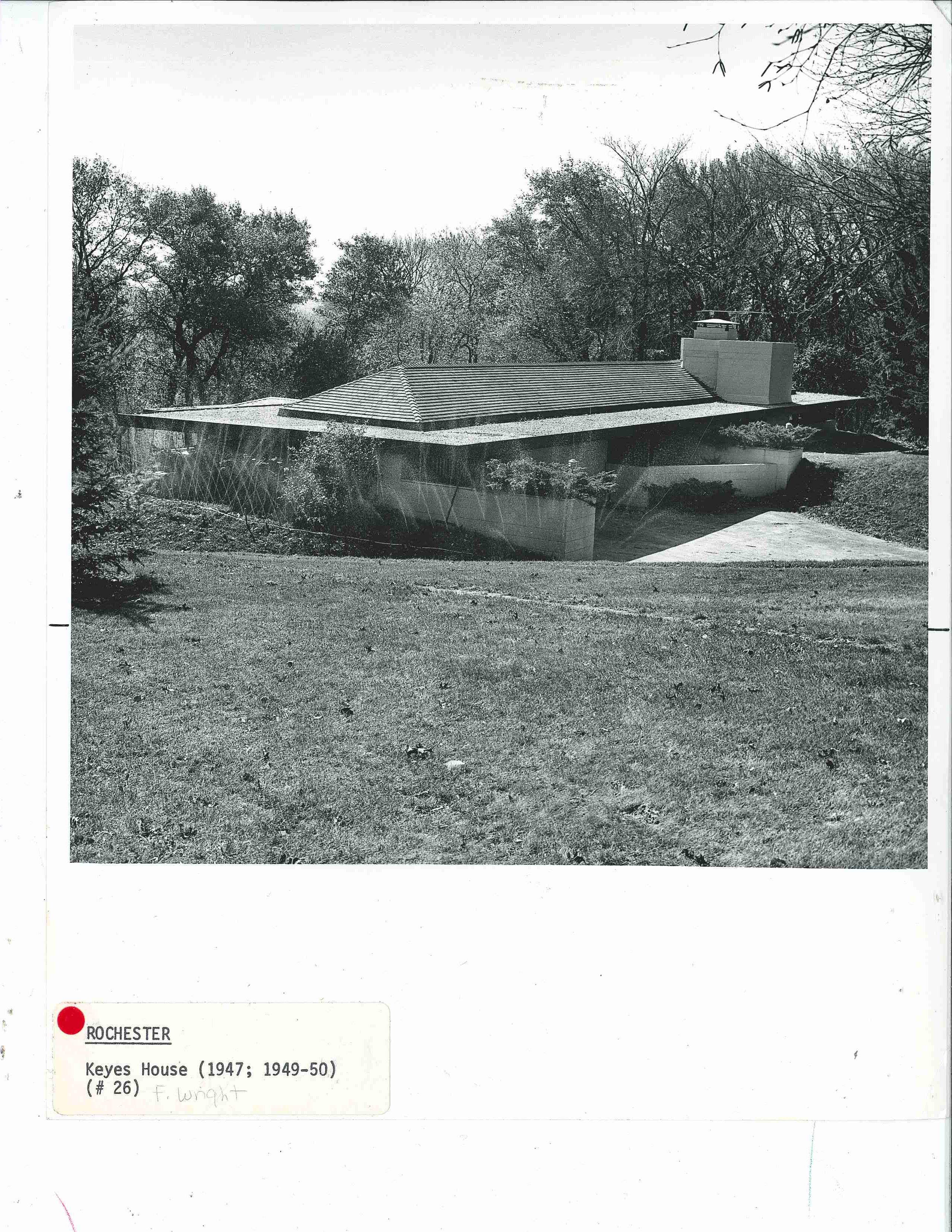
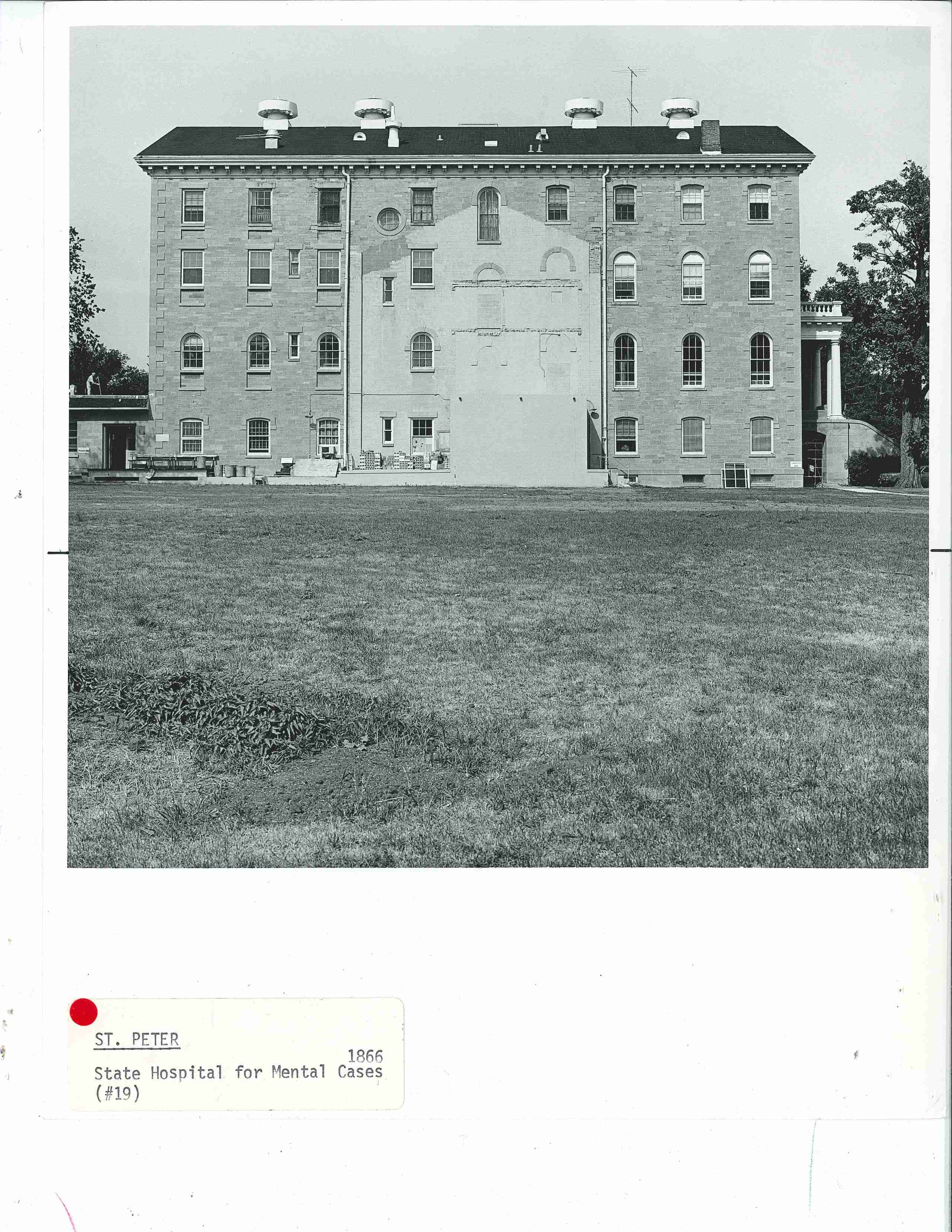
Photography has a curious way of encapsulating and immortalizing what might otherwise be a fleeting moment. Contemporary architectural photography is often devoid of people, sometimes placeless and gives a sense that the structures exist outside of time. While processing hundreds of photos for  A Guide to the Architecture of Minnesota, these uncropped, raw, pre-published versions of the architectural photography struck me as time capsules, outside the norms of architectural photography. Even knowing the intended use, there still seem to be more questions than answers in these photos. Some capture people or places during everyday moments like sprinklers watering a lawn or filling up a battered hatchback at a quaint gas station. Some are dated by non-architectural objects like automobiles and signs, and some imply movement while others are hauntingly still. Moments of happenstance frozen in time.

Fifth in a series, this photo-post was inspired by A Guide to the Architecture of Minnesota, published in 1977 as a supplement to University Gallery’s Bicentennial exhibition The Art and Architecture of Minnesota.


Heather Carroll is the processing archivist for the Weisman Art Museum‘s collection at the University of Minnesota Archives. This project was made possible by funds provided by the State of Minnesota from the Arts and Cultural Heritage Fund through the Minnesota Historical Society.


Hard Lines: A Guide to the Architecture of Minnesota


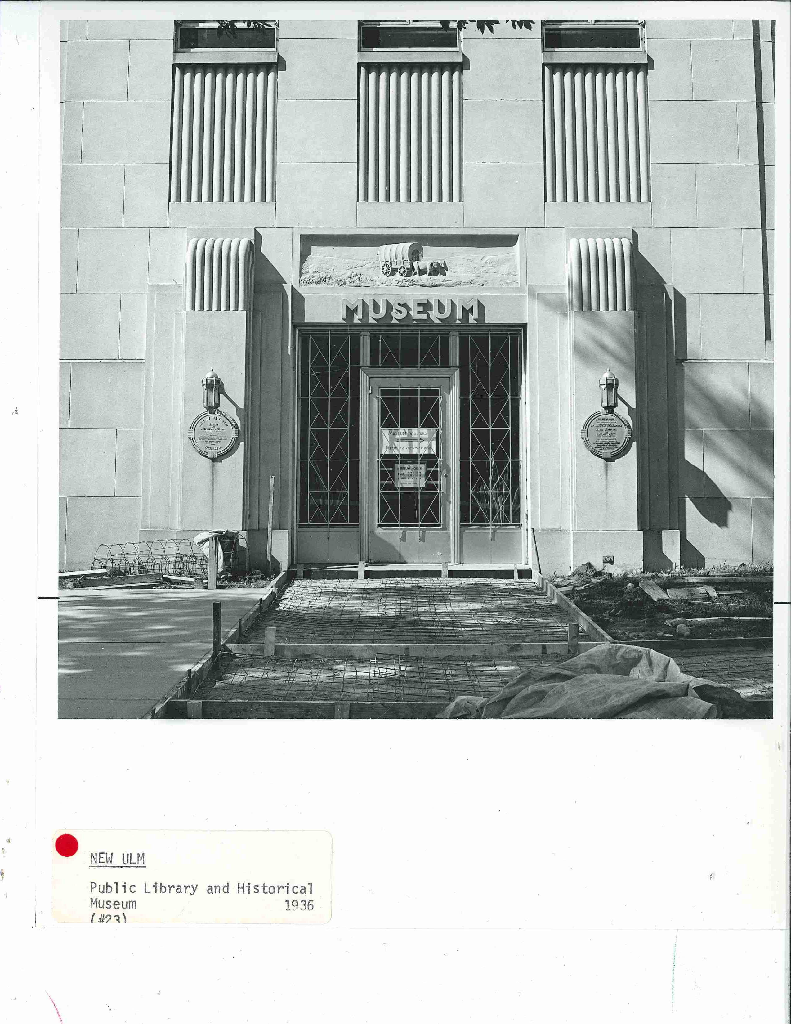
Straight lines, crisp angles, geometric forms, and openly planar surfaces in buildings become an embodiment of human’s power over the elements and ability to manipulate materials and environments. A Guide to the Architecture of Minnesota defines most of the buildings included in this post as Moderne (Art Deco) Style, International Style, New Brutalist or New Formalist. Contemporary architectural photography–where buildings appear timeless, monumental and almost separate from their actual locations and with a general absence of people–seems to accentuate and highlight these particular styles.

Fourth in a series of photo-posts inspired by A Guide to the Architecture of Minnesota, published in 1977 as a supplement to University Gallery’s Bicentennial exhibition The Art and Architecture of Minnesota, this post samples some of the awesomely geometric, monumental and sometimes hauntingly sparse buildings so popular at the time this book was published.

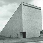
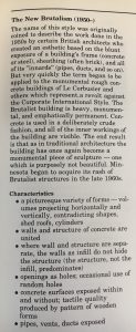
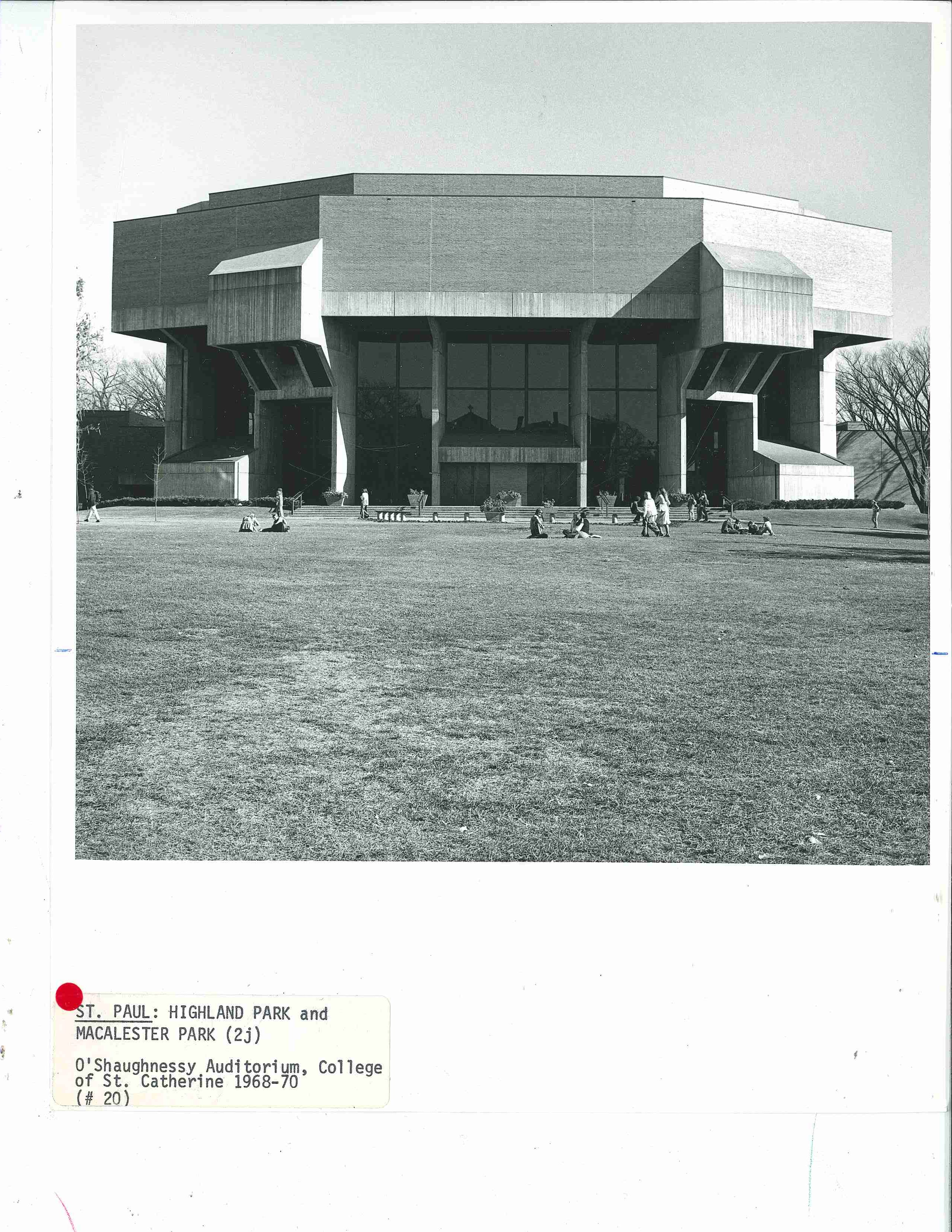
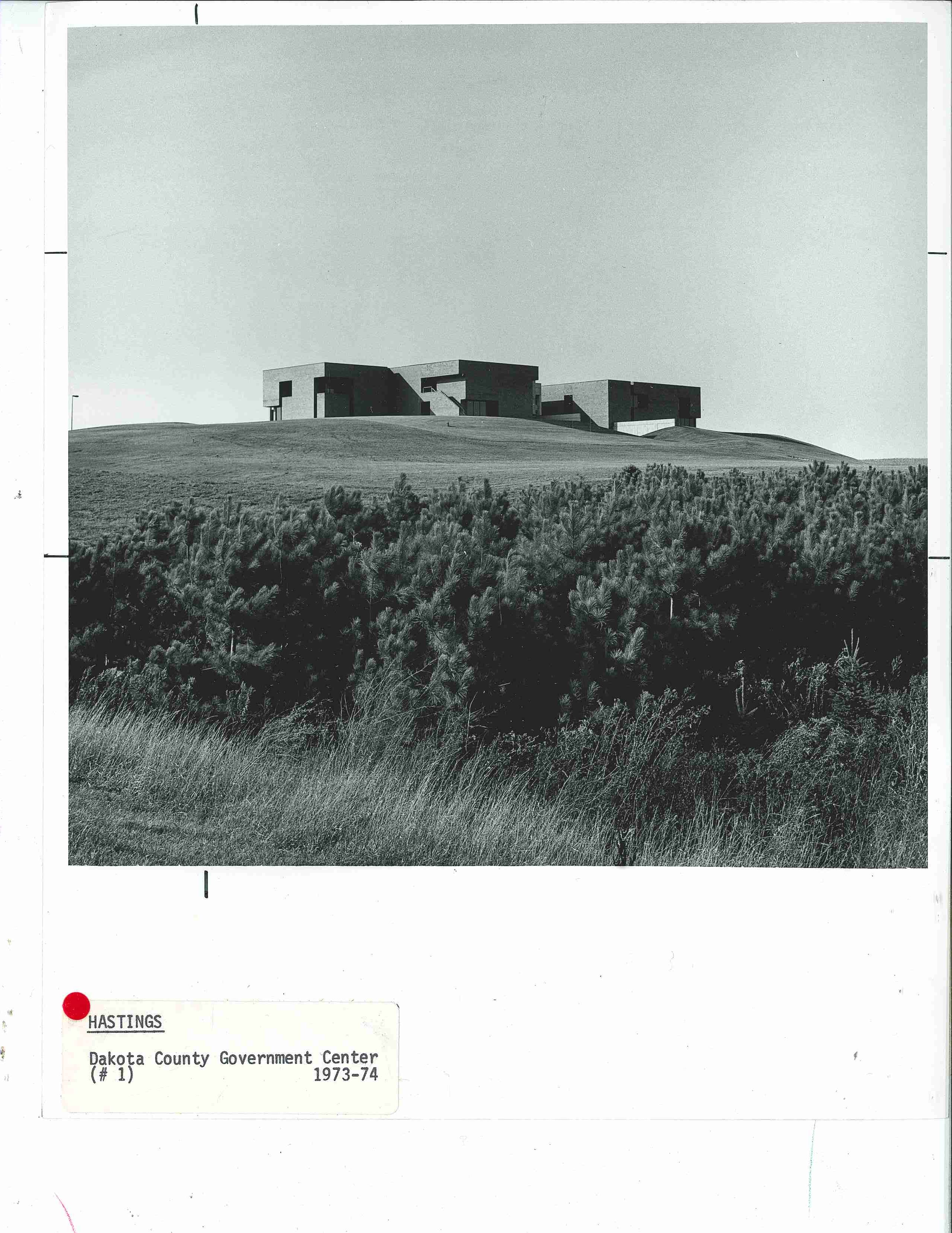
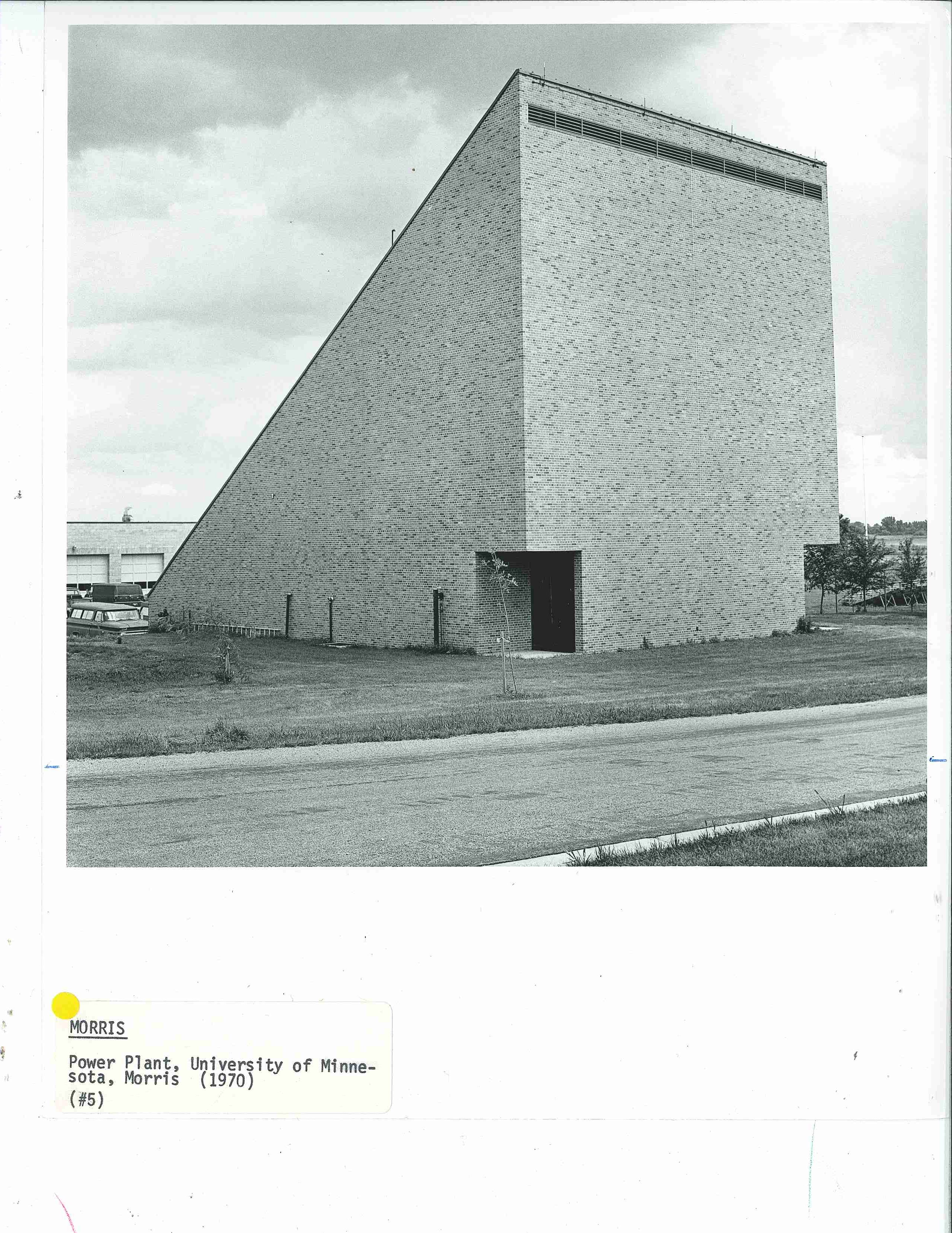
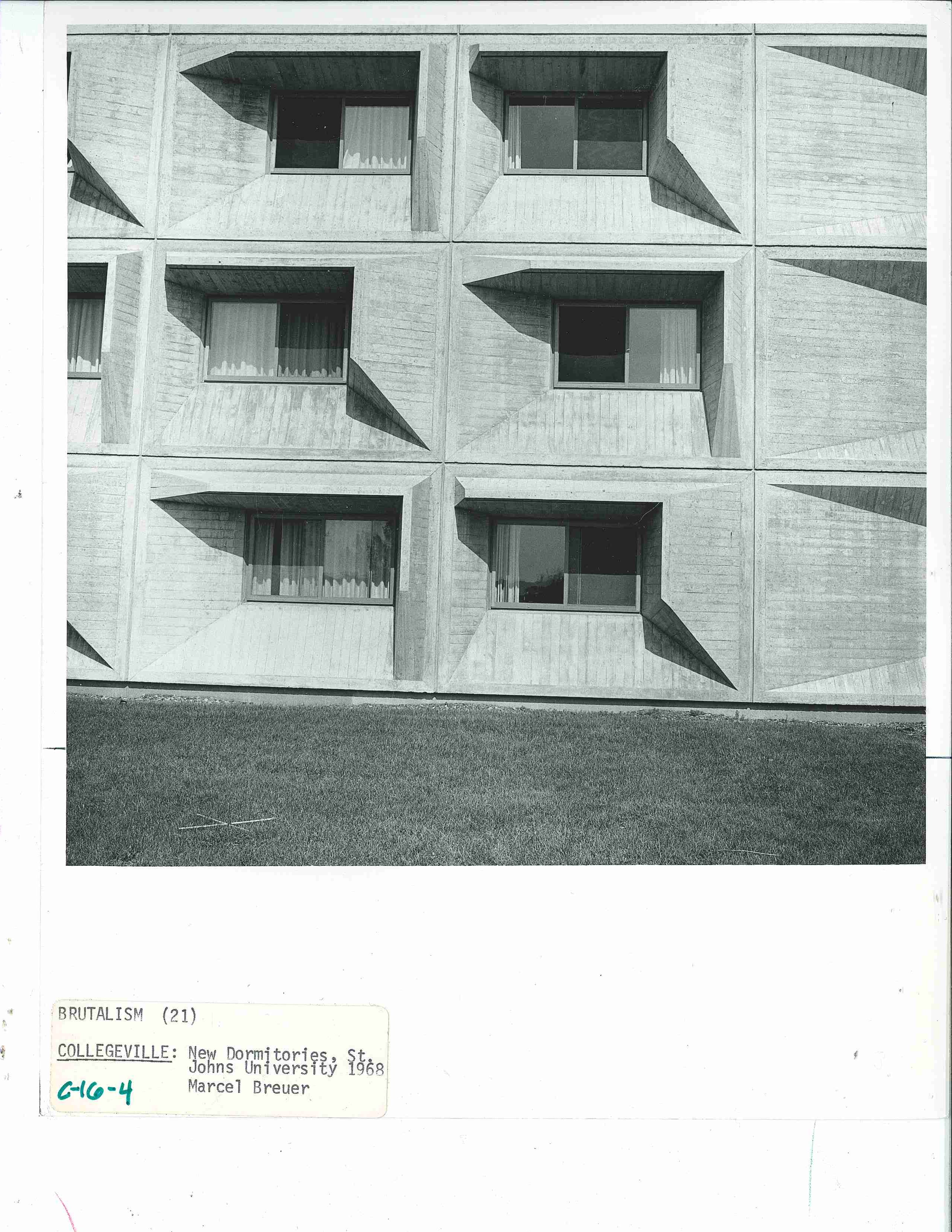
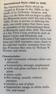
The first few photos of the post exemplify the Guide’s glossary definition and characteristics of New Brutalism: “heavy, monumental and emphatically permanent…[with] a picturesque variety of forms–volumes projecting horizontally and vertically, contradicting shapes, shed roofs, cylinders.” Click the image to the left for the full description from the Guide.


St. Catherine University’s O’Shaughnessy Auditorium in St. Paul, MN (below)

Dakota County Government Center in Hastings MN circa 1977. (below)Power Plant at the University of Minnesota in Morris, MN circa 19877 (below)

The “new” dormitories at St. John’s University in Collegeville, MN circa 1977 (below)

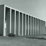
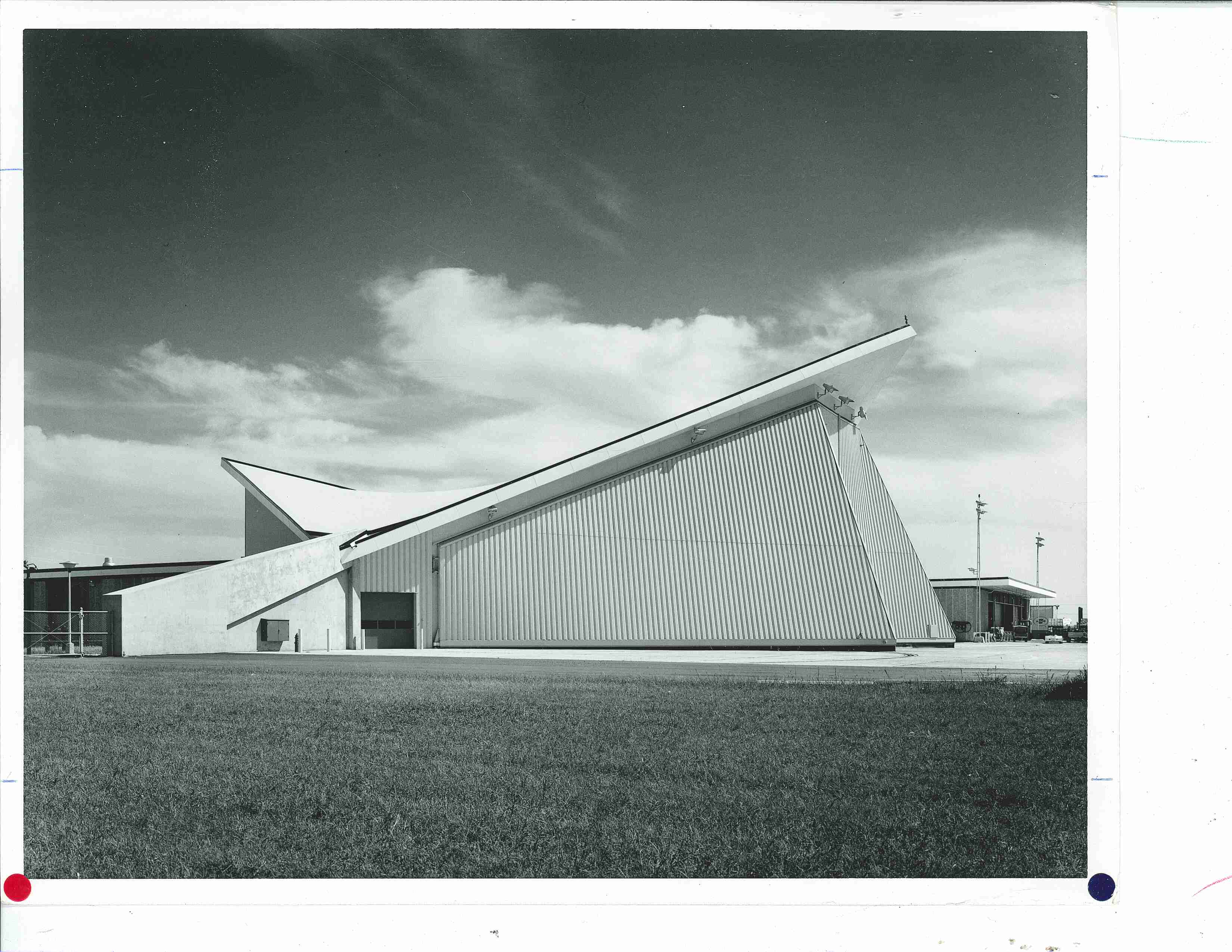
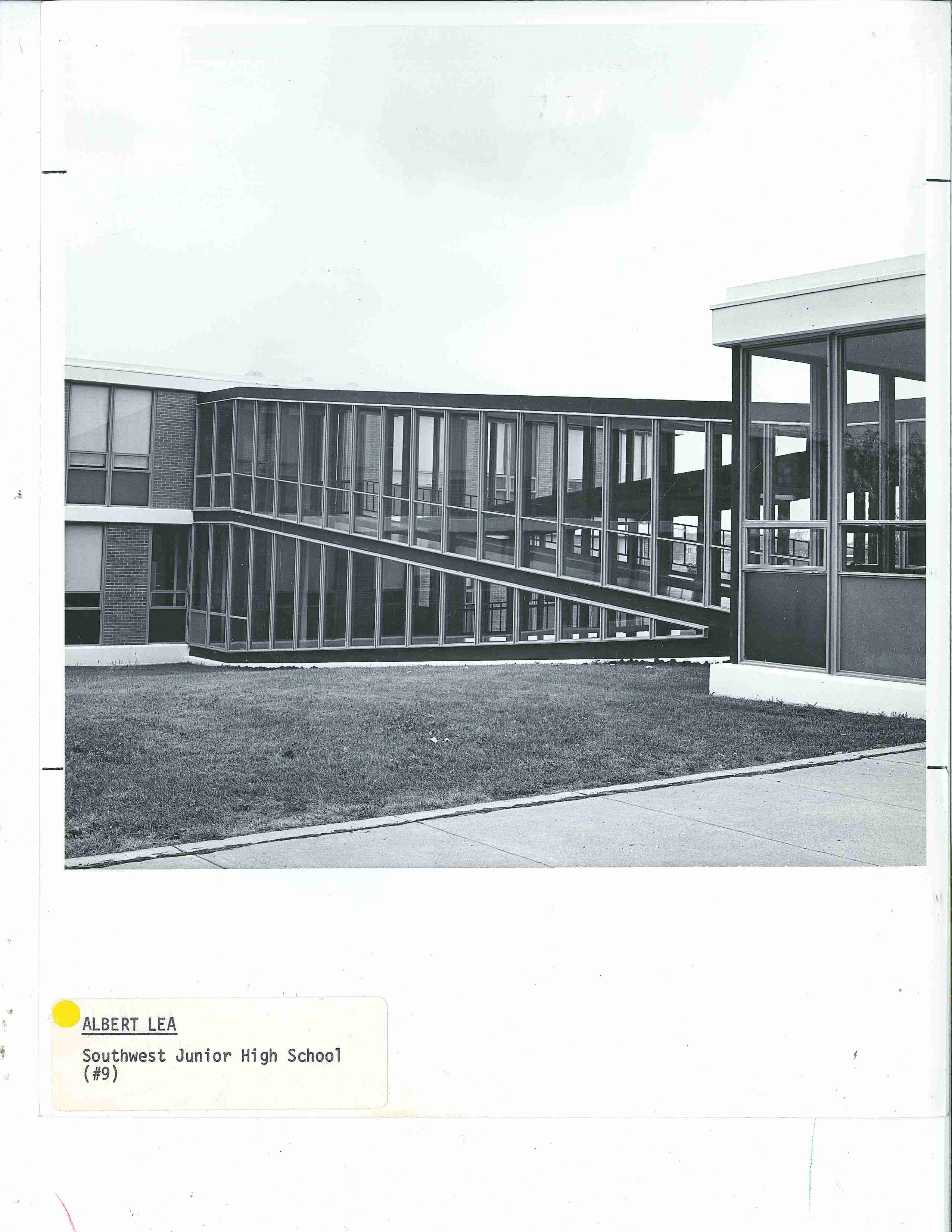
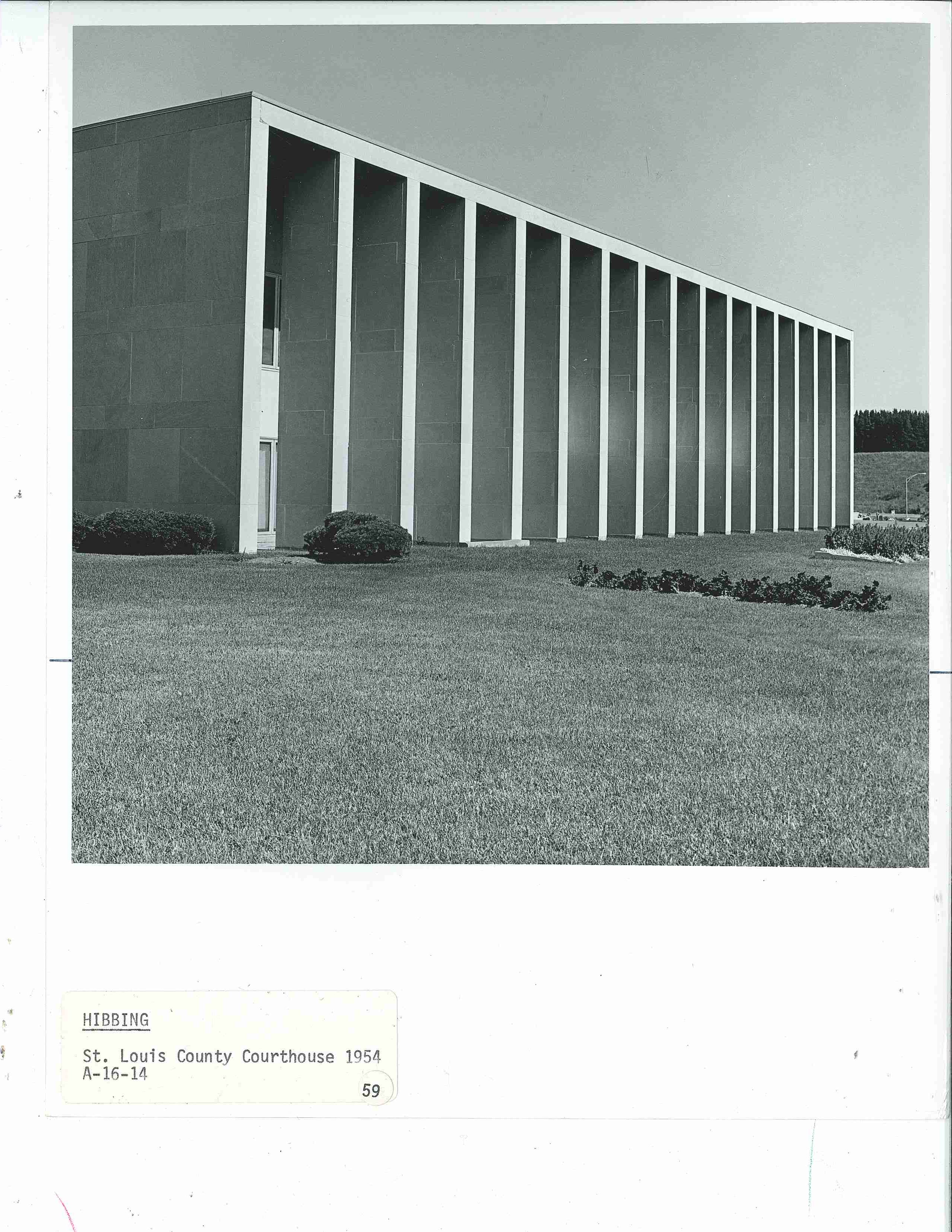
The following photos of the post might better exemplify the Guide’s glossary definition and characteristics of International Style: “light horizontal volumes (often cantilevered), horizontality strongly emphasized, walls and glass surfaces in the same plane…extensive use of glass…” Click the image to the left for the full description from the Guide.


The United Airlines Hangar (below) was near the intersections of 34th Ave S and 494 in Bloomington MN. Described in the Guide as “a giant and workable hyperbolic paraboloid. Saarinen’s TWA building at Kennedy Airport transformed from concrete into angular steel.”

Southwest Junior High School in Albert Lea, MN circa 1977 (below)St Louis County Courthouse in Hibbing, MN circa 1977 (below)

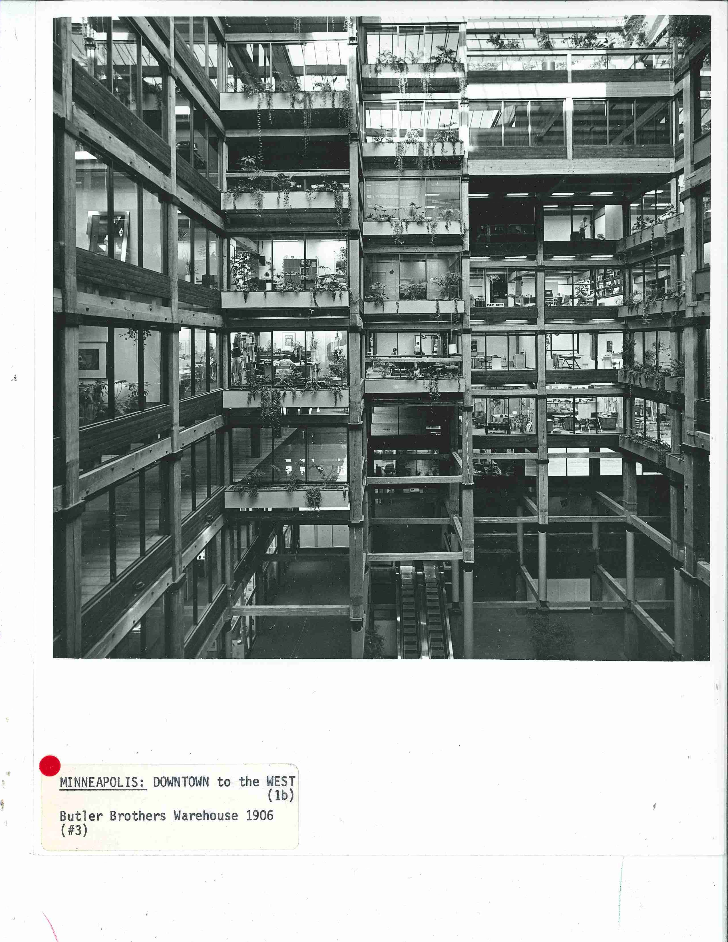
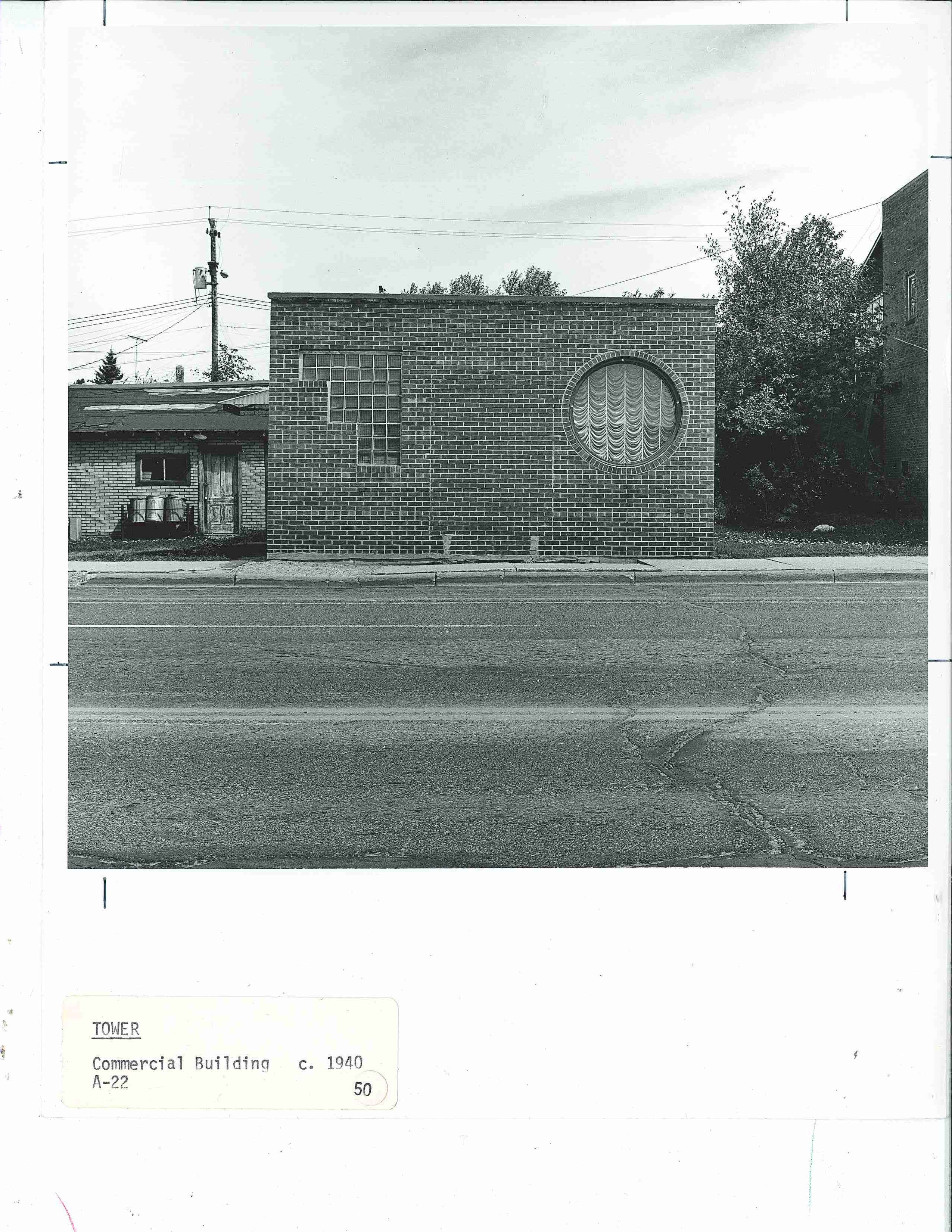
Butler Brothers Warehouse Building in Minneapolis, MN circa 1977 (below) was remodeled inside with walls of glass and the original heavy wood beams.The image (below) of a humble commercial building turned residence in Tower, MN didn’t make it into the book but instead is described as Streamline Moderne style which the Guide’s glossary describes as “an outgrowth of the machine aesthetic” and characterized here by the “non-symmetric compositions, glass brick for walls and windows, [and] round windows”. 

Heather Carroll is the processing archivist for the Weisman Art Museum‘s collection at the University of Minnesota Archives. This project was made possible by funds provided by the State of Minnesota from the Arts and Cultural Heritage Fund through the Minnesota Historical Society.


Sculptures: A Guide to the Architecture of Minnesota


Minnesota has no shortage of roadside attractions, including sculptures of monumental scale. Third in a series of photo-posts inspired by A Guide to the Architecture of Minnesota, published in 1977 as a supplement to University Gallery’s Bicentennial exhibition The Art and Architecture of Minnesota, this post is dedicated to just a few of the architectural sculptures across the state.

A detail (below) from the previous post–just one of the quirky sculpture areas of the Nordaas American Homes former landscape/architecture folly in Minnesota Lake.

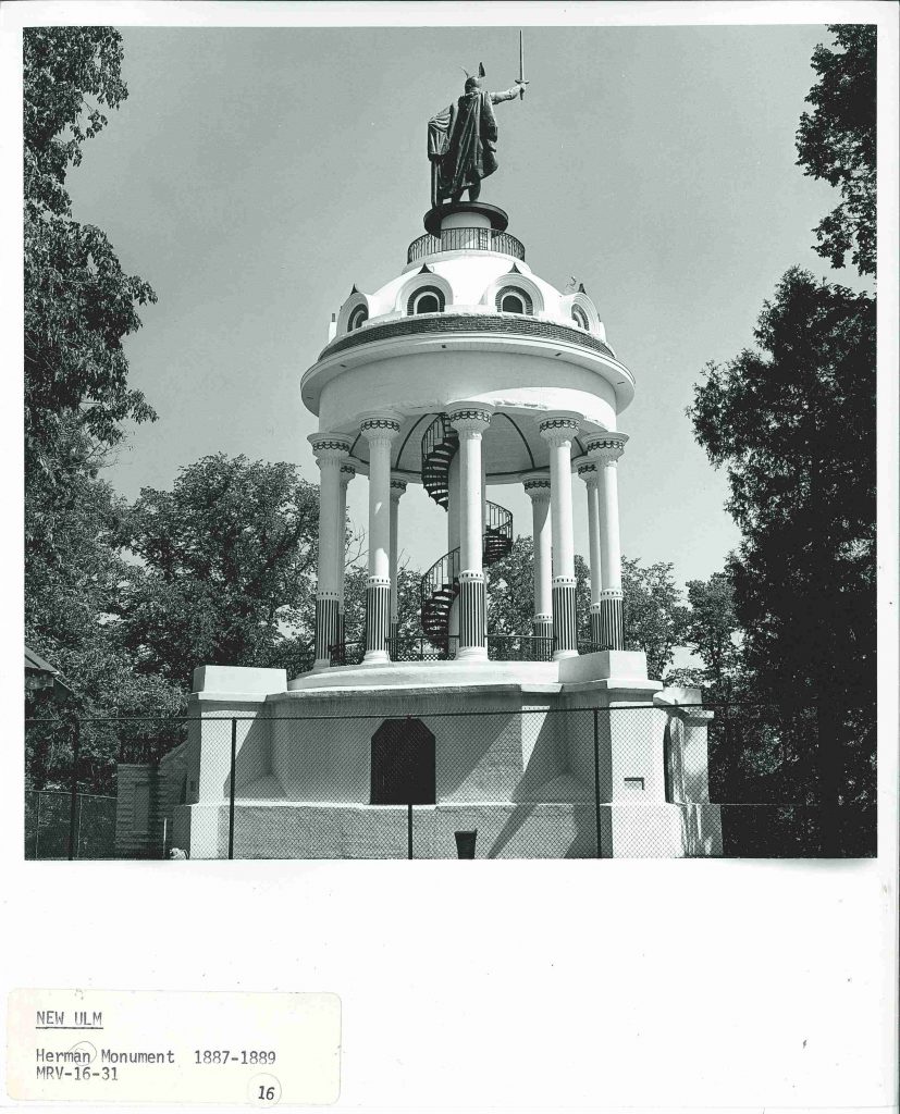
Hermann Heights Monument aka Hermann the German (below) of New Ulm, MN.

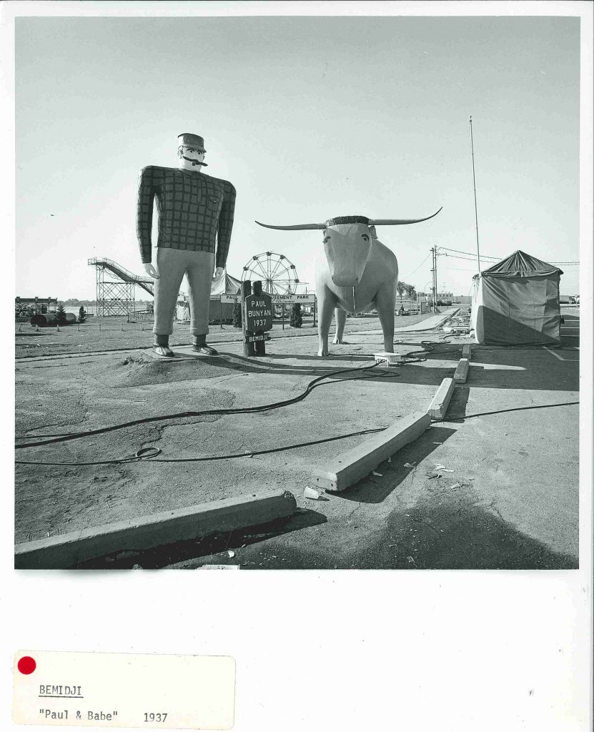
Paul Bunyan and Babe the Blue Ox, statues standing 18′ and 10′ tall respectively, made their public debut at the 1937 winter carnival in Bemidji, MN. Paul and Babe have continued to captivate imaginations ever since.

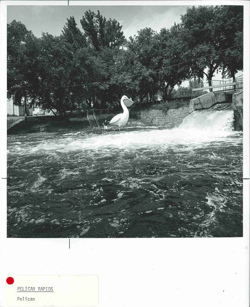
Inspired by the enduring success of  Paul & Babe in Bemidji, Pelican Pete (below) “is a 5:1 scale model [in concrete] of a mounted stuffed pelican which is located in the Old City Hall” of Pelican Rapids.

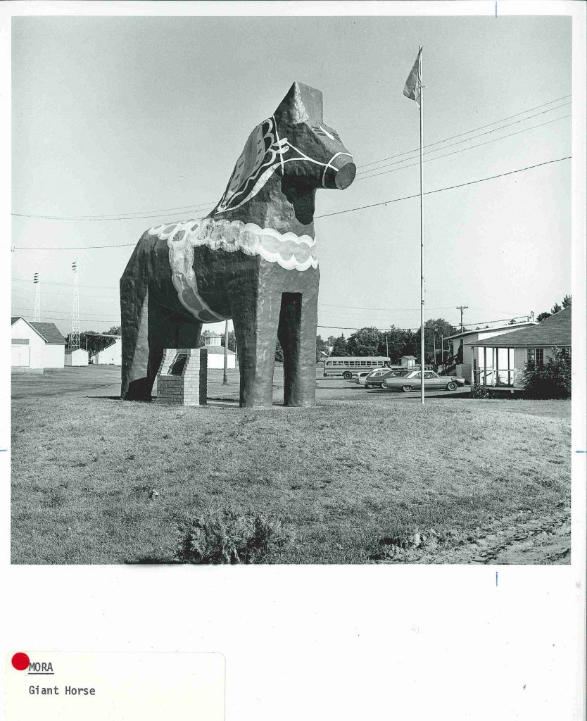
The giant Dalecarlian Horse or Dala Horse in Mora, MN honors the towns Swedish roots.

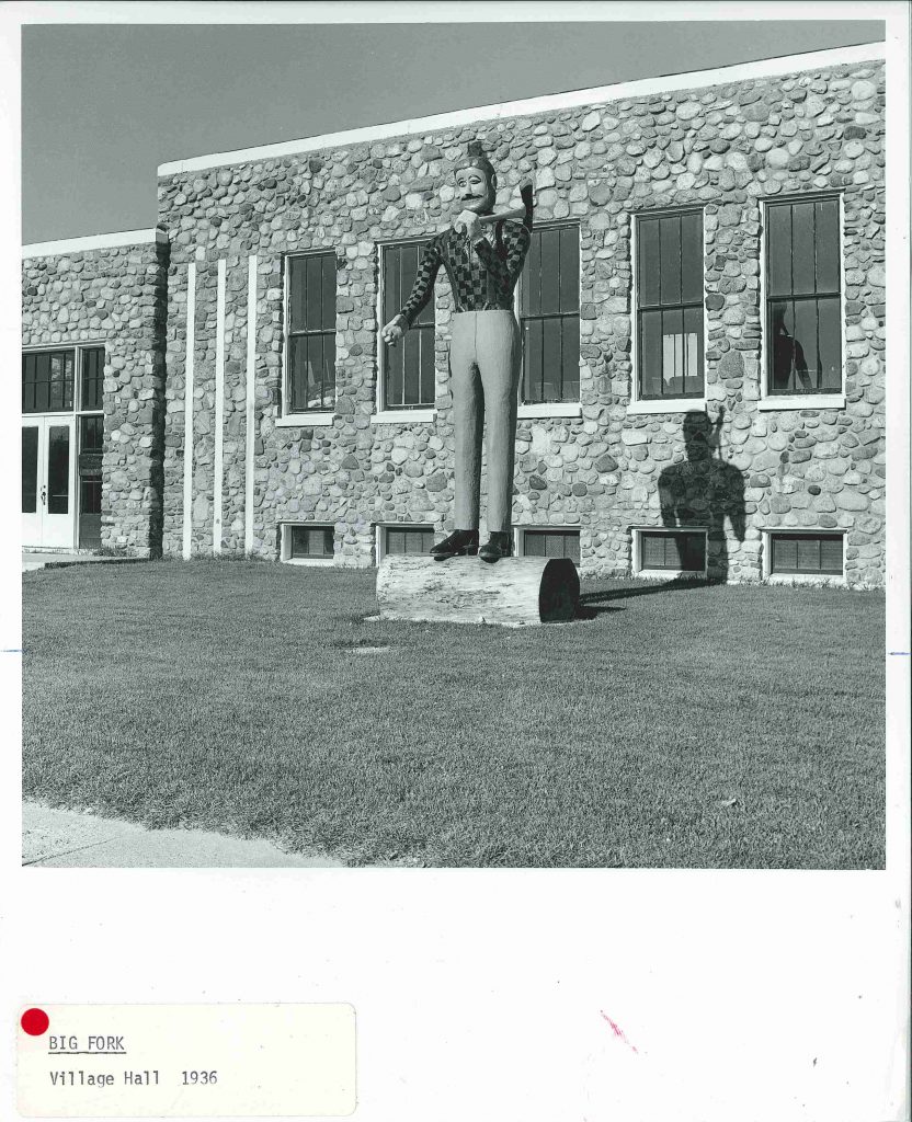
While this winking lumberjack no longer stands outside Bigfork’s WPA-built Village Hall, a new lumberjack does.

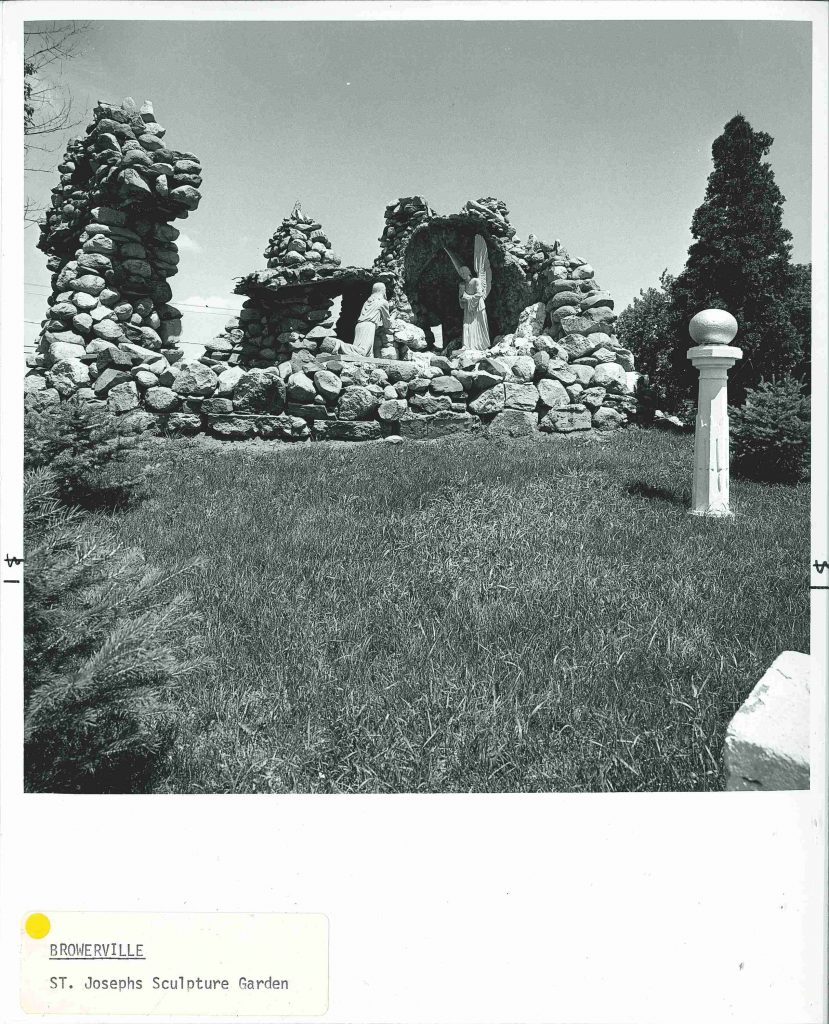
St Joseph’s Church sculpture garden in Browerville MN (below). “To the right and left of the church are what appear to be an eighteenth century English folly and grotto, only in this case the intent is religious– a depiction of Christ in the garden of Gethsemane. The boulder composition on the right with its sculptured figure, and the cascade on the left were created in the early twentieth century by Joseph Kieselewski.” ~A Guide to the Architecture of Minnesota, 1977.

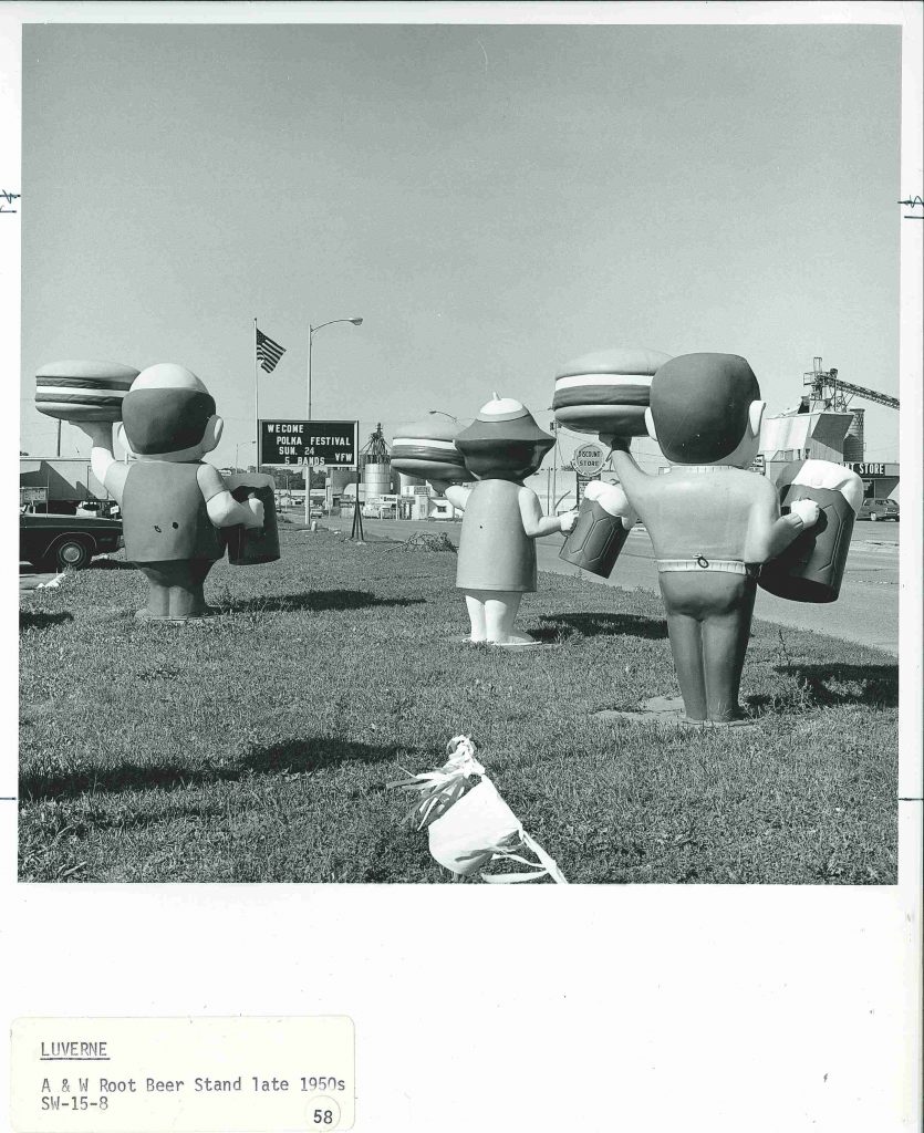
The A&W Root Beer stand in Luverne, MN. This image didn’t make it into the final publication but a description did:
“Three creatures from the wilds of Disneyland, each holding a hamburger and a mug of root beer.”
Creatures from the wilds of Disneyland?? I can only imagine–but will probably never know–the sculpted expressions from the other side.


Heather Carroll is the processing archivist for the Weisman Art Museum‘s collection at the University of Minnesota Archives. This project was made possible by funds provided by the State of Minnesota from the Arts and Cultural Heritage Fund through the Minnesota Historical Society.


Quirkiness: A Guide to the Architecture of Minnesota

Idiosyncratic and quirky architecture seemed to abound at one time in the not-so-distant past. The purpose of these buildings remains in most cases a mystery–perhaps in some cases necessity was the mother of invention or in other cases people someone took matters into their own hands to make the building of their dreams a reality.

The book A Guide to the Architecture of Minnesota, which was created “to supplement and augment the Bicentennial exhibition, The Art and Architecture of Minnesota‚ organized and presented by the University Gallery in conjunction with the Minnesota Society of Architects”, includes many unique structures. Here is a just a selection of the unique, quirky and idiosyncratic buildings across the state:

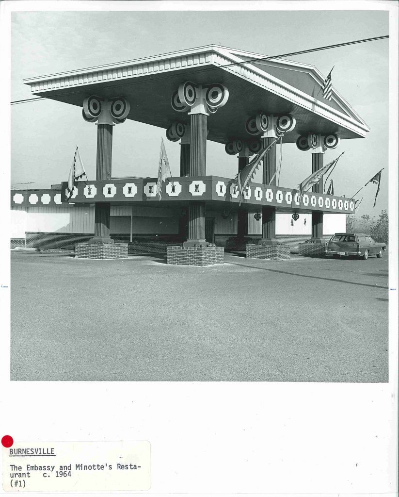
This unique structure (below, circa 1977) known as the Corner House Restaurant no longer exists but stood near what is now a car dealership off Cliff Road and 35W South in Burnesville, MN. I can only hope that this tympanum suspended by exaggerated columns was used as an outdoor dining area or observation deck looking out at the nearby Minnesota River valley.

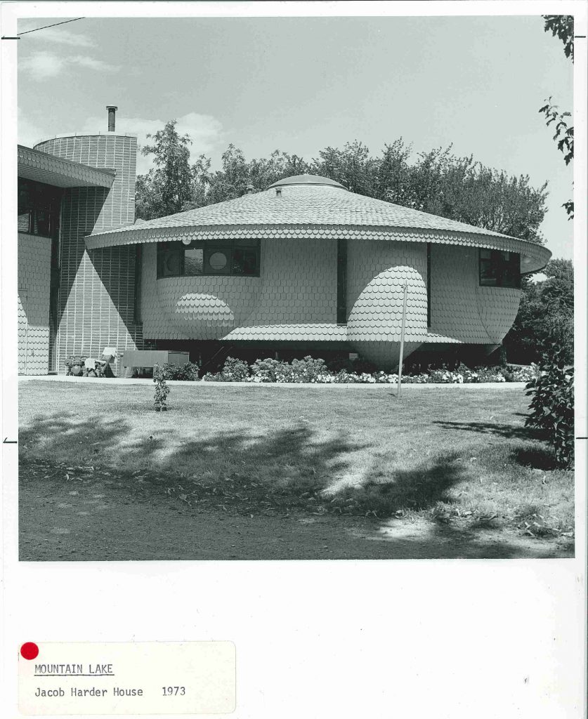
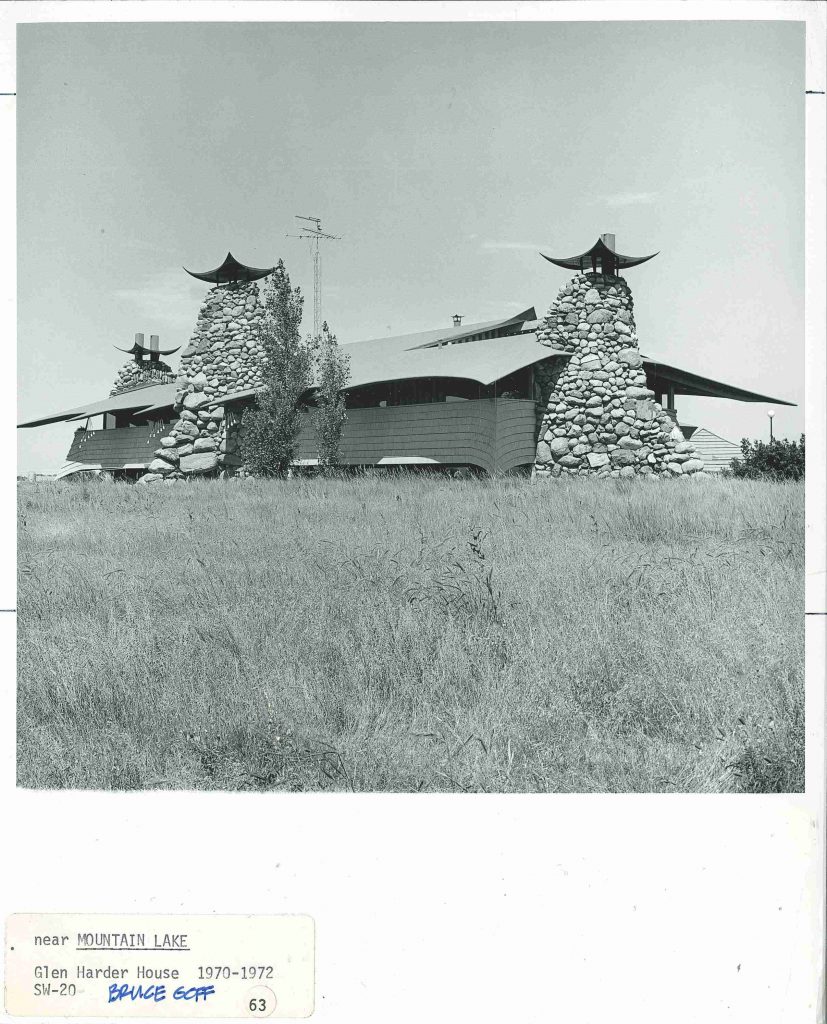
Bruce Goff, inspired by Antoni Gaudi, Frank Lloyd Wright and more, developed an architecture style was all his own. The small southwest Minnesota town of Mountain Lake was home to two of Goff’s creations: the Jacob Harder House and the Glen Harder House. A Guide to the Architecture of Minnesota describes the Jacob Harder House (below) as “somewhat like a pregnant spaceship, sheathed in fish-scale shingles which really look more like chicken feathers.”

Goff’s “Glen Harder House” (below) was described in Guide: “Three gigantic tree-trunk chimneys of river boulders project upward, each topped by an upturned piece of metal, and between them floats the house in birdlike (turkey?) fashion. The roof is covered with bright orange indoor/outdoor carpet.” Barn swallow perhaps, but turkey seems a bit harsh. Sadly, this house was burnt to the ground in a fire in the 1990’s.

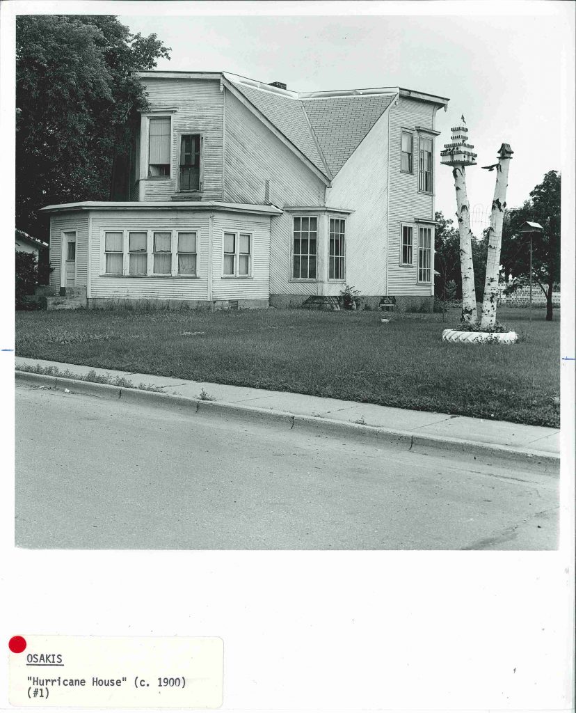
Built by J.B. Johnson the Hurricane House (below) in Osakis, MN “was the home of a man who adjusted very little to any convention and admired bees.” While the home did withstand a tornado, it is apparently a misnomer that it was designed to do so and rather the shape was inspired by industrious bees (according to Historic Homes of Minnesota by Roger G Kennedy).

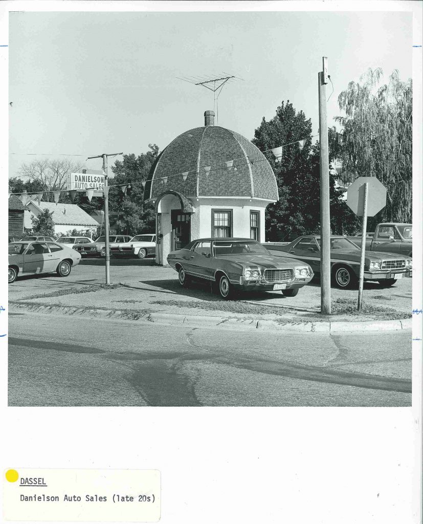
West of the Twin Cities in Dassel MN, what was once Danielson Auto Sales is today known as The Mushroom Building (below) was restored by the Dassel Area Historical Society and now serves ice cream and hosts town events.

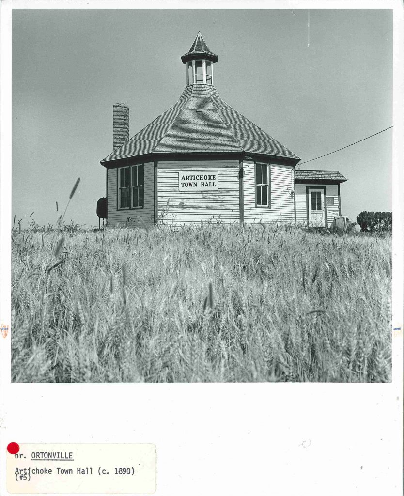
Artichoke Town Hall, was described in Guide circa 1977 as a shape that strongly suggested an artichoke with trim painted (appropriately) in artichoke green. However, the later application to the National Register of Historic Places suggests it is named for the nearby lake rather than its shape. Prior to becoming a town hall, this was the District 13 School House and is the only known octagonal school house in the state.

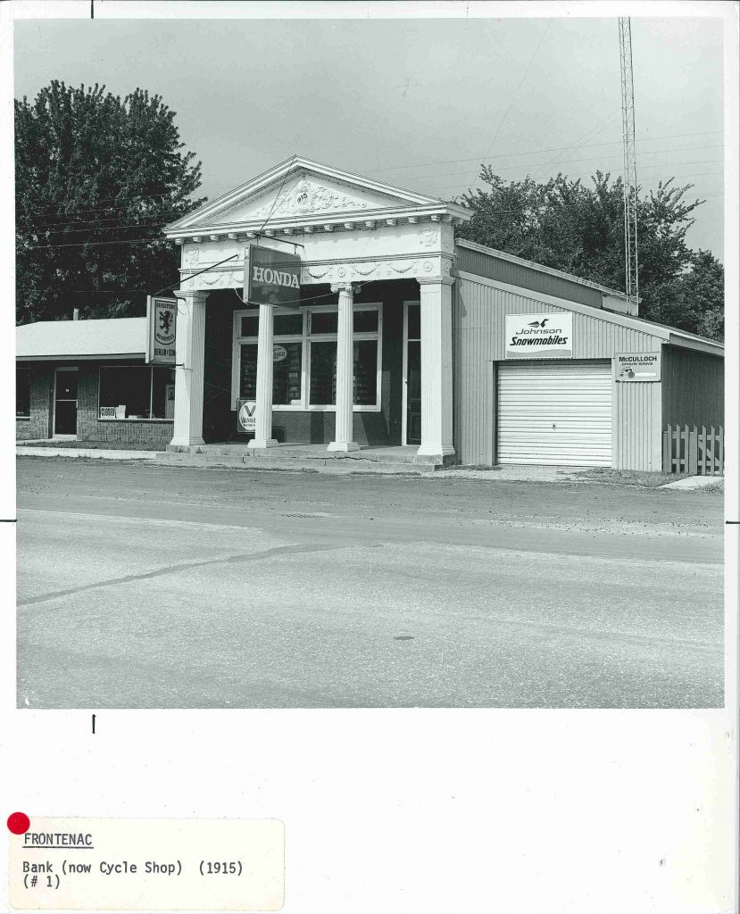
The Greek revival bank in Frontenac, MN–aka Frontenac Cycle Sales–has a cast iron facade identical to the historic bank in Marine-on-St-Croix, according to Guide.

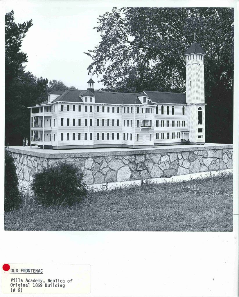
This miniature replica of the Villa Maria Academy in Old Frontenac, memorializes the girls’ school that burned to the ground in 1969 after being struck by lightening. Read more about it in the Old Frontenac history here.

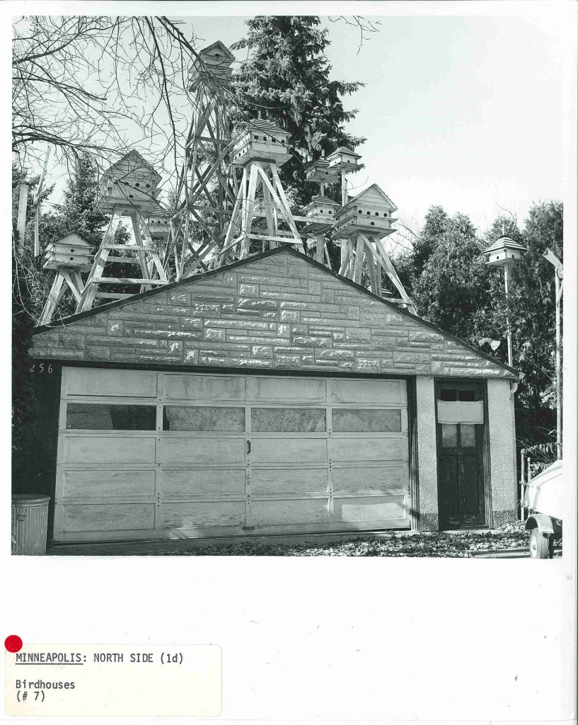
This North Minneapolis garage (below, circa 1977) is still in use but no longer for the birds–today this garage is home only to automobiles and lawn mowers.

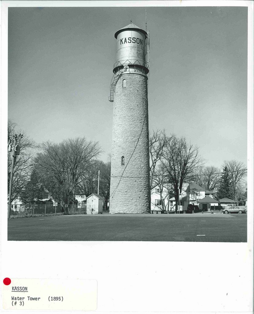
“[Kasson’s] major landmark. A circular stone base with a metal spiral staircase wrapped around it and the tank on tom–utility and romance, all in one.”
~from A Guide to the Architecture of Minnesota, 1977.

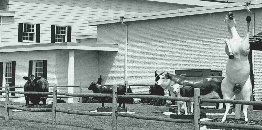
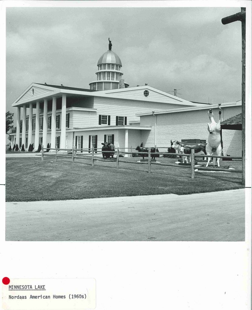
From A Guide: ” Here is an architectural/landscape folly which should be preserved. The main building is a dream version of Mount Vernon, surmounted by a triple tiered drum, a dome and a small replica of the Statue of Liberty. In the adjoining area are fenced statues of cows and horses. The nearby pond has a bridge, a fountain and a battleship…”
If you can believe it, the description of the folly* goes on. Although the site no longer exists, the business Nordaas American Homes is the biggest business in Minnesota Lake. The last building in this post is included as much for its interesting interpretation of Greek Revival architecture as for it’s sculptural adornments, which preview the next post in this series.

*Folly      noun
Architecture. a whimsical or extravagant structure built to serve as conversation piece, lend interest to a view,
commemorate a person or event, etc.: found especially in England in the 18th century.


Heather Carroll is the processing archivist for the Weisman Art Museum‘s collection at the University of Minnesota Archives. This project was made possible by funds provided by the State of Minnesota from the Arts and Cultural Heritage Fund through the Minnesota Historical Society.


Familiar Places: A Guide to the Architecture of Minnesota

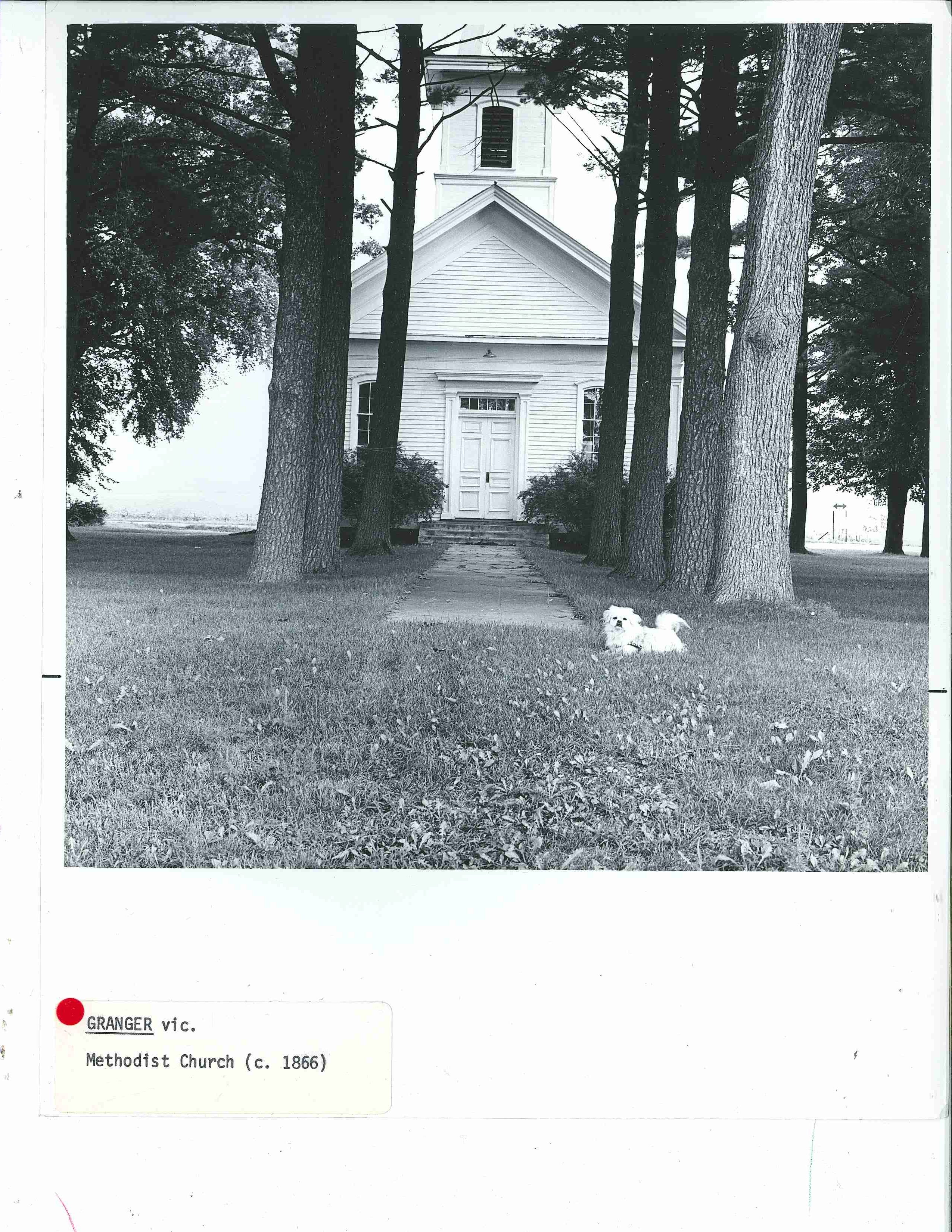
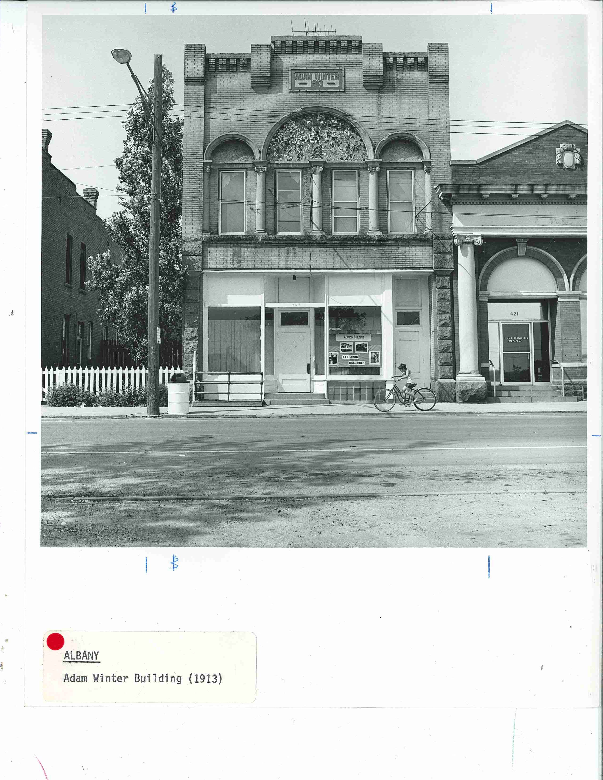
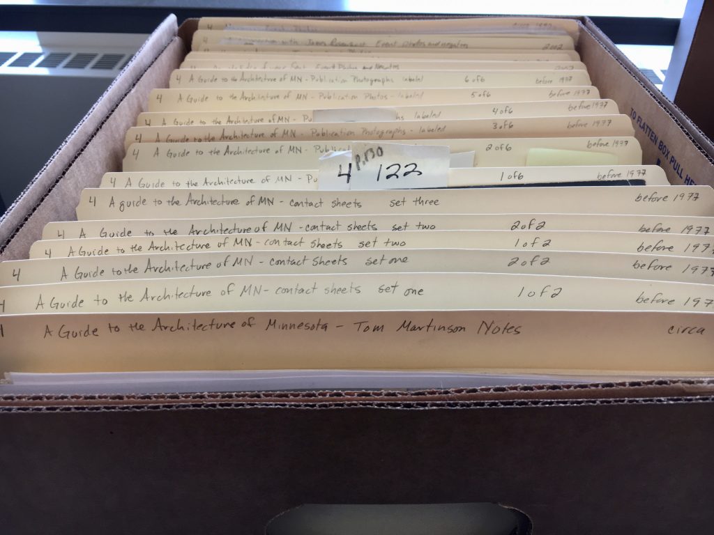
It was a great day when I opened a banker box to find hundreds of glossy, black and white photos of buildings–I love the nostalgia of old photographs, I love how architecture can be a time capsule reflecting the sensibilities and priorities of a community at a particular point in time and I have a growing curiosity about what was here before. I was delighted to discover they are all photos of structures that exist(ed) in Minnesota. There are over 2800 2″x 2″ contact prints of over 900 buildings and structures and more than 700 8″ x 10″ glossy photos.  Given my job, naturally I ask: How are these connected to the University and the Weisman Art Museum (WAM) archives? Were they in an exhibition? For a catalog?

With a little digging I found the photos were included in the book A Guide to the Architecture of Minnesota, by David Gebhard and Tom Martinson and published by the U Press in 1977.

“This book was conceived from its inception to supplement and augment the Bicentennial exhibition, The Art and Architecture of Minnesota‚ organized and presented by the University Gallery in conjunction with the Minnesota Society of Architects. The exhibition was more than three years in the planning stages, and at every step our desire was to publish something other than an exhibition catalogue — something at once less ephemeral and more comprehensive yet not boring that ubiquitous person, the “interested layman,” with heavily erudite prose. In the end we decided to publish A Guide to the Architecture of Minnesota.”

~From the forward by Barbara Shissler, Director of University Gallery (UMN) and Daniel Sheridan, Executive Director of MN Society of Architects.

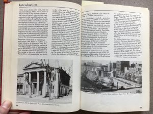
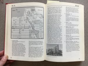
Based on the large amount of large format photos in the archives, I incorrectly expected this to be a coffeetable book. Instead, the book is small, thick and crammed with words in a small font.

Inside: razed buildings

Inside: typical page


While the book is brimming with information, the pictures are tiny and surprisingly few. Here at the WAM Files, you get to enjoy a select few digital versions in comparatively glorious medium-high resolution! All the photos are believed to be taken in the mid-1970s by co-author Tom Martinson. The dates included on the labels usually refer to the construction dates of the buildings.

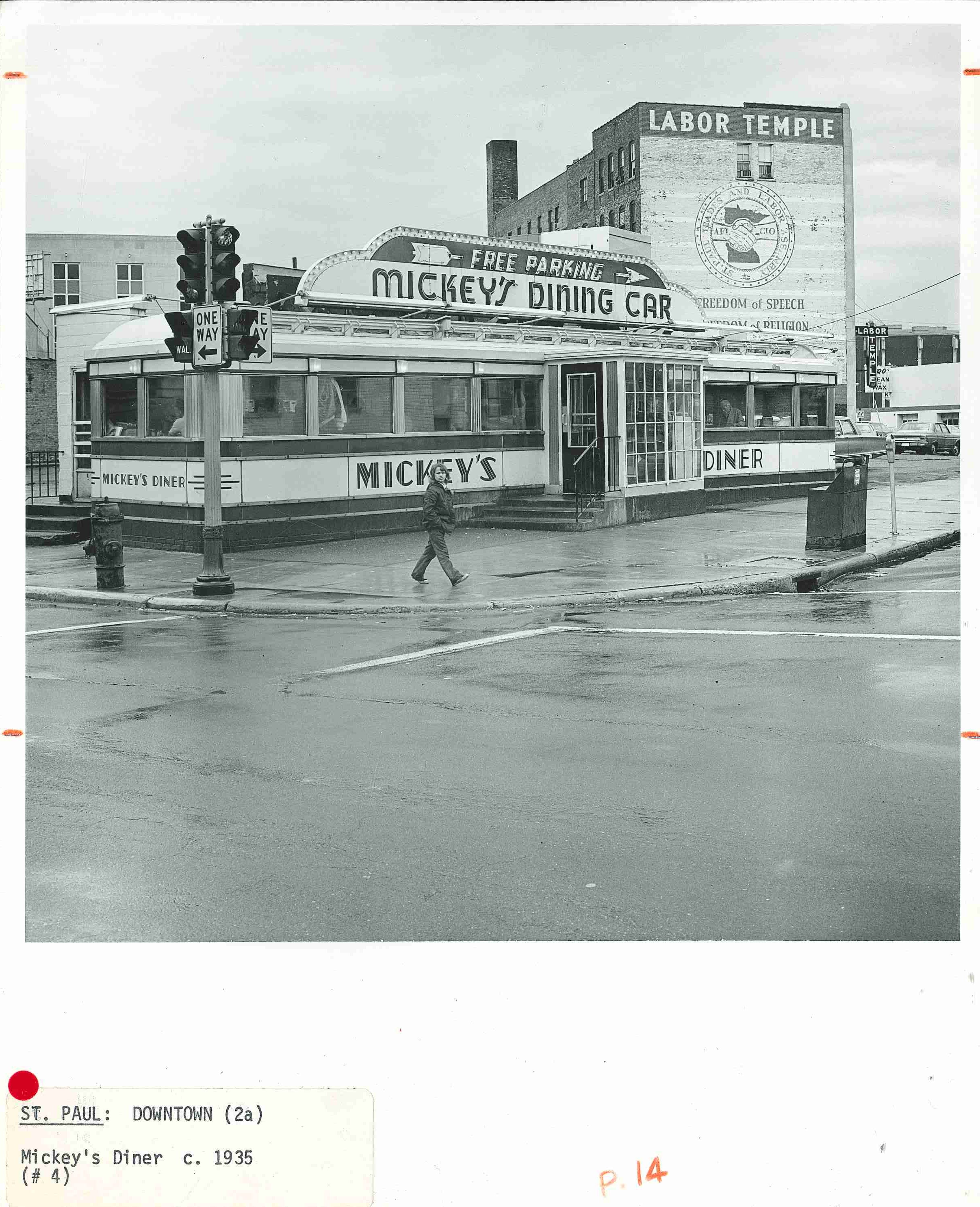
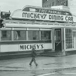
Mickey’s Diner (below), now on the National Register of Historic Places. Circa 1977 (when 9 year olds could wander downtown St. Paul alone).


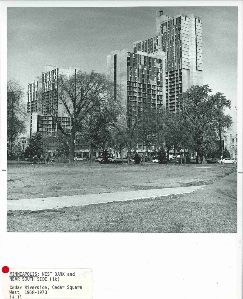
Cedar Square West (below), today known as Riverside Plaza, was designed by famed local architect Ralph Rapson who ran with the likes of Charles and Ray Eames, Harry Bertoia and Eero Saarinen. It is an icon of the Minneapolis skyline with its primary colored panels, located just outside Minneapolis’ downtown district.

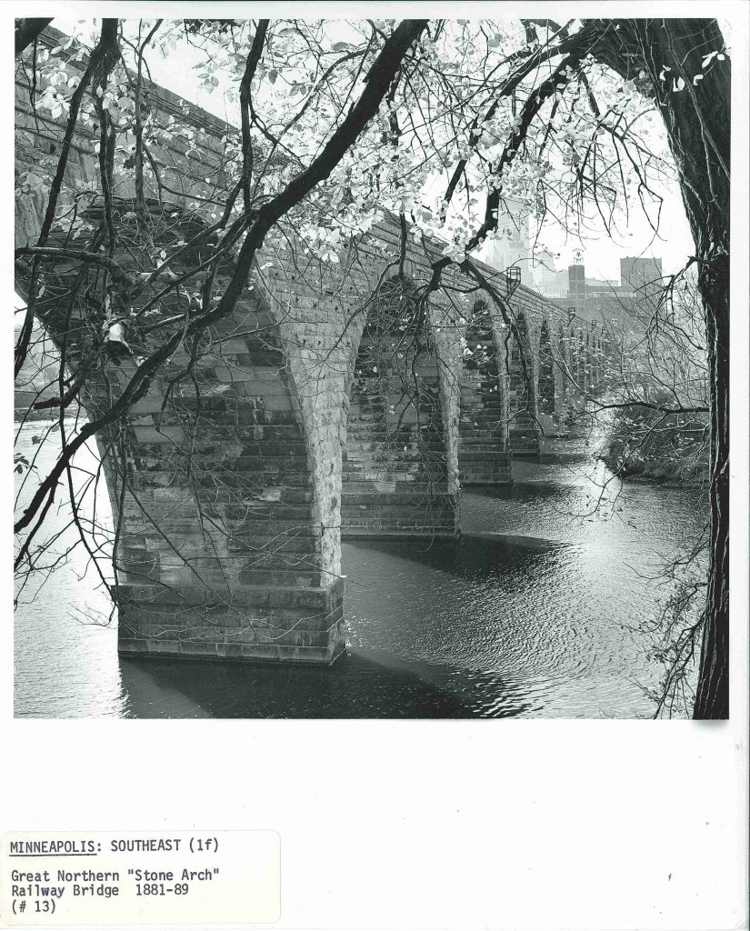
The Stone Arch Bridge (below), today a pedestrian bridge, was in use as a train bridge until at least 1978, just a year or so after this picture was taken.

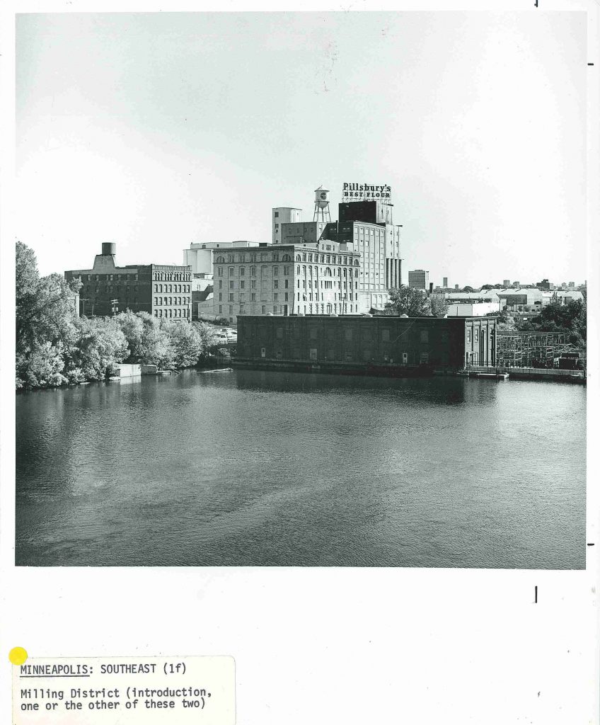
This view of the milling district (below) on the North side of the river is surprisingly similar today.

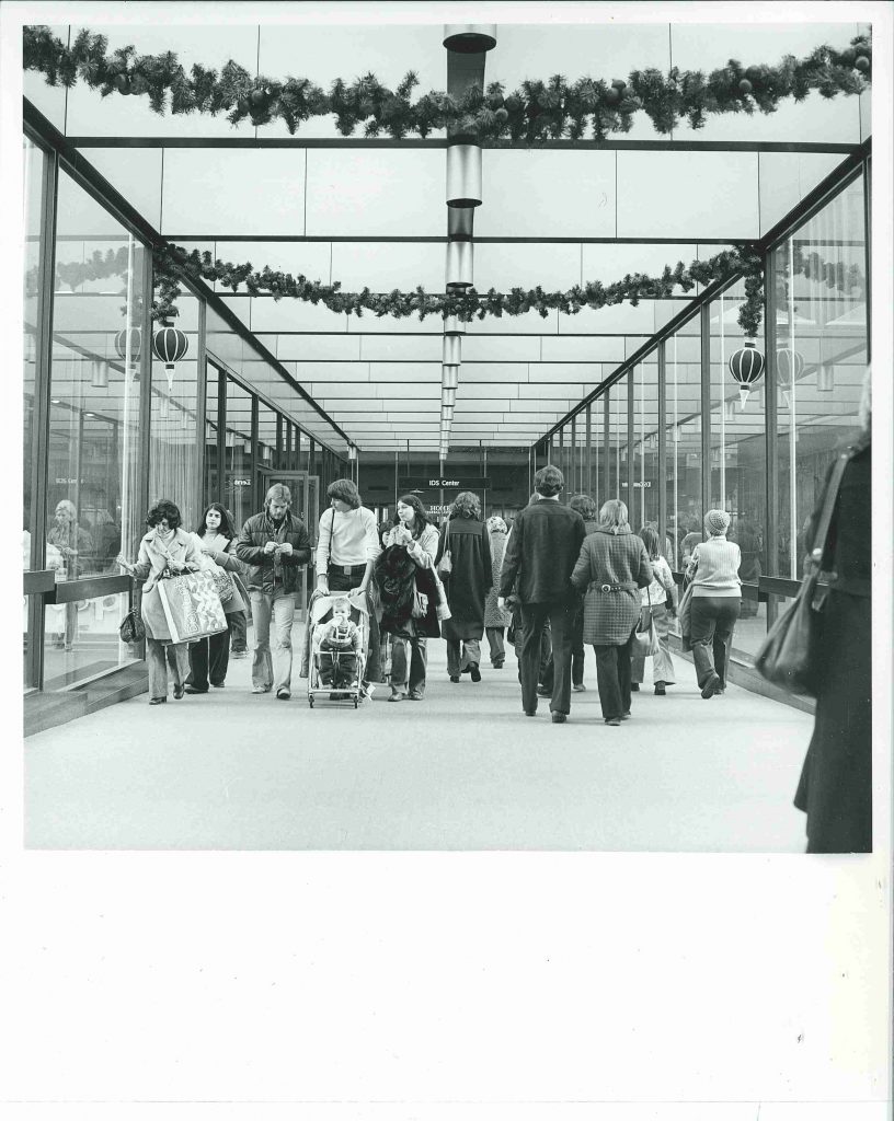
Minneapolis wouldn’t be Minneapolis without Skyways (below). Minnesotans have come up with some pretty clever ways to adapt to winter-life here and Skyways have got to be one of my favorites. This shot was taken between the IDS tower and (I believe) the former Dayton’s department store, crossing Nicollet Mall. Circa 1977.

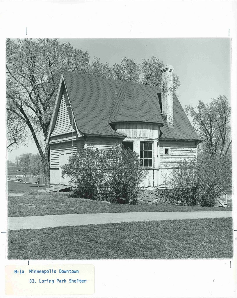
The shelter on the west side of Loring Park (below) is a far cry prettier today with fresh paint and a cupola restored.

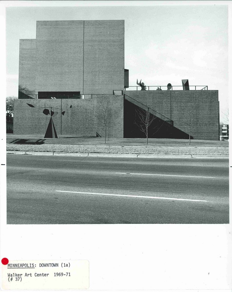
The ever-evolving Walker Art Center (below), designed by Edward Larrabee Barnes, opened in 1971 and shown here with two Alexander Calder sculptures, Spinner and Octopus.

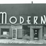
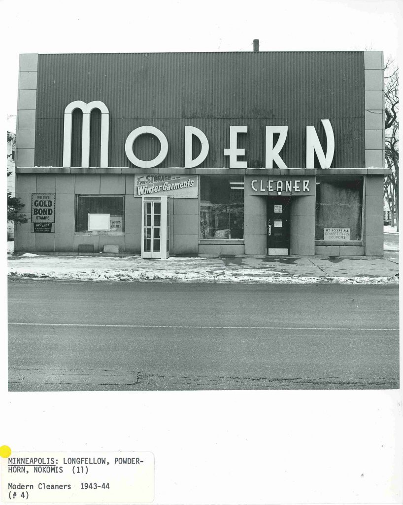
Modern Cleaner building (below) is today the Modern Times Cafe in south Minneapolis. You’ll know it when you see it by its bright lime green and orange exterior. 


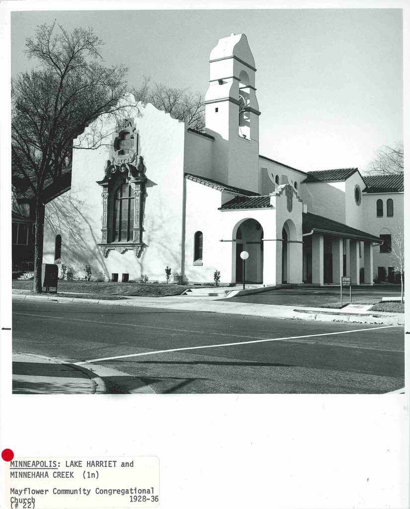
Mayflower Congregational Church on Diamond Lake Rd off of Highway 35 W, circa 1977. Today, this is The Museum of Russian Art.

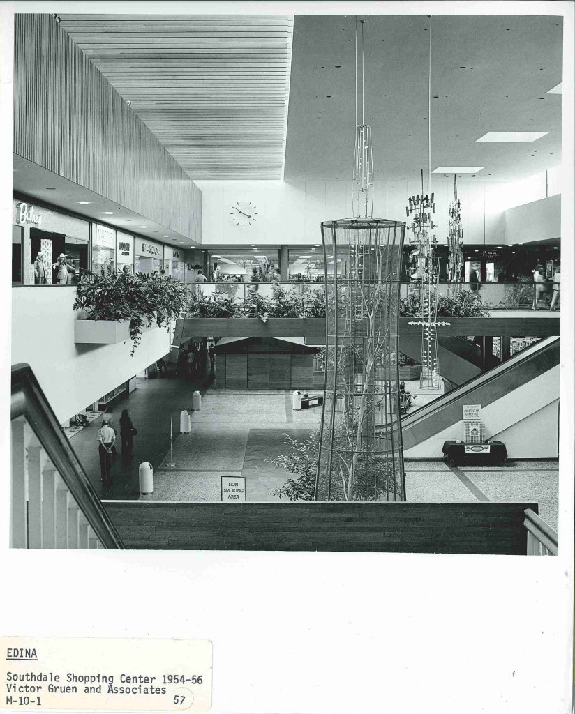
Southdale Shopping Center (bellow)was the first fully enclosed shopping mall in the nation. It was quite luxurious, complete with Harry Bertoia sculptures, at least one of which remains in the space today.

Is that a two-story bird cage?

This is a fraction of the photos that seemed most familiar, but there were so many more. Hence, this is just the first of a few posts yet to come that will contain sculptures, architectural quirkiness, futuristic and brutalist buildings and more. Or if you’d rather, the photos and notes of co-author Tom Martinson are tidily awaiting your visit in box number 248.

Heather Carroll is the processing archivist for the Weisman Art Museum‘s collection at the University of Minnesota Archives. This project was made possible by funds provided by the State of Minnesota from the Arts and Cultural Heritage Fund through the Minnesota Historical Society.


“Art and Science Can Open the Door”

I find the two best parts of working in the archives are making discoveries while I’m processing materials, and helping people answer questions and make their own discoveries. In the library and archive world, the latter is called Reference Service. Recently, I was able to provide reference services using WAM’s archival collection, UMN’s digital conservancy and the Digital Content Library to help a researcher uncover information about a specific set of artworks by UMN faculty member, Walter Quirt (pronounced KURT), made while he was in the Yucatan region of Mexico.

Quirt was a mostly self taught painter, “a pioneer of American abstract art” and “a man of  strong and forthright opinions, a man of ideas” according to H.H. Arneson, Chairman of the Art Department, from a clipping dated November 17, 1958 found in the University Gallery’s press books.

Walter Quirt really was a “man of ideas” who, along with UMN studio art student Jack French, took art to science’s door. They traveled to the Yucatan region of Mexico in the Winter of 1967 to test a social science hypothesis regarding cultural visual preferences. To test the theory, the artists would take photographs of the local landscapes and urban terrains, then translate the linear elements and movement of the photographs into drawings which would then be shown to local residents to gauge their non-verbal reactions.

Page 1

During what little leisure time they had during this months-long trip, Walter Quirt made observational drawings of life in the Yucatan. Shortly after their return from the Yucatan, Quirt exhibited seventeen of his Yucatan drawings at the U Gallery. For the exhibition statement, he wrote:

Page 2

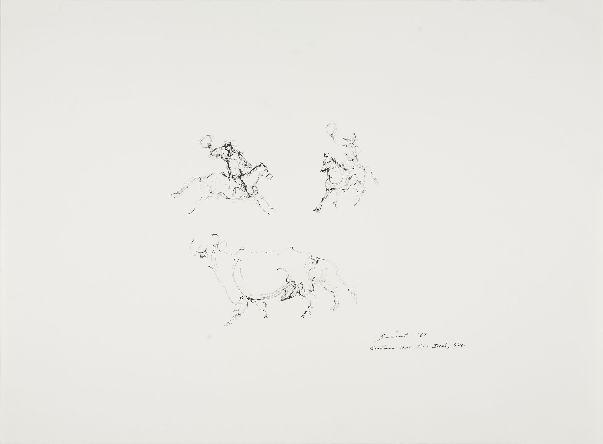
Most of the drawings in this exhibition are casual impressions of an amateur bull fight I witnessed in Ticul, Yucatan. Those not of this subject bear a relation to the visual test material Mr. Jack French and I worked on during our stay in Ticul, which we carried out on behalf of Dr. Strodtbeck of the University of Chicago and the sponsorship of The International Programs and Graduate School of the University of Minnesota.

One of the Yucatan drawings: Amateur Bull Fight, Ticul, Yucatan by Walter Quirt, 1967. Image Courtesy of Weisman Art Muesum, accessed through UMN’s Digital Content Library.

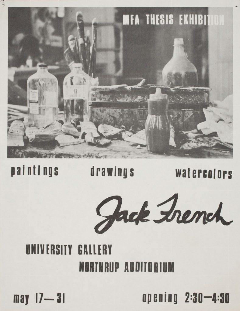
A year later, French exhibited his MFA thesis, also at the University Gallery.

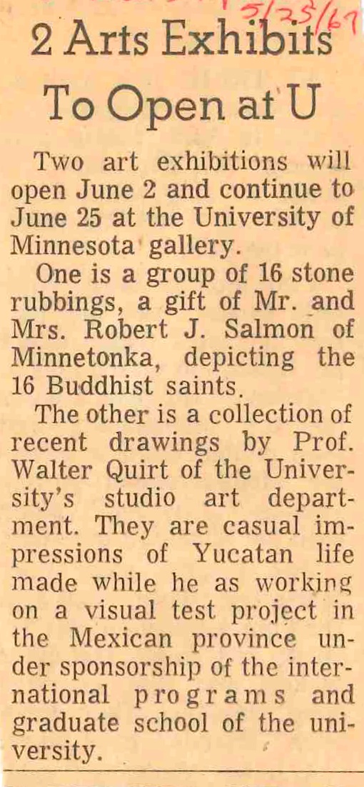
St Paul Dispatch blurb from May 25, 1967


Although I wasn’t able to locate images of either exhibition on display, French wrote an interesting paper of his field observations and findings of the Yucatan project that closed with these thoughts:

Science has proven that energy is the essential force needed for life and motion. If the energy is misused it follows that life and motion will be in jeopardy. Art is also a form of energy and the theoritician [sic] can show that a’ specific art form has been created by the acceptance of a certain kind of energy. We know that science can measure physical energy forces. We have not been able to measure psychological energy forces, because we have never isolated a specific instrument by which to arrive at this
measurement. A test based on linear preferences may well be the necessary instrument needed for this energy measurement.

Psychologists working in the field of perception, now argue that visual stimuli do, in fact, affect mans’ social and psychological
motivations. Logically -then, the visual arts represent a socio-psychological force which can affect the attitudes and temperaments of individual and social behavioral patterns. If these two antecedents are alligned [sic] with a definite procedure for measuring the individual and social preference for a particular linear energy, it seems highly probable that art and science
can open the door to a deeper understanding of the living patterns of man and society.

Its a pretty great day when through references services in the archives we get to open a door to a place where art and science meet.

Heather Carroll is the processing archivist for the Weisman Art Museum‘s collection at the University of Minnesota Archives. This project was made possible by funds provided by the State of Minnesota from the Arts and Cultural Heritage Fund through the Minnesota Historical Society.


The Unusual Life of Painting No. 85

University Gallery Publicity Books

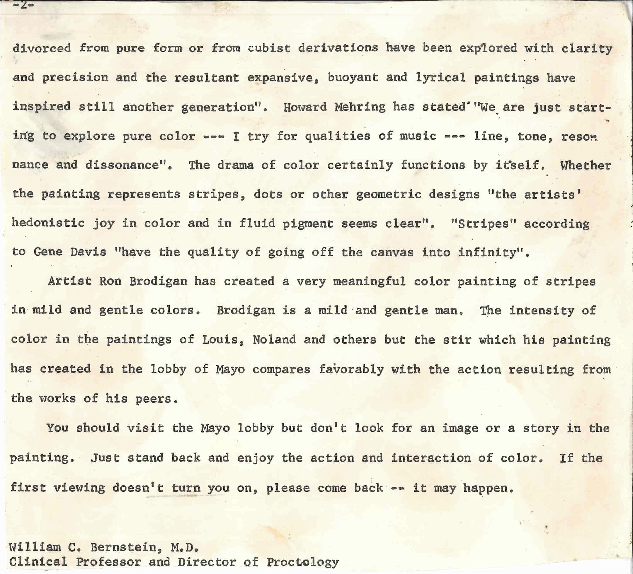
In a University Gallery Publicity Book dated 1968, amidst other article clippings about the gallery is an open letter to the University community from William C. Bernstien M.D., Clinical Professor and Director of Proctology. This item stands out from the rest–first, its a letter rather than an article, its written by a doctor rather than an art critic or art historian and the letter is not directly about the gallery but a student’s artwork. This unusual letter is an introduction to the the twisting tale of an ill-fated painting titled No. 85.

The letter begins:

“Have you heard about the “happening” at the University Hospital and do you know what has caused the “stir” in the lobby of Mayo? Here’s what it is all about! Quite by accident a large color painting by Ron Brodigan was selected for exhibit in the hospital lobby and the reaction  to its presence there has been an exciting one.”
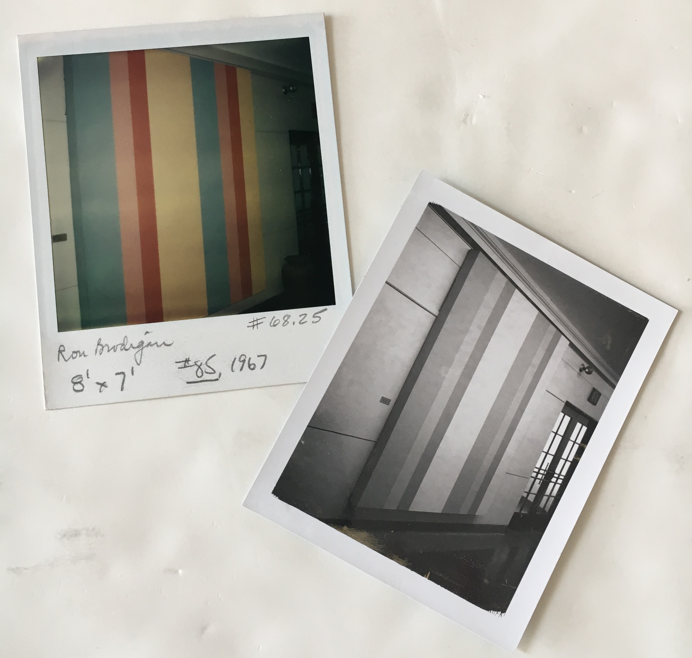
 

Polaroid pictures circa 1968 of Brodigan’s painting titled No. 85 upon installation in the University hospital lobby. Courtesy Weisman Art Museum registrar’s accession files.

Intriguing beginning, right? Digging a little deeper into the publicity book, another article surfaces revealing a related and opportune moment in time: a University alum needs to find a new home for his enormous paintings offering them to the gallery; the University Gallery, already with too little storage space, would normally have to decline the student’s donation but a perfectly timed request from the U hospital for artwork saves the day. This painting appears to begin an initiative to display works from the art collection in public spaces around the campus–a practice which continues today. The stars seemed to align for Ron Brodigan’s painting back in 1968… but things aren’t always what they appear.
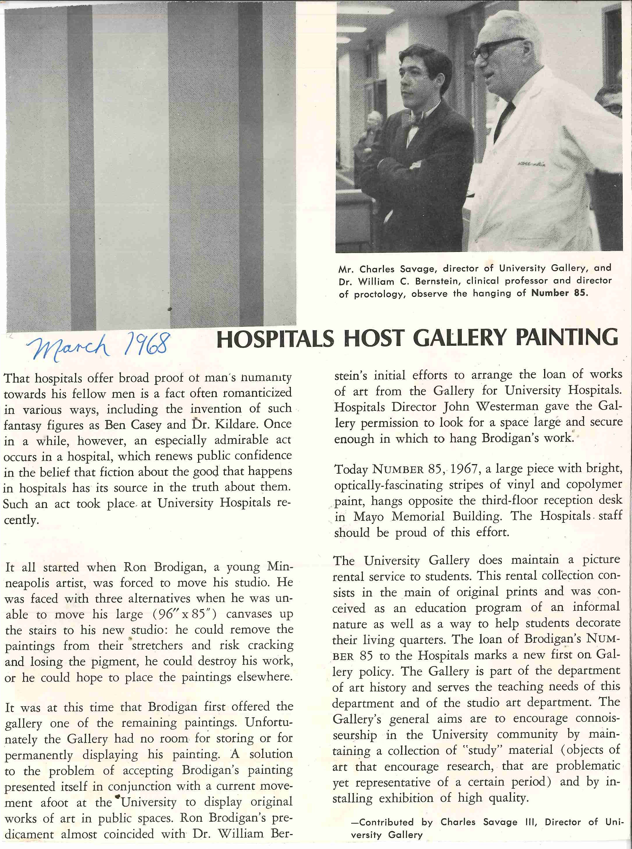
 

Article from an unknown publication, written by former gallery director Charles Savage III,  found in the gallery Publicity Book 1968.

Back to the open letter from Dr. Bernstein: it goes on to describe public reactions to the Brodigan’s painting No. 85 in the lobby:

“”Ye gads! What is this supposed to be?” to “This is just what this lobby needs!”. One professor in the medical sciences asked if the painting was supposed to be some new type of bulletin board. At least, the painting is being looked at, questioned and, at times, admired. The painting is Rob Brodigan’s expression of color – for color’s sake. What, one is often asked, inspires an artist to create such a painting?”

Dr. Bernstein goes on in the letter to articulately trace the possible inspiration for No. 85 from Jackson Pollock to the Washington School Color Painters to Ron Brodigan via the Walker Art Center, concluding:

Artist Ron Brodigan has created a very meaningful color painting of stripes in mild, gentle colors. Brodigan is a mild and gentle man… but the stir has created in the lobby of Mayo compares favorably with the action resulting from the works of his peers.
You should visit the Mayo lobby but don’t look for an image or a story in the painting. Just stand back and enjoy the action and interaction of color. If the first viewing doesn’t turn you on, please come back — it may happen.”
The stir it created? The “happening”? What happened?

A partial answer was found in the accession files of WAM’s registrarial department. Just a few months after Brodigan’s No.85 was installed in the hospital lobby, it was removed due to what appears to be vandalism. The condition report in the WAM accession file states: “Entire surface soiled. Finger marks, color pencil mark & ball point pen marks in several places. The above condition was noted upon return of the picture from Special Loan to Dr. John Westerman, Director, University of Minn. Admin on August 27, 1968.”


But this vandalism and return to art storage isn’t the end of No. 85’s tale.

Painting No. 85 leads a quiet existence–whether back on display or in storage–for following twenty-five years. That is until Brodigan’s No. 85 is on display in a lobby again, this time in Northrop Auditorium circa 1993, when a 30″ gash is inflicted upon the painting in unknown circumstances.
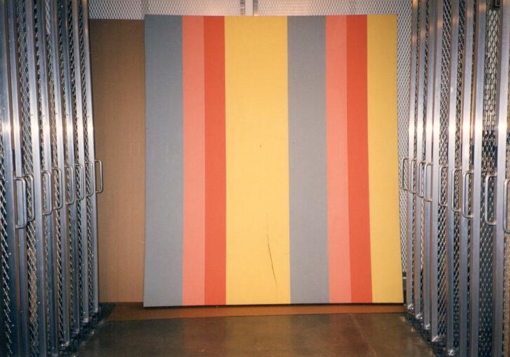
Brodigan’s No. 85 circa 1993 with 30″ gash.

Once again, the painting is removed and brought back to art storage where a new discussion ensues. The painting is large and expensive to store, the repair of the gash would cost substantially more than the painting’s estimated value. However, according to a printed email from the registrar in the accession files, the University Museum’s collection policy at the time stated that deaccessioning could only happen if the work was “bug-infested”. “Deaccessioning” is museum-lingo for removing an item from a collection. There are strict rules of conduct and ethical considerations regarding removing works from a museum collection. These strict guidelines protect the integrity of both the collection and the museum. It is normal for museum collection policies to be routinely evaluated and updated.

This incident with the painting seems to instigate a different conversation about collection policy, crossing years to the opening of the Weisman Art Museum, and may have contributed to the regular process of updating deaccessioning policies for the University’s art collection.

In 1995, Ron Brodigan is contacted about the situation with No. 85 and the options for the artwork going forward which may have included return to the artist, request for funds to repair the work or deaccesioning. The decision was made by all involved to deaccession the work. In this case, while a very unusual outcome for deaccessioning and not without much discussion and debate, deaccessioning included destruction of No. 85.

Rest in peace, mild and gentle, No. 85.

Special thanks to WAM’s registrars-Erin, Rosa and Annette-for all their help.

Heather Carroll is the processing archivist for the Weisman Art Museum‘s collection at the University of Minnesota Archives. This project was made possible by funds provided by the State of Minnesota from the Arts and Cultural Heritage Fund through the Minnesota Historical Society.

Full letter from Dr. Bernstien the University Community:
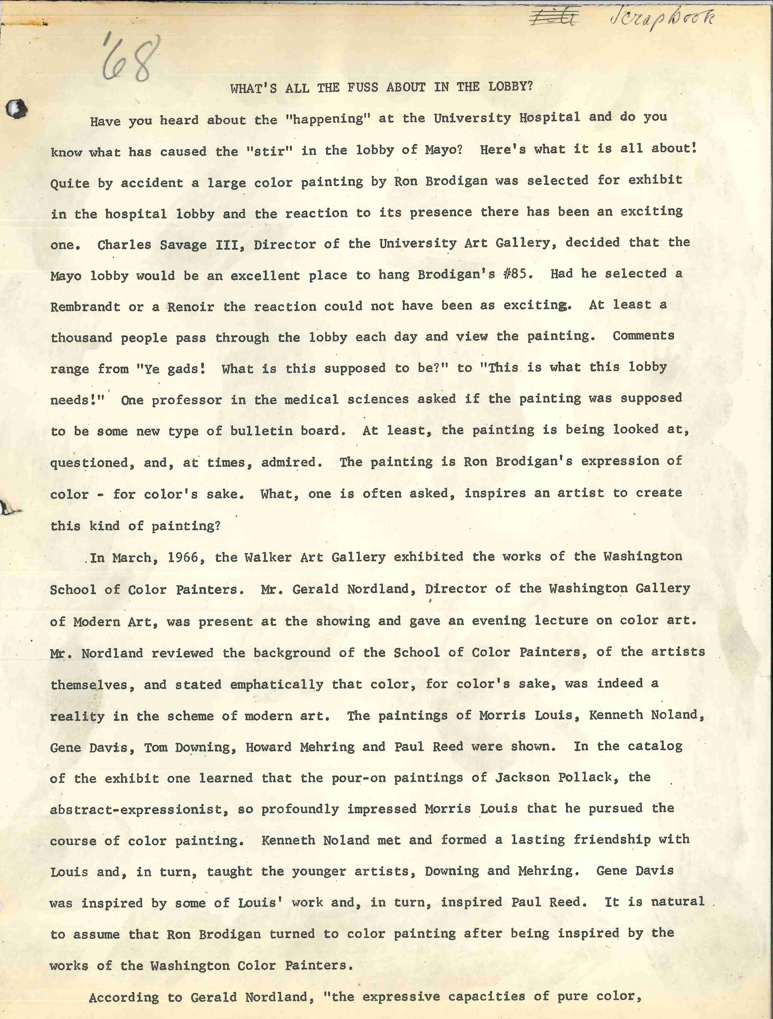
“What’s all the fuss about in the lobby?” Open letter from Dr. Bernstein, page 1.
“What’s all the fuss about in the lobby?” page 2.


From the Publicity Books: Honoring Ruth Lawrence…I


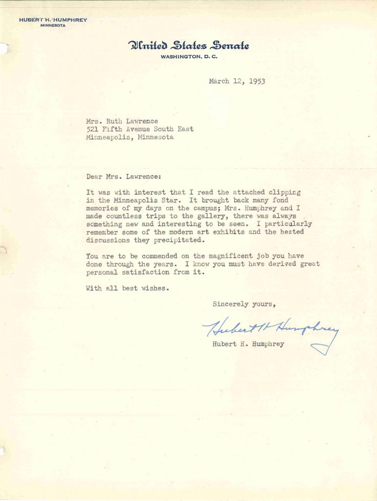
At first glance, the University Gallery’s Publicity Books appear to be mere scrapbooks filled with mementos of early exhibitions, that were found filed away on a bookshelf somewhere in the back of someone’s office. However, tucked unassumingly into a Publicity Book dated 1953-1954, rests a short but impressive letter that challenges that idea.
 

March 12, 1953

Dear Mrs. Lawrence:

It was with interest that I read the attached clipping in the Minneapolis Star.  It brought back many fond memories of my days on the campus; Mrs. Humphrey and I made countless trips to the gallery, there was always something new and interesting to be seen.  I particularly remember some of the modern art exhibits and the heated discussions they precipitated.

You are to be commended on the magnificent job you have done through the years. I know you must have derived great personal satisfaction from it.

With all the best wishes.

Sincerely yours,
Hubert H. Humphrey


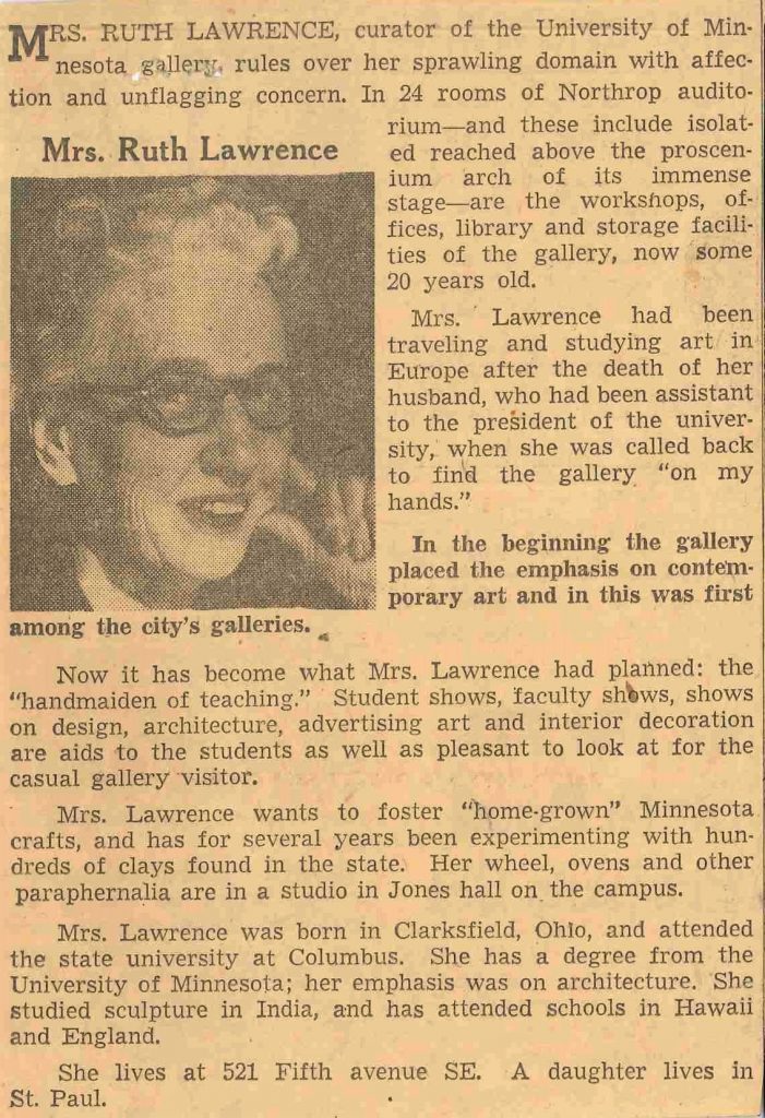
The letter was sent to University Gallery director Ruth Lawrence from then senator and future Vice President of the United States, Hubert H. Humphrey shortly after his first unsuccessful run for president. Humphrey cared enough to write to Lawrence after coming across an article featuring Lawrence in the daily newspaper.  The article states:

In the beginning the gallery placed the emphasis on contemporary art and in this was the first among the city’s galleries.  

Now it has become what Mrs. Lawrence had planned: the “handmaiden of teaching.” Student shows, faculty show, shows on design, architecture, advertising art and interior decoration are aids to the student as well as pleasant to look at for the casual gallery visitor. 


It’s clear from Humphrey’s letter, that included the clipping, that the gallery had fulfilled Lawrence’s instructional mission in meaningful, lasting ways.


I don’t know about you, but if I received a letter out of the blue from one of our senators commending me for a job well done, I would certainly be flattered and I might frame or otherwise show off the letter. From the inclusion of such a glowing letter from a prominent local and national figure in the Publicity Book, one gets the feeling that the books weren’t tucked away in the back of an office but perhaps on display to be perused by students and visitors to the gallery or the Fine Arts Room.

In an archival setting, correspondence of all types are often grouped together within a collection. However, original order is a fundamental principle of archives because it can help define relationships. The Humphrey letter, while unusual for its placement in a Publicity Book, wasn’t misfiled but rather infers that these books were publicly used. Perhaps this letter inside the Publicity Book was almost as visible as a frame on the wall, and so a fitting way to honor Ruth Lawrence and her mission with the gallery.


Heather Carroll is the processing archivist for the Weisman Art Museum‘s collection at the University of Minnesota Archives. This project was made possible by funds provided by the State of Minnesota from the Arts and Cultural Heritage Fund through the Minnesota Historical Society.