Planning continues for the WAM Files exhibit that will open at WAM on July 14th… The exhibit will feature, amongst other unique items from the Archives, some of the first items of intrigue that the project processors encountered – University Gallery exhibition posters. A WAM Files blog post from February 27, 2011 profiles processor Areca’s initial reaction to her discovery of a set of exhibit posters. As the project continued, we kept finding posters – in the exhibition files, in a separate over-sized materials collection at the Archives, and even more in a box in the back of WAM’s work room (which will later be transferred to the Archives).

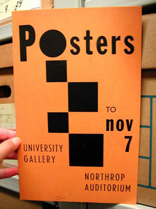
One of the many posters that we encountered was created to promote an actual exhibition of posters. The exhibit, simply titled, “Posters,” was held in the Gallery in the fall of 1952.
Correspondence written by Assistant to the Director, Ivan Majdrakof – found within the exhibition record in Box 4 – described the exhibit:
Rather than the artist-designed poster we concentrated on what we thought were good posters encountering a large public. A high standard of design was our basic criteria. Sources of material were: the New York Subway Advertising, the New York Times, Army andNavy Recruiting offices, Foreign Travel agencies, Cancer Society, our own collection of World War I work, and private collectors of early European posters.
Label text from the exhibition stated:
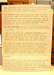
WELL DESIGNED posters rarely reach a large audience and yet nearly every poster in this exhibit has been seen by a huge number of people.
THE PRIMARY reason for choosing one work and disregarding another was its DESIGN BASIS. Did the poster stop you and invite consideration? Was it eye-appealing? How well did it sell its product? How much did it use the DESIGN ELEMENTS easel painting had and is passing on to it?
THE WELL DESIGNED poster is invariably emotionally satisfying. There is no convincing emotion without GOOD DESIGN.
SINCE the criteria of a STRONGLY DESIGNED poster before a large public was used we found that certain categories of the poster-makerʼs art were eliminated. Sentiment, sex, the actual graphic portraying of a product are more often absent.
THE GREATEST successes DESIGN-WISE seem to be in the realm of ideas. The CAREFULLY DESIGNED poster seems to stress emotional attitudes. Subtler, non-visible ideas lend themselves to CONTEMPORARY DESIGN. Yet the same challenge is there for all poster or visual communication. Only through more “extreme” successful solutions as those on display here will the level of this art be generally raised.
THESE POSTERS divide into three approximate periods. The earliest displayed here are from about the thirties when European poster art was quite advanced from a DESIGN STANDPOINT. The typographic layout of these early German posters still influence the works of VISUAL DESIGNING today.
When the WAM Files exhibit opens in July, we hope that museum visitors find a few eye-appealing posters that will invite their consideration…

