2012

Understanding Sculpture Today

From the beginning, the exhibition philosophy of the University Gallery was guided by a simple purpose – to expose University of Minnesota students to new forms of art in order to further understanding and cultivate appreciation. The exhibit Understanding Sculpture Today, held from November – December 1946, is one example of an application of this philosophy.

Sculpture1.jpgThe University Gallery press books contain various articles, printed by local newspapers, which promoted and reviewed the exhibit. According to these sources, the exhibit was assembled by William Saltzman (acting director), and included 40 works of sculpture loaned by galleries and individual artists throughout the country. According to Saltzman, who was quoted in a November 1, 1946 MN Daily article, “The purpose of the exhibit, as the title implies, is to present various media and methods of interpretation as found in contemporary sculpture.

The exhibit included “Two Bodies,” by Alexander Archipenko, “Overture,” by Calvin Albert, “Hanging Mobile,” by Alexander Calder, and “Biography in Bronze,” by Carl Milles. Various local artists were also represented in the exhibit, to include University of Minnesota art professor S. Chatwood Burton, and Evelyn Raymond of the Walker Art Center.

University student Stan Hietala reviewed the exhibit in a November 22, 1946 MN Daily article titled, “From Marble to Plexiglas: Sculpture Shows Versatility.” Hietala reported, “The show is an excellent example of the ability of William Salt[z]man, gallery assistant director, and his staff. It answers a need in a field somewhat unknown to the [non-art] student, helping him to understand today’s sculpture.

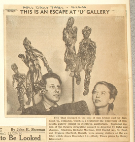
The Minneapolis Daily Times printed a photograph of two University students observing a sculpture titled, “Five That Escaped” (above). The sculpture was popularly mentioned in many of the articles about the exhibit. Hietala’s review also mentioned the work:

Quite often an artist is found who expresses his emotions primarily, ignoring conventional style or contemporary trends. In Randolph W. Johnson’s bronze… the sculptor almost achieves pure emotionalism, void of dogmatic style.

The five figures are stumbling along, fatigued, yet in haste. Their whole demeanor reflects horror and fright.”

WAM continues to promote the understanding of sculpture in the museum galleries, as well as throughout campus. Archipenko’s, “Two Bodies” is currently on display in the Woodhouse Gallery, and is one of many examples of sculpture that can be found within the museum. For the current Target Studio for Creative Collaboration exhibit, contextual flux, artist Jason Hackenwerth worked with University students (to include several studying “non-art” disciplines) to produce new sculptural forms. Throughout the University, over 30 different forms of sculpture can be found in courtyards, building entrances, lounges, garden spaces, and other campus locations as part of the Public Works of Art program.

For current University of Minnesota students – and visitors – who have harbored a latent curiosity in regards to the shapes and forms that they encounter on campus, opportunities abound at WAM for them to start understanding sculpture today


Season’s Greetings Cards

Don’t let the above-normal temperatures of late fool you — December has officially arrived. Though some of you may have a sliver of pie somewhere in the back of your fridge, Thanksgiving is now far behind, and for many, the focus has sharply turned towards December holiday preparations. It is at this time, every year, that my mother starts to lay the prep work for the 25th: requesting lists of gift ideas, reporting the status of holiday home decorating, and asking that truly pivotal question, “What should we write in the annual Christmas card?”

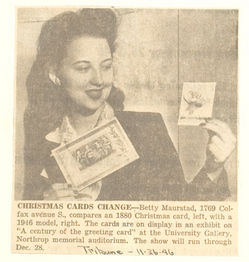
GreetingCard.jpgThis question has been on the minds of mothers (and other card preparers) since the Victorian era, as a representative display of card designs exhibited at the University Gallery in 1946 suggested. The exhibit provided a history of printed salutations and displayed an array of designs likely to inspire visitors as they made plans to spread their holiday wishes. A Century of the Greeting Card, held from November 25 to December 28, 1946, included Christmas and other holiday cards produced by English and American card manufacturers. On loan from Brownie’s Blockprints, Inc. of New York City, the cards included then current designs from the 1940s as well as a print of the first Christmas card ever produced. (at left – Betty Maurstad, curator, is shown holding examples of the holiday cards in a photograph printed in the Minneapolis Tribune.)

In the 1840s, Sir Henry Cole (the first director of the Victoria and Albert Museum, London) commissioned John Callcott Horsley, an artist from the Royal Academy, to design a card to send to friends at Christmas. Horsley’s design portrayed a multi-generational family toasting the holidays (the child toasted too, as she or he is shown sipping from the wine glass). The greeting included a simple message:

A Merry Christmas and a Happy New Year to you.

It wasn’t until the 1860s that the card business developed commercially. The greeting card economy crossed the pond in the 1870s when Louis Prang, a lithographer and publisher, referred to as “the father of the American Christmas card,” began printing cards in the United States.

Though modern day greeting cards have become quite sophisticated, to include audio cards that allow you to record your own greeting, as well as increasingly complex and impressively staged photo greetings, I think I will take inspiration from Cole’s first holiday card and respond to my mother that the simplest of greetings can often be among the best.

You can carry on the tradition of the greeting card by creating your own at WAM’s annual holiday discount event, BeDazzled, on Wednesday, December 4, 2012 from 4:00 – 6:00 p.m. Letterpress your own card with Studio on Fire and enjoy treats, music, discounts, and more!


Symphony Art Project

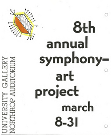
Are you ever inspired by music? Are you a college student for whom a study session would be incomplete without “ear buds” habitually positioned in said ears and the latest up-and-coming sounds from emerging bands playing from your rotating playlist? (What are the kids listening to these days?) Are you an artist who prepares to paint/sculpt/etc. not only by setting out your materials and tools, but by also pressing play on your chosen audio transmitting device to start a carefully curated soundtrack to which you whistle to while you work? Musical inspiration and artistic creation was in the mind of Antal Dorati, director of the Minneapolis Symphony (known today as the Minnesota Orchestra) when he approached the Young People’s Symphony Concert Association (YPSCA) in 1949 with a proposed program titled, Symphony Art Project.

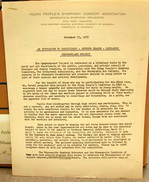
SymphonyArt-Poster.jpgAn official invitation to participate in the 1955-1956 season of the Symphony Art Project by the YPSCA dated November 21, 1955, indicates that “For the benefit of those who may be participating for the first time…” a description of Dorati’s impetus for creating the program is expressed: “to encourage a deeper sympathy and understanding for music in young people.” Dorati “suggested that one way to arouse [student] interest would be through their expression in art media of the ideas and emotions gained in listening first to ‘live music,’ whenever possible, and secondly to recordings and broadcasts.” (Original symphony recordings were provided to schools that could not send students to view a symphony concert in Northrop Auditorium.)

SymphonyInvitation1.jpg The invitation (at left) also provides additional background about the program, and includes rules and instructions for participation, noting that, “Pupils from kindergarten through high school may participate,” and that “This is not a contest.” The Young People’s Symphony Concert Association sponsored the annual program, and schools from across the metro area participated. Each school displayed the art created by their students within their own buildings, and teachers later selected a representative example of works produced by their students to be included in a spring exhibition at the University Gallery.

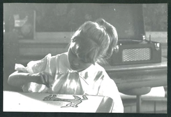
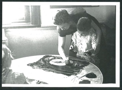
Clippings found in the University Gallery press books show the students in the midst of creating their music-inspired works:

SymphonyArtStudents1.png SymphonyArtStudents2.png

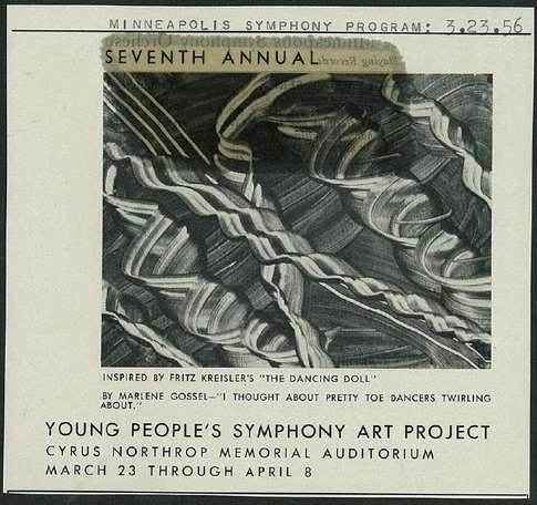
Another clipping provides an example of student work. The Minneapolis Symphony program from March 23, 1956, shows a painting inspired by Fritz Kreisler’s musical arrangement, “The Dancing Doll.” The artist, student Marlene Gossel, described her inspiration, “I thought about pretty toe dancers twirling about.”

SymphonyArtProgram.png

Though the Minnesota Orchestra is currently quiet, the organization still performs Young People’s Concerts and holds other education and outreach programs and activities to spread the appreciation of symphony music to all ages.

*(All of this symphony-izing has subsequently inspired me to search for and listen to arrangements I remember playing in combined orchestra in high school… Yahoo!)


Put on your party hat…

This upcoming weekend marks the 19th anniversary of a big and important weekend in the history of WAM: the dedication and opening of the Frank Gehry designed Frederick R. Weisman Art Museum building. The building was dedicated on Thursday, November 18, 1993 with a ribbon cutting ceremony. Open Houses were held on the 19th and 21st for the University community and general public, respectively. A grand opening gala – with namesake Frederick R. Weisman and architect Frank Gehry in attendance – was held on Saturday evening, November 20th.

The September/October 1993 issue of Minnesota Magazine, a publication of the University of Minnesota Alumni Association, previewed the then new building in a feature article titled, “Both Sides Now.” Author Pamela Lavigne began her article: “Where once stood a sleepy little hill topped by a small parking lot on the Twin Cities campus, now there’s this… structure that causes the average viewer to exclaim, What the heck is that?!

For just shy of 20 years, many visitors to the University of Minnesota have uttered the same question, and it is likely that no two visitors have shared the same reaction. Whether you are an art or architecture enthusiast, University student on assignment, or a community member on a casual weekend walk in search for a bathroom and/or drinking fountain, the building – and the contents within – provide many things to many people, which in itself deserves celebration. Throughout the years, WAM has always found an occasion to celebrate, and the archives contain the evidence of the museum’s many commemorations…

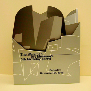
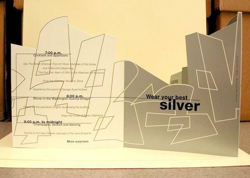
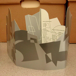
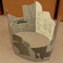
Partyhat3.jpgAn invitation to The Weisman Art Museum’s 5th birthday party! on Saturday, November 21, 1998 was designed to be multi-functional, and served not only as an announcement, but also as an accessory. The invitation, when opened, revealed the details of the celebratory event: cocktails and appetizers, the opportunity to see the exhibitions The Great American Pop Art Store: Multiples of the Sixties and A Bountiful Beginning: The First Five Years of Gifts to the Weisman Art Museum, music, dinner in the Washington Ave. Bridge, and champagne, dessert, and dancing. It also informed attendees to “Wear your best silver.”

Partyhat4.jpg

On the inset, instructions were provided that revealed the second function of the invitation:

Directions for wearing party hat:

  1. Unfold invitation into circular shape (side without words faces out)
  2. Adjust tabs to fit (cross tabs so that ends face inward)
  3. Wear party hat to party November 21!


Partyhat1.jpg Partyhat2.jpg

This year, WAM celebrated a little earlier than it’s official birthday date, when it held the first annual fundraiser gala at the end of October: The Big WAM Bash. In case you missed the Bash, the months of November and December are still full of party hat worthy events and programs: Weekends with the Weisguides, WAM Chatter, Be Dazzled. Now that the first snow of the season has fallen, put on your coat and hat (stocking or party), join the celebrations, and discover what the heck is going on at WAM.


Awesome Auditorium

Today, Monday, October 22, marks the 83rd anniversary of the opening and dedication of Northrop Memorial Auditorium at the University of Minnesota. This is an important milestone when considering that this performance hall and concert venue is currently closed, undergoing a major reconstruction and revitalization to preserve and update the facility. Northrop is an important building in the history of WAM, as it is the building where the museum resided for 59 years prior to moving into the Frank Gehry designed stainless steel clad Weisman building in 1993 (the museum’s “home” for nearly 20 years).

This anniversary reminds us of the enduring legacy of buildings and facilities at the University of Minnesota. The Northrop Auditorium building, named after University President Cyrus Northrop, opened in 1929 to fanfare and musical celebration. As described in a MN Daily article, “University Opens Doors of Auditorium At First Dedication Program Tonight,” the opening ceremony was complete with performances from the symphony orchestra, a piano solo, and the University band. In addition, “A cannon at the head of the mall will be fired near the close of the concert, in accordance with the custom of giving a military salute at the dedication of a state building.

The October 23, 1929 edition of the MN Daily, which covered the opening celebration, reported that although nearly every seat was filled, the opening festivities were not pitch perfect. The grand cannon salute – which was scheduled to fire during the finale performance of the “1812 Overture” to represent the guns fired during the infamous battle for which the piece was written – did not go off as planned. As John Harvey of the MN Daily explained:

‘Did you hear the cannon?’ With those words, Henri Verbrugghen, director of the Minneapolis Symphony orchestra, finished the first of a series of dedicatory exercises for the Cyrus Northrop Auditorium last night after a concert with Eunice Norton as soloist.

High winds broke wires that were to have taken the signal to representatives of the military department and prevented the firing of a cannon as part of the finale of Tchaikovsky’s ‘1812 Overture’ in which the University band joined with the symphony orchestra.”

Despite the (technical?) snafu, the tradition of commemorating a state building was not forgotten. Harvey reported that, “After the crowds left the campus, 10 shots rang out saluting belatedly the opening of the building.”

In the early years of the building, the Minneapolis Symphony Orchestra (now known as the Minnesota Orchestra, which moved from Northrop to Orchestra Hall in downtown Minneapolis in 1974) regularly held concerts, and the University Artists Course hosted a wide range of musical and theatrical performances. It wasn’t until 1934, nearly 5 years after the commemoration of the building, due to the fortuitous insight and dedication of University administration – to include President Lotus Coffman and Assistant to the President Malcolm Willey – that a “little” art gallery would open on the 4th floor of the facility. Though no cannons were used in commemoration of the gallery, the festivities planned to celebrate the opening of a new space for the exhibition of original artwork on campus was befitting of the tradition of the building. Read more about the “Little Gallery” opening ceremonies from a 2011 WAM Files blog post.

View past photos of and about Northrop Auditorium on the UMedia Archive.


Regarding our health…

I participated in the Twin Cities Kidney Walk last weekend. On a drizzly Saturday morning, hundreds of people – to include those afflicted with kidney disease as well as their friends and family members – walked to raise money to support disease prevention and the need for transplants. (Over $250,000 was raised for the cause.) As I walked to support a family member who has undergone multiple transplants over the course of his life, I thought about how we think about “health.” Some of us only think about it if and when we are personally affected, or are reminded about healthcare as politicians argue over which policy/stance is best for us through election advertisements and televised debates…

While thinking about health during and after the walk, I remembered a series of exhibition folders that I processed in the WAM archival collection last year. The folders contained records that documented a 2000 exhibit held at WAM titled, Hospice: A Photographic Inquiry. The exhibit considered art as a way to introduce conversations about health, with a particular focus on hospice care.

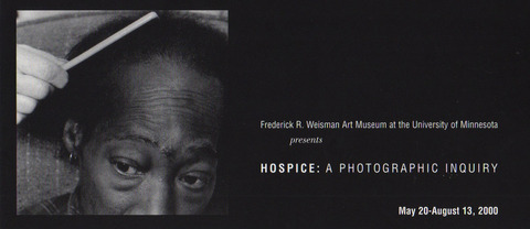
Consider the description of the exhibit, printed on the invitation to the opening reception:

Hospice care, offering physical, emotional, and spiritual assistance to terminally ill people and their families, is the subject of this unique exhibition featuring the work of contemporary photographers and filmmakers. By immersing artists in the world of patients, families, and health care providers, each project documents individual perspectives on the collaborative experience of living and working in hospice environments throughout the country. HOSPICE: A PHOTOGRAPHIC INQUIRY conveys the power with which art is able to reveal a fact of life that may not be part of everyone’s experience.

The exhibit was organized by the Corcoran Gallery of Art in collaboration with the National Hospice Foundation, and was exhibited at WAM from May 20 – August 13, 2000. It featured photographs from five American photographers: Jim Goldberg, Nan Goldin, Sally Mann, Jack Radcliffe, and Kathy Vargas, as well as a documentary film produced and directed by Susan Froemke, Deborah Dickson, and Albert Sayles.

A photograph featured in the exhibit was used for the cover art for the exhibit brochure and opening invitation:

Hospice1.jpeg

Jack Radcliffe, Gill, February 25, 1955, gelatin silver print.

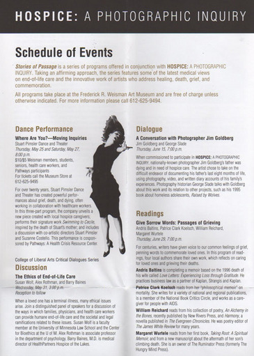
WAM educators and curators worked with a group of local community advisors to develop a series of programs to further the conversation on health and hospice care during the run of the exhibit. Stories of Passage, the title of the program series, explored medical views on end-of-life care as well as the visions of artists who addressed themes of “healing, death, grief, and commemoration” in their work. A description of some of the programs are found in a promotional brochure:

Hospice2.jpeg

Healthcare is a topical and personal issue to many artists as well as to the museum visitors who view and interact with exhibits that address health related themes. Just last month, the Spencer Museum of Art at Kansas University opened a traveling exhibit titled, DropIN/PopUp Waiting Room Project, which addresses the question, “What kind of healthcare system, access, facilities, and services do we desire or expect for ourselves? For others?” Visitors are introduced to possible answers to this question through a waiting room – the common entry/access point to medical care. Read more about the exhibit here.

Whether you walk, witness a work of art, or wait… participating in events and attending exhibits that support and address the topic of “health” could help us all towards a better understanding of our own approaches to healthcare.


Robert Clark Nelson

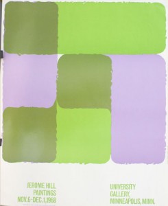
The WAM Files exhibit features a series of exhibition posters from the 1960s that can all be attributed to the same artist/designer. The name “Robert Clark Nelson” is found in small type on the edges and corners of several posters created to promote University Gallery exhibitions throughout the decade.

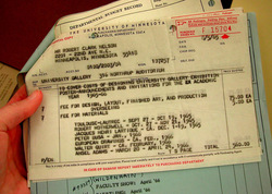
Nelsonposter1.jpgMany clues are found within WAM’s archival collection (housed at the University Archives in Andersen Library) that explain the circumstances of the creation of these posters. A U of M Purchasing Department form dated August 5, 1965 outlines that the total amount of $560.00 was used “to cover costs of designing University Gallery exhibition poster-announcements and invitations for the Academic Year 1965-66.” A Fee of $75 was assessed for the “design, layout, finished art, and production overseeing” with an additional $5 for materials for each of the 7 posters created. Two of the posters that now hang on the East wall of the Edith Carlson Gallery in the WAM Files exhibit were designed by Nelson for the 1965-1966 Academic Year: “Robert Motherwell,” and “Peter Busa.”

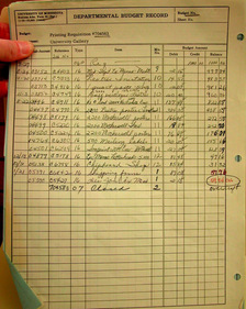
NelsonPoster2.jpgA Departmental Budget Record that represents Printing Requisitions for the University Gallery indicates that 2200 posters were printed to promote the Motherwell exhibit. The line item for 500 mailing labels found on the budget record, along with the fact that many of the posters kept from that era have folds and small tears (and some also include mailing labels on the back), are clues that lead us to believe that exhibition posters were created to serve as mailed exhibition announcements.

Thanks to the digitization efforts of the library unit of another institution of higher education, more information is gleaned about Robert Clark Nelson – the designer behind the name. In the September 28, 1966 edition (Volume XLI-No. 2) of the Clarion, the student newspaper of Bethel University in St. Paul, MN, an article titled, “Professor Receives Top Award In Walker Art Center Exhibition,” reveals that Nelson was a professor at Bethel. The article includes a portrait of Nelson and reported that he was one of top three award winners in the Walker Art Center biennial of painting and sculpture in 1966.

Other posters included in the WAM Files exhibit designed by Nelson include the following: John Rood Sculpture, 1964; Alechinsky, 1965; American Drawings, 1965; Marsden Hartley, 1966; Alan Davie, 1967; Jerome Hill, 1968:

*A note on artistic processes: The posters created by Nelson during the 1960s were created through photo-offset and lithography, processes that the Smithsonian American Art Museum describes in the online exhibit, “Posters: American Style.”


Twentieth Century Painters: The Sidney Janis Collection

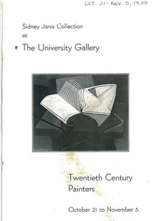
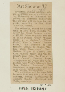
From the outset of the University Gallery program for the 1935-1936 academic year (the second year of its existence), the gallery’s focus on contemporary art was evidenced by the first exhibit that opened that season. The Minneapolis Tribune reported that the exhibit – literally titled – Twentieth Century Painters, consisted of seventeen original paintings valued at $70,000 from the personal collection of Sidney Janis of New York City. Artists represented in the October exhibit included Henri Rosseau, Pablo Picasso, Paul Klee, Piet Mondrian, and Arshile Gorky.

Cats_001_SidneyJanis_1935.jpgGallery curator Ruth Lawrence created a catalogue to provide explanatory material for the exhibit. Assistant to the President Malcolm Willey sent a copy of the catalogue to President Lotus Coffman, along with an accompanying note that promoted the profile of the exhibit in the infant gallery…

Malcolm Willey to President Coffman, October 25, 1935:

“I am attaching a catalog covering the exhibition now at the University Art Gallery. The catalog was written by Mrs. Lawrence. I do hope that during the showing of the Janis collection you and Mrs. Coffman will be able to visit the gallery. It is an exceedingly remarkable group of pictures and demonstrates better than I have ever seen it demonstrated, just how unbalanced art can sometimes become. It is, however, a very significant show and you will observe from the catalog that the paintings have hitherto been seen at relatively few places, but these important ones.”

A list of the artworks displayed in the exhibit was also published in the Minneapolis Tribune (click on the newspaper clipping from the gallery press books at left to view the article).

Decades after the exhibit, art collector Sidney Janis donated many of the works from his private collection to the Museum of Modern Art in New York City. From MOMA’s online collection database, we can view images of a few of the paintings that were once featured in the University Gallery’s October 1935 exhibit:

SidneyJanis1.jpg

Le Reve” (The Dream) – Henri Rosseau

Nature Morte a la Guitare” (Glass, Guitar, and Bottle)” – Pablo Picasso

Actor’s Mask,” “In the Grass,” – Paul Klee


Art: A matter of appreciation…

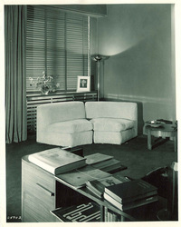
UA_Photos_FineArts_2.jpgWhen the Fine Arts Room first opened adjacent to the University Gallery in Northrop Auditorium in February 1936, the reaction amongst faculty and students was not that of unanimous approval. The room, designed by curator Ruth Lawrence with modern furnishings, was in stark contrast to other types of interior decoration then on campus. The room included a kapok circular couch, as well as venetian blinds and large blue floor length drapes. Lawrence even had the audacity to vary the paint color — two walls were painted blue, the other two off-white. Dean of the College of Education, Melvin E. Haggerty, who was apparently shocked by the décor of the room — as well as its purpose — wrote to Malcolm Willey and President Lotus Coffman to express his concern:
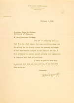
FAR_Letter-Haggerty.jpgFebruary 7, 1936, Dean Haggerty to President Coffman :

My dear President Coffman:

You can see from the enclosure that I am in a bad temper, but some activities about the University cut so clearly across the general philosophy of our departmental program in the field of art that I have attempted to express myself probably more emphatically than you will feel is justified.

I shall be glad to have this manuscript back when you have read it, if you have the time to do so.

Sincerely,
M.E. Haggerty

Haggerty included a manuscript titled, “The Artist and the Layman,” from a publication titled, “Arts & Progress,” dated 1915, the main point of which argued that “the idea which distinguished the artist as a different kind of being from the layman has led to an unfortunate and unnecessary separation in artistic education.” It further stated that in artistic training, even if an artist were to acquire the best technical training, he still has “little chance of knowing anything even about art. The one thing which he ought to have above anything else is critical judgment; and this can be formed only on the basis of serious and prolonged study of masterpieces of the past and of the present day.”

Such thought was in contrast to the intent and purpose of the Fine Arts Room, which was opened not to rigorously train artists, but to provide access to art and cultivate artistic appreciation for ALL University students. When Dean Malcolm Willey first proposed opening a Fine Arts Room to President Coffman, he wrote that he was inspired by the “theory that true appreciation of fine art comes from being in presence of a fine object under ideal conditions.” The origination of the Fine Arts Room was revealed in a letter Willey wrote to Coffman on June 1, 1935:

I should like to try the experiment of fitting up on our campus, as part of our attempt to increase interest in and appreciation of fine arts, a room which in its furnishings should be simple, but in impeccable taste, comfortable, and in every way lovely as a room. Into this I would put one art object at a time – one of the fine things we have bought… I would open this room as a retreat. No studying allowed, no textbooks admitted, no formal instruction. If the setting and the art object [cannot] induce the spell I am seeking, nothing else can.

Haggerty, not inclined to follow this philosophy, and still stirred up by the Fine Arts Room and the University’s approach to arts appreciation, wrote another letter, this time to Dean Willey:
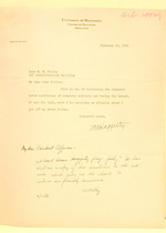
FAR_Letter-Haggerty2.jpgFebruary 10, 1936, Dean Haggerty to Dean Willey:

My dear Dean Willey:

Just by way of continuing the argument under conditions of complete sobriety and having the latest, if not the last, word I am enclosing an effusion which I got off my chest Friday.

Sincerely yours,
M.E. Haggerty

On the bottom of Haggerty’s typed letter is a hand-written note from Willey to President Coffman, whom he likely forwarded the letter to:

My dear President Coffman,

At least Dean Haggerty plays fairly! He has sent me a copy of his reactions to the art room, which gives me the chance to continue our friendly discussion.

M.Willey

In President Coffman’s reply to Dean Haggerty regarding the Fine Arts Room, and of art in general and its appreciation in the University, a reflection of Coffman’s well-held educational beliefs are asserted:

February 13, 1936, President Coffman to Dean Haggerty:

I think there may be something to your surmise that you got out on the wrong side of the bed the morning you wrote your reflections on visiting the new fine art room in Northrop Memorial Auditorium.

I agree fully with your general position that we should create an environment which will be artistic and attractive, which means that attention should be given to the architecture and the general style of our buildings, to the improvement of campus, and to doing everything and anything that will in any way contribute to making our situation more attractive and beautiful. Now from this point I think we might begin to have some differences of opinion.

I do not believe that all art is associated with utility as I think that many researches are carried on with just the researcher having any thought or conception of their value or use. I should have pictures and other forms of art about the campus even though I don’t understand them, just as I would have a beautiful chapel on the campus even though no one ever worshipped in it, or ever went there for prayers, or to hear the Scriptures read. I would have fine music played on the campus and I would reduce the rates, if I had my way, to a point which made it possible for the poorest to attend; I would do this even though I know that most of those who attend don’t understand a thing that is being played. I have often thought that it would be a most interesting psychological study for one to take an inventory of the thoughts that race through the minds of a hundred or more persons in the audience at one of the Symphony concerts. I find, for example, that I think about everything under the sun. I would have people live in an environment every feature of which makes some artistic contribution and I really would try to teach students as much as possible about these features, for I believe that appreciation and genuine understanding are closely related.

Mr. Willey said you sent him a copy of your paper. I am glad that you did. He told me that you and he are carrying on an interesting and animated discussion on the subject of art. Who knows, maybe your letters and his will be published some day just as Royce’s and James’ letters have been published.”

After reading this series of correspondence, a new appreciation is gained of President Coffman’s early advocacy of the arts and his enlightened educational philosophy.

WPA: Visual Aids to Teachers of Art

In her report titled, “University of Minnesota Gallery of Art,” with “Mrs. Lawrence 25-year report” written in pencil across the top, long time gallery director Ruth Lawrence provided a 24 page background on all of the activities of the Gallery over the course of 25 years. A large portion of the report — nearly seven pages — outlined the Works Progress Administration (WPA) work projects assigned to the Gallery. Ruth reflected, “By February 6, 1938, significant changes were taking place, but greater ones were ahead. On that date the Emergency Relief Works Progress Administration assigned a project of 20 workmen to the Gallery.”

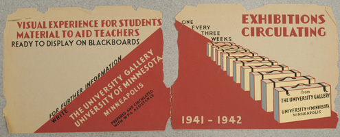
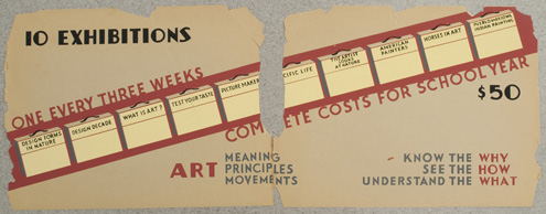
From 1938-1942 WPA workers were assigned to annual work projects in the University Gallery. The main duties of their work consisted of developing an art reference service to support instruction at the University. Workers also created circulating exhibitions comprised of visual aids for teachers. These visual aids were matted, framed, and compiled by the WPA employees and distributed by the Junior League Clubs of Minneapolis, St. Paul, and Duluth. Exhibitors from elementary and secondary schools, teachers colleges, and other small arts organizations throughout the state could rent the visual aid exhibits for a fee that covered postage.

WPA.jpg

WPA2.jpg

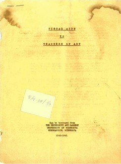
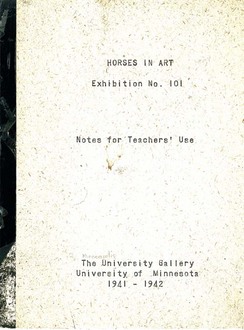
Found within WAM’s collection of exhibition catalogues was a stapled report titled, “Visual Aids to Teachers of Art” that included descriptions of the exhibits and how they could be rented. A booklet titled, “Horses in Art, Exhibition No. 101” was also found. This booklet, which contains instructions and a sample curriculum, accompanied the exhibit materials. Exhibits were comprised of 10 reproductions of old and contemporary artwork that were mounted to boards, designed to be set in the grooves of a chalk well and rest against classroom blackboards.

Cats_017_VisualAids_1940.jpg Cats_022_HorsesArt_1941-2.jpg

After the outbreak of WWII, all WPA work at the University was re-assigned to the war effort, and the art reference service was scaled back to provide resources to University instructors and students only. Ruth reflected, “All traveling exhibitions were stopped. During the war years unfortunately, these were destroyed by a mysterious fire in the storage or fan room, beginning in the organ loft.”

Thanks to the accessibility of the Minnesota Daily’s PDF Archives, more information about the mysterious fire is gleaned when a search of the PDF Archives provided a copy of the November 5, 1942 edition of the newspaper, which contains the following headline, “Fire Destroys Northrop Art Works.” The article begins,

A fire of undetermined origin burning for more than half an hour in the organ blower room, 303 Northrop auditorium, yesterday destroyed almost all of the art displays, and equipment stored in the room.

About $250 worth of picture frame moldings, ten elementary school art exhibits and numerous picture display board were burned.

Thanks to the WPA project reports, the existence and preservation of posters and catalogues, as well as additional resources such as the PDF Archives, we are able to learn more about the unique services and programs that the Gallery once provided.